
Articulate Storyline And Mobile Learning
I recently read an article published by Articulate (makers of authoring tool Articulate Storyline) in which they define their outlook on the delivery of learning and detail how they plan to release new software designed specifically to better deliver eLearning content for mobile. The article outlined the fact that learning content is usually delivered via a slide style interface and that Articulate intend to retain this format across all devices using a responsive mobile player.
Whilst I am glad that Storyline may be getting a partner app to better target mobile compatibility, I hesitate to jump on the “one slide fits all” approach they favor. Whilst it’s true that this is the current paradigm, it does not consider whether slide-based learning is the best solution for every platform and device.
Below I will explain the various approaches available when it comes to developing mobile learning and discuss how we should be making the most of the opportunities available, rather than choosing a one size fits all strategy.
Why Has This Become An Issue?
Within the world of digital learning we are experiencing growing pressure for courses and training ephemera to be made available on a range of devices, from PCs to tablets and smartphones. eLearning is changing from an alternative to classroom equivalents to a fully mobile service, where end users have more control over how they consume their learning content.
With different use cases, devices, operating systems and browsers, how do you best deliver your content without sacrificing its efficacy?
What Are The Options For Mobile Delivery?
There are a number of terms that get mentioned when talking about this subject, therefore it makes sense to define what we mean when we use them:
- Responsive.
A responsive system is a fluid system where content stretches to fill the screen area most efficiently. This system covers the largest number of user devices because device resolutions (and screen sizes) vary so greatly between desktops, tablets, and phones.
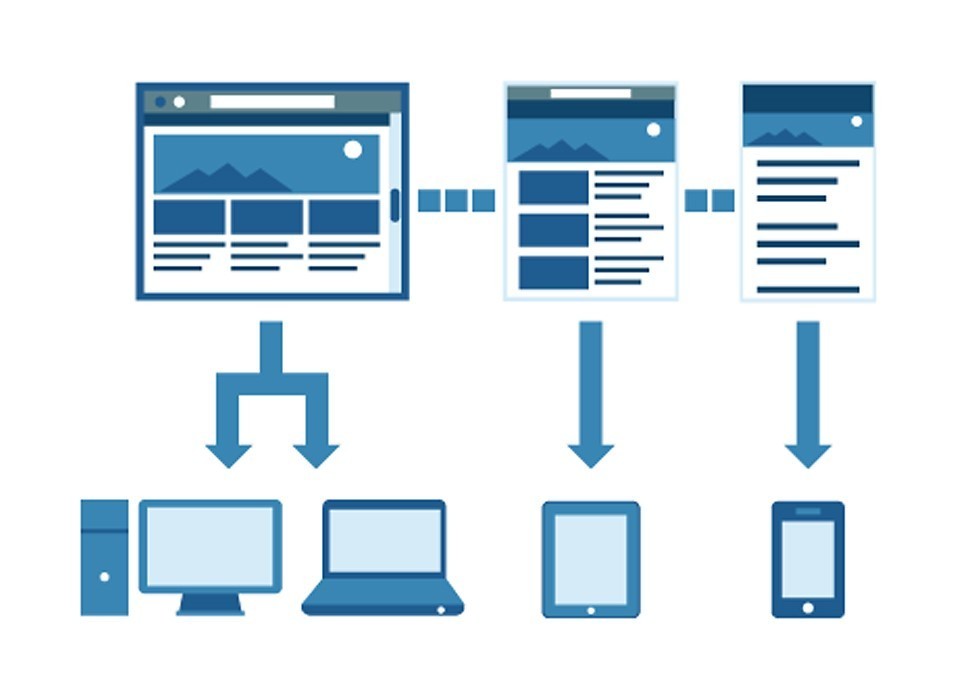
- Adaptive.
This system uses breakpoints to switch the design to a predetermined layout depending on the space available. Essentially delivering a custom experience at each screen level, an adaptive solution usually requires more design time to accurately define each style, but works best when a fluid layout just won’t do the content justice. - Native.
Building a custom app for a given platform which allows you to exploit the features of the operating system and device at hand, e.g. GPS, camera, accelerometer, multi-touch, and the processing power of the device itself.
Where Does Articulate Storyline Fit In?
As one of the leading authoring tools on the market, Storyline creates packages for iOS, Android, and PC by publishing either Flash or HTML5 output. This output resizes the slide-based learning to fit the available screen space. However the content scales with the course, not independently responding to the device. This makes text almost unreadable on smart phones.
On a tablet you can opt to use their mobile app to boost performance, but this has one drawback in that it doesn’t work with a learning management system. Output from Articulate Storyline does not cater to smart phone resolutions as the content only scales down to fit the dimensions, leaving you with an illegible course. It also doesn’t currently support any version of Windows mobile (a platform designed for professional and casual work flows).
What Do The Experts Say?
We can learn a lot from the branding, design, and print industry, which has gone through a similar digital revolution where demand for ever increasing portability has driven many magazines and websites to adapt to the mobile age.
Erik Spiekermann, the noted typographer and designer, has experienced this change first-hand and has this to say about communication on digital platforms:
“The way to design is the same, you give content form and the medium really is always different. (…) I’ve got to cram a lot of complex content into a given format no matter how small that may be. I don’t see any difficult issues there it’s the same always; you solve the problem, you think about the users and think about the issue at hand: How much information, how do people read, when do they read, why do they read, do they have to read, can they read, must they read?”
Clearly, adapting content around the user can result in much more effective delivery if we consider how they will digest the content available given the medium at hand.
“Tell me and I forget. Teach me and I remember. Involve me and I learn.” This classic quote from Benjamin Franklin about education in general also references the need to involve the learner in the learning experience. Engaging content is important, but you also need to provide the information in the right medium to maximize take up.
Finally, I find it pertinent to point out that this is still a very new development in the learning industry which has only really become important in the past couple of years. However, sometimes we need to take a step back and look at the bigger picture:
“...we are still only a little way into the digital publishing revolution. It took 200 years (…) for the full ramification of the printing press to be felt in society and economics, and we are, at the most, 50 years into the computerized publishing revolution.” (Belam, 2011)
In Summary: Always Consider The Learner
What the article by Articulate fails to address is the fact that people consume content in different ways depending on the device. It is the great success of many apps and e-books that they give the user a more portable, instant access and retrieve system. Applications like the New York Times app, for example, deliver vast quantities of information across devices, seamlessly integrating multimedia, imagery and even typography into a familiar structure.
The idea of a one size fits all system is a developer-centric concept, rather than thinking about how best to deliver the content in a form that benefits the user, based on what they have to hand.
What’s more important is the content that we’re striving to deliver in an engaging way. If you take away the idea of the slide as the vehicle, you have far more options for delivery.
With this alternative approach, slide based content might not reflow on other devices, but instead delivers a different experience tailored to the mobile nature of the device. What was previously an in-depth course on wiring up a boiler and product catalogues becomes a short video and diagram prompt-based resource. Making the most of responsive, adaptive and native content where appropriate is a more diverse and user friendly approach.
My hope is that this new tool from Articulate Storyline does include some aspects of a more modern approach to responsive content and does not tie itself to reproducing the same slide across each device. Without implementing some sort of responsive element, text size and graphics will suffer as a result.
However, I am sure that Articulate have big plans for this software and, as I’ve already said, I am looking forward to testing what they have to offer in this space.
In the end, the market for this will be driven by the demand for mobile adapted learning. This quote sums up our new reality perfectly:
“The overall point is that new technology will not necessarily replace old technology, but it will date it. By definition, eventually, it will replace it. But it’s like people who had black-and-white TVs when color came out. They eventually decided whether or not the new technology was worth the investment.” - Steve Jobs
