

Writing And Organizing Deeper Learning: Use Readable Fonts And Type Sizes
Patti Shank, PhD, author of the Make It Learnable series, is allowing our readers to read portions of her new books. This article comes from Write And Organize For Deeper Learning.
In the first part of this article we talked about testing readability. Let’s now discuss about the type of fonts you need to use for improving your content and making it readable.
1. Use Readable Fonts
Font fanatics and readability experts debate the legibility of serif fonts (fonts with small decorative embellishments, such as Times) versus sans serif fonts (fonts without those embellishments, such as Arial).
Some say we should use serif fonts in print-based materials and sans serif fonts in digital materials. Research is unclear, so we can assume (for now) there is no significant difference between the readability of serif fonts and that of sans serif fonts in either print or digital.
Luckily, research does offer the following guidance for choosing fonts for readability. We should:
- Use fonts that are non-decorative, not unusual, and unlikely to convey specific meanings.
- Make text large enough to read in the selected medium. The farther away the text will be from the reader, the larger it needs to be.
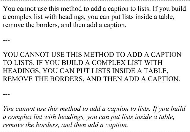
- Use sentence case (normal upper- and lowercase) because it is easier to read than UPPERCASE (Figure 5.3).
- Use UPPERCASE, bold, or italics only for emphasis, as they are harder to read, and we should not overuse them.
- Use only one or two fonts.
Figure 5.3 Body text in sentence case (top), uppercase (middle), and italics (bottom)

2. Use Readable Type Sizes
We measure type on a computer screen in point sizes. Linda Lohr, who was an instructional technology professor and is the author of Creating Graphics for Learning and Performance, recommends that non-projected (printed and computer) text (for example, articles, job aids, and online courses) be around 12 points.
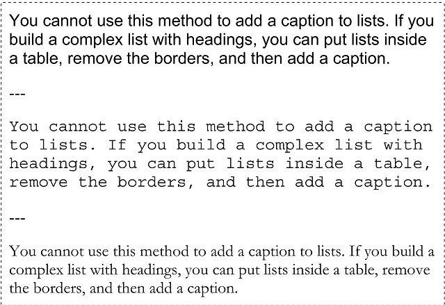
It is difficult to offer hard-and-fast rules about point sizes, however, as different typefaces in the same point size are often different sizes, as you can see in Figure 5.4. Look at how much space the different typefaces take up in the same point size. Arial and Courier New almost look too big, while Garamond looks reasonably sized for a print page (…to my eyes. How about you?).
Figure 5.4 Different typefaces in the same size: Arial 12 (top), Courier New 12 (middle), and Garamond 12 (bottom)

Style sheets (for computer text) can allow readers to change the size of text on their screen. Consider adding the option to increase or decrease the text size for those who need it.
For projected text (such as slides on a screen), text must be much larger. Normally 18 points is the very smallest projected text size people can read; however, 18 points may be far too small from the back of a large auditorium. This means that, to know what will work, you need to test projected text at the size people will view it. And text will look quite different when viewed from either the front or back of a large room. Yes, a dilemma. Ask yourself where people are most likely to sit. In the conferences I attend, more people sit in the middle and the back.
If you want to know more about making your content readable, check my book Write And Organize For Deeper Learning.
See you soon!