Visual Design Principles
In this article, I discuss the key takeaways from one of the presentations given at LearnFlux in June 2022. This excerpt helps cultivate the ability to design dynamic visual assets that promote engagement and stimulate learning.
There are several fundamental visual design elements that should be considered while building and developing since they affect learning. This article will concentrate on the 5 fundamental principles of visual design. They are the following.
1. Simplicity
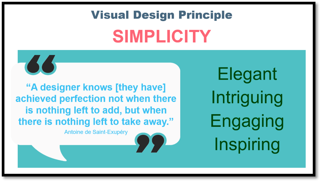
Always make things as basic as possible in design, and do so by asking yourself, "Is it okay, have we reduced this down to what's most important to produce that efficient experience?" Simplicity is essential. There is a famous quotation on design simplicity—"A designer knows that they have achieved perfection, not when there is nothing left to add, but when there is nothing left to take away."
This is a fantastic idea since we want to be able to create simplified, efficient learning experiences. Get in, learn what you need to know, and get out as soon as possible.
2. Contrast
In design elements, contrast is vital. But, given a choice between photos A and B below, which do you think is the most effective?
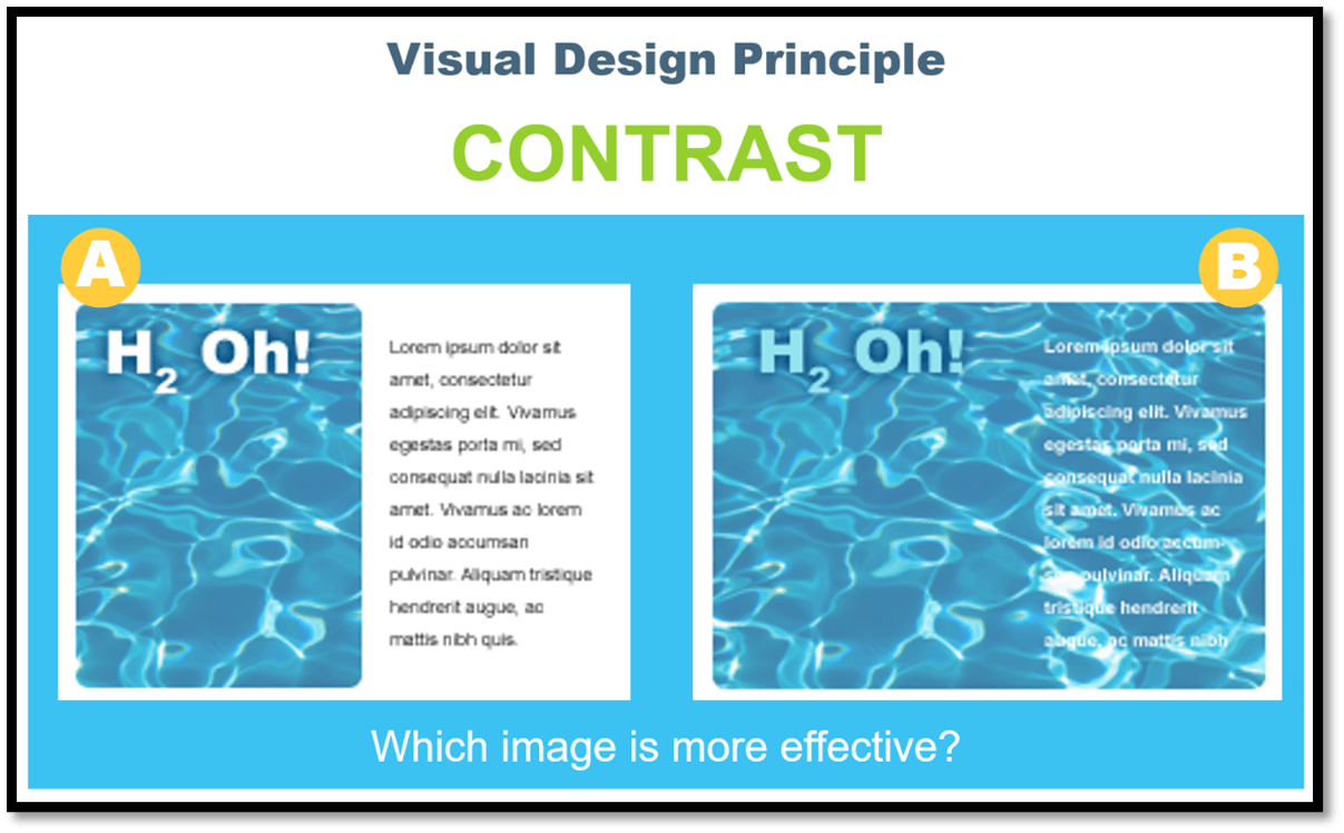
The first thing you notice is that the display appears somewhat fuzzy. Contrast is critical for both effective impact and visual accessibility. Consider the relevance of color blindness in persons studying in diverse situations, such as on a phone or tablet.
3. Repetition
Which of the illustrations below do you think is most powerful?
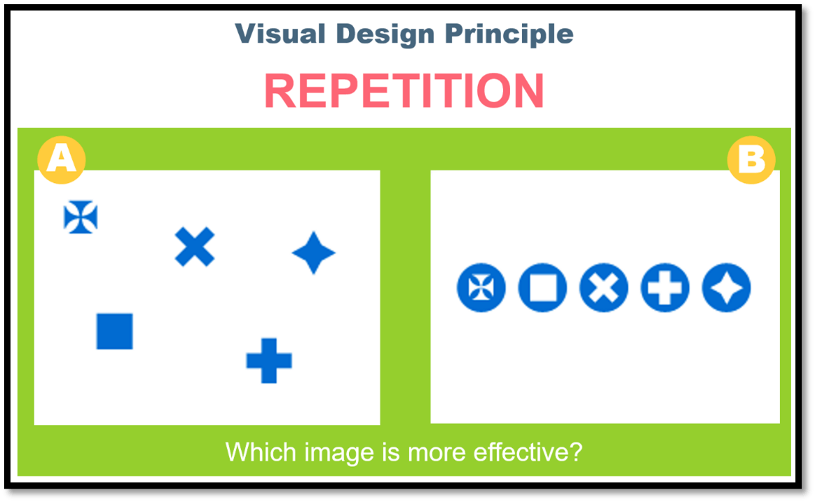
Due to its cleanliness, image B performs better when the idea of repetition is considered. While your brain tries to make sense of what's happening, why they're scattered, and what that means, image B is easier to comprehend than image A. Our brains are so quick to try to make sense of things that if repetition is incorporated into our visual designs, we can reduce the stress of trying to make sense of things and make the brain more attentive to what it should be learning.
4. Alignment
Which image would you say is more effective in this case?
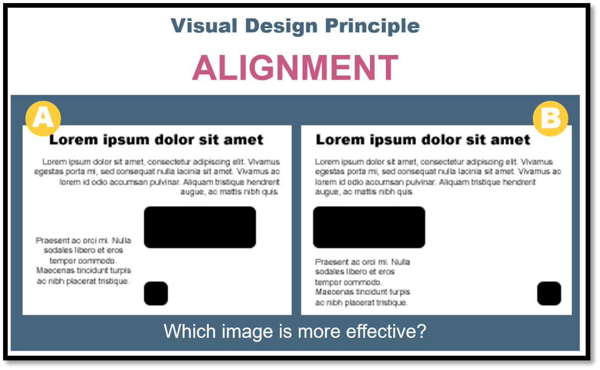
The image on the right!
Alignment is the subsequent step. Design elements should have alignment, repetition, and contrast. The brain can process information more readily when things are aligned rather than when they are more dispersed.
5. Proximity
Examine the accompanying picture of apples and oranges in comparison. Which one do you think is the more powerful image?
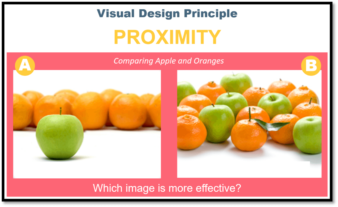
Image A, correct? The reason is proximity. Here, we're attempting to convey that apples and oranges are distinct from one another, and image A achieves it more succinctly than image B.
Other Visual Design Principles
The other visual design principles which can be used to create high-impact learning and performance support solutions are:
1. Coherence: Removing extraneous words, pictures, and sounds. Remember, less is more! Learning is diminished when interesting, but irrelevant words, pictures, sound, and music are added to a multimedia presentation.
2. Image: It is not necessary to include an image of the speaker (narrator) onscreen.
3. Modality: Graphics, images, and animations are more effective when they are explained through narration rather than onscreen text.
4. Multimedia: Words and pictures are more effective than words alone. However, having images that are merely "decorative" is not helpful.
5. Personalization: A conversational tone (for a speaker or narrator) is more effective than a formal style.
6. Practice: Structured activities and interactions that are job-context-relevant improve learning and transfer back to the job.
7. Pre-training: Make sure to communicate the names and characteristics of the main concepts.
8. Redundancy: Graphics and images should be explained by audio narration alone rather than audio narration and on-screen text.
9. Segmenting: Present content, activities, and interactions in leaner-paced segments rather than as a continuous unit.
Big Picture
Consider applying the tenets of these principles to any visual while designing to make that visual have a far more significant impact on learning. These visual concepts are crucial; luckily, there is an easy-to-remember acronym: SCRAP (Simplicity, Contrast, Repetition, Alignment, Proximity). It is important to remember these concepts while creating dynamic images. If you pay great attention to these design principles, you will significantly increase your learning impact.