The Complete Popup Banners Guide For eLearning Companies
Chapters
popup-banner-ads-guide-elearning-companies

The Complete Popup Banners Guide For eLearning Companies

WHAT YOU WILL LEARN

  • The benefits of using popup banners for your eLearning company.
  • Ways popup banners can increase awareness around your eLearning solutions.
  • Tips to design and optimize popup banner campaigns that convert.
  • Copywriting secrets to skyrocket popup banner conversions.
  • Why outsourcing a popup banner campaign can boost your marketing ROI.
Christopher Pappas
Christopher Pappas
Founder
Christopher Pappas is the Founder of eLearning Industry Inc, which is the leading publishing platform that delivers inspiring, industry-specific content to eLearning professionals. Christopher holds an MBA and an MEd (Learning Design) from BGSU.
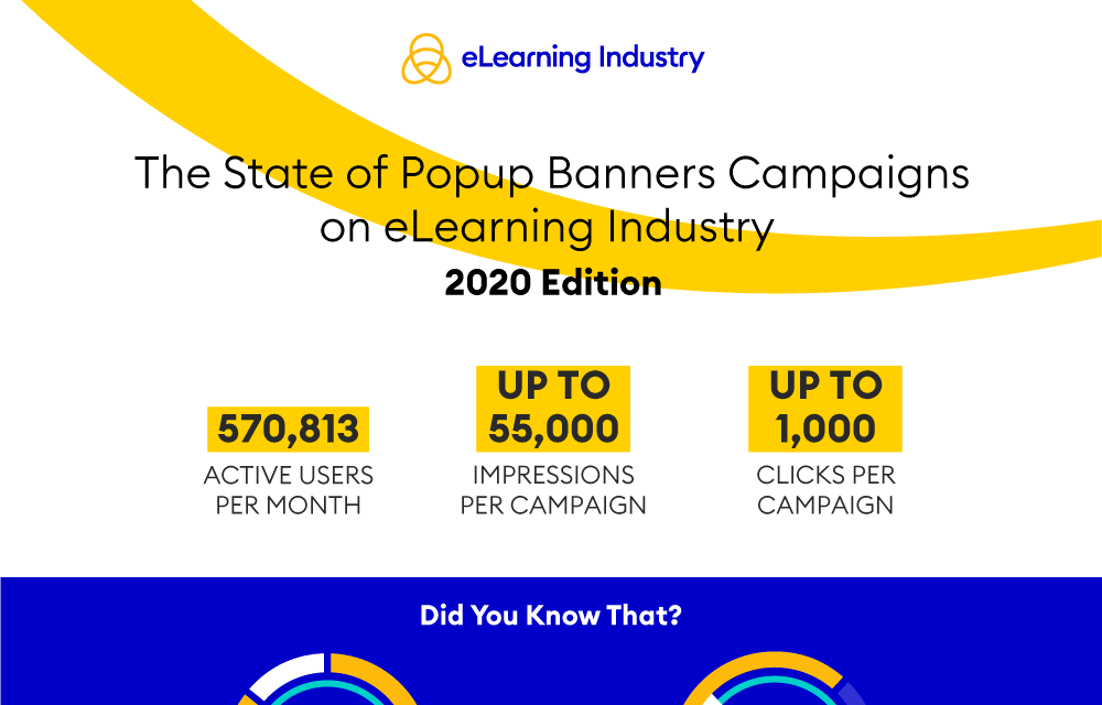
Popup-Banner Campaigns infographic

Do you want to download this infographic?

Change your privacy settings to see the content.
In order to fill-in the form you need to have functionality cookies enabled.
You can adjust your cookie preferences here.
Popup-Banner Campaigns infographic

Deliver highly targeted Popup Banner ads to the Largest Community of eLearning Professionals

Start a popup banner campaign

Deliver highly targeted Popup Banner ads to the Largest Community of eLearning Professionals

Start a popup banner campaign
5
Chapter

How Can An Exit-Intent Popup Help Grow Your Revenue?

As internet users living in 2019, we are all being targeted by someone trying to make a sale out of us. However, sometimes we let them succeed and sometimes we blatantly ignore their attempts.

Did you ever think why? Well, while there can be a number of reasons that factor in, the timing of the campaign plays a significant role.

Think for yourself, what’s the point of asking your unique website visitors to buy your eBook, with the most valuable insights, as soon as they arrive on your web page?

It’ll bring you little to no good. In fact, it may even turn your new visitors off.

Solution? Strategize. Time your popup banners so they are in sync with your visitors. Don’t get it? You soon will. Here’s how an exit popup can be useful for your eLearning business and how you can optimally use it for the best results.

What Is An Exit Popup?

An exit popup (a.k.a exit-intent popup) is an overlay that appears on a webpage when a user tries to navigate away from the page. The purpose of an exit popup is to convince the leaving users to stay on that particular web page.

The way these popups look and work for your eLearning business can be customized based on the page they are to be used on.

For example, an exit-intent popup can work wonders for reminding visitors about your special offers. When users try to exit one of your landing pages the exit popup could remind them of a coupon or a discount. This can also be a general, “non-salesy” reminder for them, which can in turn convince them to not leave your website as well. Just give them an incentive to take an action that will benefit them

What Is Exit-Intent Technology?

An exit-intent technology works on the simple technique of tracking the mouse movement of users on the target page. Basically, when a user takes the cursor away from the web page (the active area/current window), this technology is activated resulting in the defined popup to pop up.

For a better understanding of how it works, here’s a GIF for you.

popup_banners_exit_intent_elearning_industry

Looks cool, right? Well, it can dramatically boost your eLearning business’s ROI. To learn how keep reading.

There’s just one bummer: exit-intent popups do not go well with your website’s mobile visitors as no cursor is used on mobile phones. However, in the last section, we’ll talk about the possible remedy.

Why Are Exit Popups As Awesome As They Are?!

Enough about what exit popups are and how their technology works, this is time to talk about why exit popups are as awesome as they are.

Imagine being reminded to place your order when you forgot to do so after just adding products to the cart. This will save you from missing out on the product that you just wanted to order. Plus, this will save the concerned website a customer.

Seems useful, right?

Well, let’s look at it from the other end. Instead of assuming that you are being targeted by a business, think of your business targeting a prospect with the same idea. Conversions smell sweet, don’t they?

Well, this along with a number of other effective and useful ideas can help you convince your visitors to not leave your website when, normally, they were going to.

As a result of this, exit-intent popups significantly reduce bounce rates. This also helps your search rankings grow.

For a better understanding, let us look at the following case when Graham Onak, owner of GainTap Digital Marketing used exit popup banners to boost overall conversion rates by 20%.

As a suggestion he quotes:

"The biggest takeaway I have for you is this: offer an incentive. Maybe they don't want to call you, so have your exit-intent be an easy form or chat. Offer a piece of really useful content (a price list for example)."

It’s clear how exit-intent popups can significantly pace you up on your way to achieving your marketing goals. It’s just the need for an air-tight implementation that’s a must.


eBook Release: Complete Popup Banners Guide For eLearning Companies
eBook Release
Complete Popup Banners Guide For eLearning Companies
Master the use of popup banner ads for your eLearning business. Our guide will help you learn tips, best practices, metrics & optimization tactics.


How to Launch Exit Popups That Target Mobile Users?

As mentioned in a section above, targeting mobile users with an exit-intent popup is difficult as mobile phone screens do not have a cursor that can be tracked. However, there still is something that can work parallel with mobile devices.

Inactivity sensor is what it’s called.

Considering the fact that nearly 80% of mobile users don’t complete their purchase, the need for coming up with an effective strategy to lower these numbers is real. Inactivity sensors hold the ball for you here.

So, what happens is that this technology senses inactivity on a web page, and based on user behaviour, it shows up the exit-intent popup banner.

For a better understanding, have a look at the GIF below.

Conclusion

As you try to scale your eLearning business in the desired direction at the desired pace, you’ll need to employ a number of marketing gimmicks.

One such gimmick is an exit-intent popup. As mentioned in the sections above, exit-intent popups, when planned and implemented correctly, can produce great results.

In this chapter, we talked about the same in detail. Hopefully, the point was made clear.

Deliver highly targeted Popup Banner ads to the Largest Community of eLearning Professionals

Start a popup banner campaign
7
Chapter

Tips To Design And Optimize Popup Banner Ad Campaigns That Convert

Now that we have understood what doesn’t work when it comes to popups, it is time to talk about what does work.

This chapter will be divided into two parts. In the first part, we will discuss how to create a popup that will entice the users enough to convert them into leads.

The second part of this chapter will focus on how you can use your awesome, conversion-focused popup to its full potential and maximize conversions.

Without further delay, let’s jump right in.

Part 1: Creating a Popup That Converts

A number of elements come together to form a great popup. Elements such as the message of the popup, the design of the popup, the Call To Action (CTA), all have a significant influence on its success.

Here’s how you can get each element right:

  • Relevant and Focused MessageThe written text or message of your popup is the most critical element for obvious reasons. If the reader does not like what you have to say, they will not proceed. When writing the copy for your popup, keep the following things in mind:Relevance
    When it comes to the message of your popup, relevance is critical. The message of the popup should be relevant to the visitor.

    For instance, if a user has been looking at information related to authoring tools, a popup talking about a course-development blueprint download will surely be enticing to them. By the same logic, it is smart to make your popup message relevant to the content of the page it is displayed on. This is not an assumption. Popups with context convert 40% better.

    If the course development blueprint pops up on a blog post about selecting the right authoring tool, there are better chances that the user will find your popup relevant.

    Focus
    The modern web user is plagued by information overload. Use your popup to give them a break.

    Sure, it may seem like a good idea to list all that you have on offer to every user that comes across your popup, but the case is quite the contrary. Multiple offers on a single popup don’t only mess with the users’ focus, but also compromise the relevance of your popup copy.

    For this reason, it is smart to focus on a single value proposition. If you have multiple goals, we recommend creating multiple popups for each individual goal/proposition.

    Text Size
    In many cases, the user wants to close the popup without knowing what is being offered. In such scenarios, your only chance of getting the user interested is to show them something they will like with just a glance. This job can be done with bold and concise copy.

    However, when you increase the size of the text, you only have a few words to get your message across. Hence, making text more noticeable also means coming up with clever copy for your popup.

    Engaging CTAs
    The importance of CTAs has been highlighted on a number of instances throughout this guide. This is no coincidence, CTAs are extremely important as they are (in many cases)  the only element that truly tells the user what action they need to take.

    When it comes to popup design, a concise and clear CTA copy is elemental to success. It is essential to make sure your CTA stands out by using contrasting colours, or even including it in the image within your popup.

  • Visuals That Command AttentionWith so many businesses using popups, simple text popups will hardly stand out. That’s why, it is important to pay attention to the design elements of your popup.Contrasting Colors
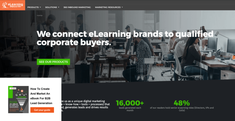
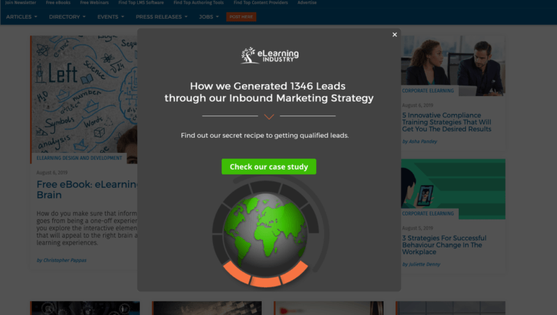
    The use of contrasting colors is probably one of the simplest ways to direct the attention of a user to the object/elements that you want them to see. While going overboard with bright colors, or the contrast itself is not recommended, a black popup on a page with white background will probably get the job done. Below is a great example:

    elearning-industry-popup-banner-example

    Visual Elements (Images) Are Your Friend
    While text-only popups do a great job in most cases, when you have a product or an offer to show off, don’t hold back. A popup accompanied by the image of what the user will get if they sign up (or share their email address) is surely going to look more convincing than a text-only popup.

    With that said, using images in a popup is simply a best practice. To really find out what works for your brand, it is best to A/B test different versions of your popup (more on this in a bit)

    Trust And Social Proof
    Creating interest in your offering is one thing, and convincing the user to take action is another. In order to make the latter possible, it is important to build credibility and communicate trust.

    The most common (and effective) way to offer social proof is through customer testimonials. However, a popup does not have the space to include several testimonials.

    Solve this problem by including one genuine and convincing testimonial in your popup copy. The rest of the copy and design elements will capture the attention of the user, and the testimonial will convince them of the authenticity and utility of your offering.

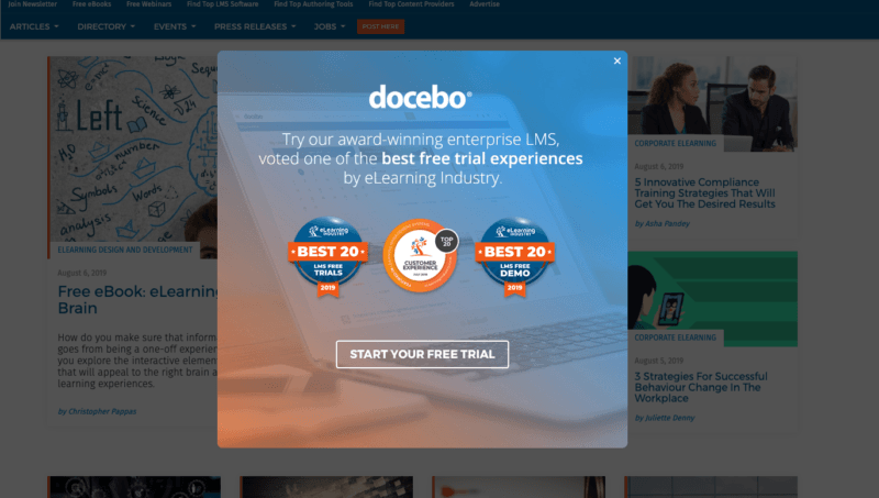
    Another great way to communicate trust is with trust badges. eLearning Industry’s platform offers such batches that are trusted by our 1 million+ audience.

    elearning-industry-popup-banner-example

    Once again, showing off the achievements of your brand is a great way to build credibility and communicate trust

Part 2: Maximizing The Potential Of Your Popup

Creating an awesome popup is only half the battle won.

In order to ensure results, it is important to target the popup to the right visitors. Greet them with the right message and support your popup with a landing page that is also designed to drive conversions.

Here are the steps you need to take in order to take complete advantage of your awesome new popup(s):

  • Audience Segmentation And Personalization
    Most eLearning products, whether they are eLearning authoring tools or LMSs, target a variety of audiences. For instance, an LMS meant for compliance training may be targeting multiple industries that require compliance training.Different segments of your audience have different needs, and in all probability, the same product will solve different problems for these segments.For this reason, it is important to understand the different segments of your targeted audience, and address their unique needs in your communication as a business. In an Infosys survey, it was found that 31% of online shoppers wish for a more personalized experience.

    For popups, you can segment your audience in terms of traffic source. First-time visitors from social media (or eLearning Industry’s platform) can be introduced as an exclusive offer.

    Similarly, you can also segment your audience based on the number of times they have visited your website. Return visitors can be shown a popup for signing up to your newsletter.

  • Tell A Consistent Story Across Your Campaign Materials
    If you are promoting a product or a lead magnet on multiple platforms, make sure the message remains consistent. The tone of your communication, the design elements, the highlights, should all seem coherent.This is a great way to boost brand recall value, while also building credibility for your brand.
  • Optimize Popups For Mobile Devices To Increase Conversions
    Since the number of mobile device users (53%) surpassed the number of desktop users (45%) on the web, mobile optimization has become critical to success.Optimising your popups for mobile devices is now as important as having a responsive website.
  • Design Your Landing Pages According To Your Goals
    Getting the user to click on your popup is not enough, convincing them to perform the desired action (signing up, making a purchase, etc.) is another obstacle businesses have to overcome.A well-crafted landing page is a must-have for any conversion-led strategy. In fact, landing pages are so important that the entire next chapter of this guide has been dedicated to them.
  • Capture Leads With An Optimized Form
    Apart from the landing page and the popup itself, the lead capture form is the most critical variable that affects conversions. In order to convert, your lead capture form should:-  Align with the message of your campaign
    -  Justify the effort (number of form fields) required with the benefits being offered
    -  Have a CTA aligned with the offer on the popup and the landing page
    -  Guarantee the protection of the users’ privacy
    -  Be accompanied by social proof (wherever possible)
    -  Highlight the errors made by the users clearly
  • Timing Is Everything
    Think about the following scenario: You come across a promoted post on your social media. It's by one of the brands that you know (but don’t follow), and the post itself is about a blog post on their website. You find it interesting, and you click through. As soon as you land on their website, you are greeted with a popup asking you to join their newsletter.Did you see the problem there?You (the user) wanted to read a blog post but were greeted with a hinderance (the popup) which you had to get rid of before you were able to access the information you wanted.To make sure this doesn’t happen to you, make sure you time your popups correctly.

    For instance, on a blog page, if you are promoting your newsletter, it is a great idea to have the signup popup appear when the user scrolls toward the end of the article.

    A helpful statistic, for this matter, is that the best performing popups on the web don’t appear immediately.

  • Don’t Ask For Too Much:
    As mentioned earlier, the efforts required to obtain your offering should justify the benefits. Most users will be apprehensive about sharing their LinkedIn profile in order to sign up to a newsletter.To send them your newsletter, all you need from a user is their email address and name. Most users will not be comfortable sharing any other information in this case.For this reason, it is smart to not push the user into giving all their information during their first interaction with your brand. Take time to build trust and more importantly, a relationship with your prospects.

    If your brand is offering a delightful and personalized experience, along with real value, potential consumers will be comfortable with sharing their personal information.

Indulge In A/B Testing (Conclusion)

This is perhaps the most important aspect of running a pop-up banner ad campaign.

When it comes to pop-ups, there is no one-size-fits-all strategy. What works for some brands and audiences, may not for others.

For this reason, it is important to test different variations of all the variable elements of your pop-up banner ad campaign.

Remember, for any marketing campaign, conversions can always be improved. It is only a matter of figuring out how they can be improved.

A/B testing is a proven strategy to continually improving conversions.

8
Chapter

How To Optimize Your Landing Pages For Better Results?

Your landing page is the final chance for you to finally convert a prospect into lead. All your marketing efforts before this will fail if your landing page isn’t optimized.

The reason is simple. The purpose of a landing page is to intrigue your visitors and to compel them to take a desired action toward being your customer. This process requires a thought-through and well strategized page design and content. Failing to create one will cost you crucial leads.

So, undoubtedly you must focus on optimizing your landing pages. Speaking of how you can do that, this chapter will make life easy for you.

1. Your Message Should Speak Clearly About Content On Your Landing Page

The first and most horrendous mistake marketers make is using a clickbait title or message in their popup banner copy which doesn’t match the offer/content on landing page.

It’s clear that doing this may get your popup banners a fine amount of traction and decent click numbers. However, in the longer run, these clicks will just cost you money without giving enough ROI.

And the reason for that is simple. You used a fake (or borderline fake) offer to lure your prospects into clicking through your popup banner ad copy. However, when they clicked for your enticing offer, they found out it was clickbait, so they turned their backs.

Result? NO CONVERSIONS! And, of course, a ruined image.

The simplest way of making sure this doesn’t happen is using a text copy that speaks about the content on your landing page and intrigues the users with that.

2. Nobody Likes Clutter

A whole bunch of information bundled into a single web page can come off as annoying to your prospects. Even if they are highly interested in your products/services, they may not want to filter through the clutter on your web pages.

As a result of this, they may bounce. Or be distracted by the information so much that they forget the purpose of them visiting your landing page. Bummer, right?

So, take action on this. Save yourself from wasting your money, ideas and time that will be wasted by running weak popup banner campaigns because of cluttered landing pages.

Understand that, around 48% of eLearning landing pages contain multiple offers. While serving the consumer with multiple offers in one place may seem like a good idea, in reality  it can bring down your conversion rates by 266%.

For this reason, you should in no case let your users be distracted by multiple offers or anything else on your landing page. Keep it simple, concise, to the point, and 100% relevant.

3. Improve Page Loading Speeds

What’s your first reaction to a website that is taking too long to load? And, have you ever noticed what “too long to load” means to you?

The whole deal relies on perception and so varies from human to human. A 2017 study, conducted by Akamai, states that over 53% of web users leave a website that doesn’t load in 3 seconds.

You know what that means? This means that you are simply losing over half of your visitors and prospects by not improving your website’s loading speeds.

It’s clear that you must work on it.

Speaking of how, the first thing that you need to do is take a page speed loading test. So, go to Google Page Speed Insights, paste your website/webpage URL and hit enter. The tool will take you to a new page displaying your page’s current loading speed along with all the reasons that your website is taking forever to load for.

The next thing you’ll need to do after this is have a look at these issues and see how you can resolve them. For the best and risk-free results, it’d be better to contact your developer for this.

4. Use Relevant And Spot-On Visuals

Visual content is one of the most valuable assets for your eLearning business.

Be it a comprehensive infographic, or a stunning explainer video talking about how your products and services work and how they can add significantly to your prospects profits— visuals are super-important and always work.

However, if not chosen smartly, the results may not suffice. For a better understanding, read below to have a better idea on how visuals can work wonders for your eLearning brand.

  • Humans Respond to Visuals better
    Nearly 50-80% of the human brain is dedicated to processing visual information like shapes, colors, movement, patterns, etc. For this reason, we process and respond to visual information much quicker and retain it with better efficiency.It’s clear that visual content is more easily consumed, processed and comprehended by users across the globe.
  • Visuals Easily Convey Your Message
    While you may have to use a thousand words to convey your message using an article or blog post, the same message may be conveyed easily in a more comprehensive way using visuals.No wonder, a visual is worth a thousand words.
  • Improve Conversions
    While having a bunch of attractive and relevant images on your landing page can keep visitors glued for a longer span, that’s not all that these can do.Using the right actionable visuals on your landing page can turn dirt into gold for your eLearning business. Just be smart while choosing images and you’ll see the results.

5. Work On Your Opt-In Form

Another mistake that most eLearning marketers make is by having a gigantic opt-in form. Something that consumes too much of the prospect’s time.

This can be a quick turn off for many of your visitors.

As users click through your popup banner ad copy, they may not always want to fill out huge a*s subscription forms. Honestly, it degrades user experience. Optimally, none of your users must have to spend too much of their time filling-up your opt-in forms.

Trust us. You don’t need to know everything about your prospect right away. It’s a process and having a small opt-in form is one crucial part of this process.

eBook Release: Complete Popup Banners Guide For eLearning Companies
eBook Release
Complete Popup Banners Guide For eLearning Companies
Master the use of popup banner ads for your eLearning business. Our guide will help you learn tips, best practices, metrics & optimization tactics.

6. Max-Out The Power Of Your CTA Buttons

Once again, creating Call-To-Action buttons that get clicked is every successful marketer’s goal. Why? Because effective CTA buttons will bring subscribers, orders or attendees to your webinars.

There are several ways to improve your Call-To-Action click rates. You might try a little tweak by optimizing your copy. You might also add some content with enticing color text.

The CTA that you decide to use is the gateway to increase your conversions. So, think carefully about what kind of CTAs you actually need on your landing page.

More on copywriting and CTAs that convert in Chapter 9.

Conclusion

As you invest your time, money and ideas in popup banner ad campaigns, an air-tight implementation will become crucial to you. This can’t be achieved without optimizing your landing pages.

And so, in this chapter we discussed everything that’s required for optimizing your landing pages for a popup banner campaign.

Deliver highly targeted Popup Banner ads to the Largest Community of eLearning Professionals

Start a popup banner campaign
9
Chapter

5 Copywriting Secrets To Skyrocket Popup Banner Conversions

Popup banner marketing is one of the hottest marketing channels of 2019.

With all the features and styles that can be used, this marketing strategy definitely makes the cut to be on any eLearning marketer’s priority list. However, starting off with popup banner ads doesn’t always mean success. It never can.

In fact, launching a popup banner campaign is more like walking a rope. One wrong move and you’ll lose your prospects.

Turns out, there really is a need for making sure all your copies are spot on. And speaking of how this can be achieved, this chapter will guide you through.

Here are the top 5 copywriting secrets to skyrocket your popup banner conversions.

1. Personalize, Everytime

You might already have heard a world of words regarding how personalization is so important in marketing.

Speak to the customer. Tell them you are talking to them, about them, for them. Know their interests and craft your copies according to that. All of this and a bunch of other instructions are trying to convey how you can personalize.

The fact is that they are all true. Basically, because the best way of persuading your prospects into buying from you is by talking to them about the stuff that’s important to them.

No wonder the quote from Dale Carnegie is so famous and spot on: “People aren’t interested in you. They’re interested in themselves.”

It simply implies that your prospects don’t particularly want to know about you, what they want to know about is how you can benefit them.

2. Use A Direct Call-To-Action

Calls-To-Action on your website form the most important bunch of buttons.

The reason is that every single user who converts, does it by clicking on a CTA on your website. So, if your CTA is actionable, your campaign will be more likely to get more clicks. While, if the CTA copy is weak, the performance of your eLearning business’ popup campaigns will go down.

But, what does a good CTA mean? What makes a CTA actionable?

Well, here’s the answer.

A good call to action is the one that compels your prospects to click through. Something that they just can’t resist. Something that they just can’t ignore. Basically, an offer they can’t refuse.

For better understanding, it’d be good to start with what not to use as a CTA copy.

  • Tell Them About Your Offer
    While writing a CTA, it’s more than important for you to be specific about what your offer is.A vague CTA may tell your prospects that there’s something on the other end. But, how will they be intrigued until they know what that thing is?For example, a CTA saying “Grab Your Offer” may be a little too vague. While, if  you reveal the offer saying “Get Your 50% Off Coupon” or something along those lines, your campaign may really perform better.
  • Don’t Use CTAs That Imply Work
    While a “Read More” or “Buy Us A Coffee” may both sound simple and like two of the most commonly used CTA copies, when responses are concerned, these may do nothing but kill conversions.How?Well, by saying read more, you are asking your prospects for a favor. Reading more will consume their time and it may tire their minds. It may bore them and it may make them bounce off.For this reason, it’s gonna be way better to use a CTA that instead of implying work, tells them what they’ll get by clicking through.A sneak-peak into your offer or anything that can entice them. A simple alternative for “Read More” can be “Find Out Now/How.” This is because, the latter one is revealing something about the offer.


3. Flattery Is Your Friend

Who doesn’t like receiving compliments? Whether it’s a small pat on the back or a compliment from a stranger, we can all agree that these gestures make everyone feel better.

The same psychology works for marketing as well. By encouraging your visitors, or by appreciating them, or in simple words, flattering them, you can take your marketing campaigns places.

In fact, in a recent study, conducted at the Hong Kong University of Science and Technology, proved flattery works, even if we openly dismiss it as dishonest.

In simple words, even when you just roll eyes over a compliment, you fall for it. And that’s why you must try to flatter your eLearning prospects whenever you can.

4. Make Use Of Numbers

The best thing you can do for boosting your popup banner conversions is to give out social proof. And for that, one of the best practices is to make use of numbers.

So, focus on denoting key information. Mention numbers in large and attractive fonts in a way that your prospects can’t ignore them. And make sure these numbers are useful for your campaign and convey the usefulness to your prospects.

For a better understanding of how you can implement this, have a look at the image below.

elearning-industry-popup-banner-example

So, you see? The basic idea is to tell your prospects that you are trusted by many others in their niche.

This can induce a fear of missing out and also give them social proof that your services are useful.

5. Make Sure Your Copy Sounds Positive

We know that button colors, numbers in the copy, social proof, flattery and several other elements matter while writing a popup banner copy. There’s one more thing that matters: Positive words.

You may know how a positive sentence can be formed even with one or two negative words in it. However, this positive sentence when skimmed by an internet user’s eyes may come off as negative. That’s what skimming means, picking up keywords from a piece of content in order to make up what it means.

For example, if your readers read negative words like “don’t,” “can’t,” “no,” “nothing,” etc., they may just pass through your campaign without taking any action.

Failing the purpose, right?

This is one of the main reasons why you must ensure at all costs the use of only positive words in your popup banners copy.

So, make sure you use positive words including some of the following: like, up, great, yes, good, awesome, sweet, reward, perfect, boost, yeah, etc.

eBook Release: Complete Popup Banners Guide For eLearning Companies
eBook Release
Complete Popup Banners Guide For eLearning Companies
Master the use of popup banner ads for your eLearning business. Our guide will help you learn tips, best practices, metrics & optimization tactics.

6. Make Use Of Power Words

Another proven approach is to make use of power words when writing your copy messages. Power words can be used to persuade your audience.

Not only will this copywriting strategy pack your CTAs and your content with emotions, but it will also create more engagement. Your prospects will feel motivated and more actionable.

You can trigger their emotions with a great list of words like: new, free, because, how to,  imagine, you, me, joy, trust, surprise, anticipation, etc.

All you have to do is to spice up your content to make it more compelling and persuade your potential clients to take action.

Conclusion

Just like any other marketing technique, copywriting plays a vital role in making or breaking your popup banner ad campaigns as well.

And just so you know how you can create actionable copies for your popup banner campaigns, we have shared 5 top copywriting secrets that can instantly boost your conversion rates.

Deliver highly targeted Popup Banner ads to the Largest Community of eLearning Professionals

Start a popup banner campaign

Deliver highly targeted Popup Banner ads to the Largest Community of eLearning Professionals

Start a popup banner campaign