

Why You Need To Think Mobile First In eLearning
2.6 billion smartphones were sold worldwide in 2014-2015 and sales are still growing.
The biggest growth is in emerging markets as prices of Android handsets are becoming affordable for many more people.
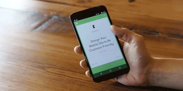
Do You Think Mobile First When Designing An eLearning Course?
Most learning designers will find out what platforms need to be supported near the start of a project. Whether to prioritize multi-device will depend on the specifics of the case in hand. We’re going to think about why a mobile first, or even mobile only approach could be the best option for your next project.
Why Consider A Mobile Only Approach?
The key is to look at your learners and choose the best option for them.
In an interview for Gamification Talk Radio, Professor Karl Kapp, learning games expert, spoke about his trip to the China ATD summit:
“In China everything is mobile, and when I say mobile, in China, I mean phones, not tablets or anything else, they’re all using mobile phones”.
In emerging markets like China, India, and Africa the mobile phone is often the primary device used for accessing online content.
If your audience is in this category mobile only is a natural option, but there are also examples of mobile only learning courses targeted at a global audience.
Google set out to create a learning platform to teach marketing techniques and best practices to as many people as possible:
Case study: Google Primer
Google Primer is an app for Android and iOS that teaches you about marketing. It currently has over 100,000 downloads from the Google Play store alone.
The lessons are short, five minutes on average, and are controlled by swiping cards on and off the screen and completing simple interactions linked to quizzes and assessments.
It works offline by downloading the lessons to your phone. There are weekly updates with new lessons and when you connect to the internet it synchronizes your progress and downloads any new content.
“We assembled a small team of our own marketers and challenged them to build a product they would use. The result is Primer.” – Teo Soares
You might be thinking that this process is easy given the virtually unlimited resources of Google, but in a Medium post about the launch of the app Soares revealed that they had a budget of just $6,000.
How Can You Create A Mobile eLearning App Yourself?
You have a few options for building a mobile learning application.
There’s no single option that stands out as clearly the best for everyone, so your choice will depend on what expertise you have available and the unique needs of your learners.
- Native app.
Building a native application for multiple platforms is a big undertaking but it offers unique advantages. You get the best performance and the possibility of using hardware that is unique to the target device. It might seem like there’s a smaller range of devices to cater for when designing a native app. But consider the range of screen sizes and resolutions of android phones, tablets and TV set-top boxes and you’ll understand that might not be the case. If you have many learners using a single type of device, or tight control over the devices being used, then a native app makes good sense. - Web app.
You can create your course using HTML5 and deploy it as a web application. Some eLearning authoring tools will also allow you to create a standalone zip file of the content which can be downloaded and run offline. A web app can be created and updated by any developer who is familiar with web standards. Once it is online it can be accessed by anyone with a modern web browser, whether on mobile or desktop. If you need to issue frequent updates to the content of your learning course then a web app will give you the fastest option. - Hybrid app.
A web app wrapped inside a native app framework is known as hybrid app. A hybrid app can offer the best of both worlds, but it often takes skill and time to get the balance right. Big names like Netflix use this approach to offer hugely popular apps across a variety of platforms. Creating a really effective hybrid app requires skills in native app and web app development. Some eLearning courses require native features and need to be used by a wide variety of employees with different needs. In this case, the flexibility of a web app could offer a big advantage.
Do Your Learners Need Desktop Support?
Although mobile is on the rise, the time spent accessing the internet from a desktop has remained stable for the last two years.
If your learners spend a lot of time on desktops and laptops without a mobile device handy, you need to support their needs too.
Comscore report that of the UK’s 48 million internet users, only 23% access the internet solely via a desktop computer, just 5% use only a mobile or tablet but 72% use a combination of platforms.
The situation in the US and other developed markets is similar, so using a responsive approach is still the best option for covering all your potential learners.
Responsive Design
Applying responsive design principles to eLearning has been many people’s preferred option for creating multi-device content for some time.
But thinking mobile first is still a little way off, with many courses still being designed for desktop initially and multi-device compatibility coming second.
Tools like Adapt offer a relatively simple workflow to create HTML5 based content that works equally well on mobile and desktop screens.
It is a responsive, open source eLearning framework which creates courses that will work on any device.
Whether you’re using this kind of process already or not, it’s increasingly important to think mobile first whatever your audience is using.
Why Design Mobile First For Desktop Users?
The way people access the internet is changing and experts agree that the trend is going to continue.
- Cisco predicts that global mobile data traffic will grow three times faster than desktop from 2014 to 2019.
- ComScore reports that the number of mobile only internet users exceeds the number of desktop only users in the US.
- Gartner predicts that by 2016 use of mobile apps will “surpass that of Internet domain names, making mobile apps the dominant means of engaging with brands”.
- Towards Maturity says 53% of learners find location or IT is a barrier to online learning, so they are turning to mobile, with 64% finding accessing learning from a mobile device essential or very useful
These trends all provide an insight into how your learners are going to expect to interact with content in the future.
Online training will need to embrace the new ways its audience uses the internet in order to be successful. Any eLearning being created today that can’t be access on a mobile device could have a severely limited shelf life.
Next time you’re starting a new eLearning project, whatever device the current audience is using, consider thinking mobile first.