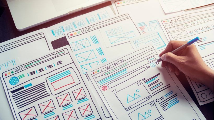

Online Course Site Navigation: to Click or Not to Click
Building an online course is much like constructing a grocery store and locating the items on the shelves for customers find. In fact, this analogy might be helpful to use when opening an online course for student access. Even if you are new customer to a grocery store, you can generally find the items you need without asking for directions. We, as customers, understand organizational principles for the shopping environment.An online course should be organized under similar principles. When an online student needs to access any aspect of the online course, one of the four following outcomes will occur:
- Online student will easily find the item needed.
- Online student will hunt and then acquire the item needed.
- Online student will hunt and then email asking for help to acquire the item needed.
- Or the online student will hunt and then stop, therefore, halting progress in the course.
Our goals as online instructors should be for one to occur at all times. Two might occur at times, but two should become one after repetition and familiarity with the site. Hopefully three and four never occur, but if you notice three occurring regularly, something is wrong.
Generally, the design of easy to navigate Learning Management Systems (LMS) fall into two categories:
- To click
- Or not to click
Or think of it this way: How many clicks does it take to complete the task?
To Click
For my writing classes certain LMS are much better for sharing documents with peers and myself than others. In order to accommodate the needs of the online class I end up utilizing many tools that do not link together seamlessly. Here is an example: Utilizing Google as my LMS, online students can write and share documents in Google Drive, have video and written discussions in our Google+ Community, and use a Google website for weekly instructions and online course resources.To navigate from the instructions to the discussions to documents online students have to click, click, click to move from one website or webpage to next. Some online instructors believe the more distance between the directions and discussions allows online students to get lost or confused along the way, which is a fairly accurate statement. Online students easily resolve this problem by opening multiple tabs in their browser. One tab for the instructions. Another tab for the discussion. And so on. Still, lots of clicking.This method works well for me because I see it as a navigational pattern consistent with our daily lives. When I complete other tasks on the web or the computer, I’m used to changing between websites and tools. To return to the grocery store analogy: On any given trip to the grocery store I expect to stop by the produce and the bakery.
Not To Click
I’m currently experimenting with the not to click design, but I haven’t experienced it “live.” Many of my colleagues use it with great success, and it does appear to have many benefits for online students. Not To Clickers are really successful at putting all the information for one project in one location.Here is a simplistic version of a Not To Clickerers’ LMS: To complete a paper, let’s say the writer needs to read the assignment sheet, read chapters in a textbook, complete discussion posts, complete peer critiques, and then submit a final draft. Not To Clickers can set up a page that walks the online student through each of the these steps in chronological order. Those who are really good setting up this kind of LMS can arrange the tasks to only open when earlier tasks have been completed. There would be no moving beyond the assignment sheet until the assignment sheet folder has been opened.When everything is in one place, the online instructor doesn’t have to worry about students becoming lost or forgetful during navigation to different usage areas. What I see as the best benefit (and what might convince me to change my LMS) is the ability to establish a small amount of accountability when online students are completing tasks. During a face-2-face we know when we have covered material. During online classes, we never really know what online students are doing at their desks. We might be able to measure their understanding during discussion and assignments, but knowing that an assignment sheet must be read before proceeding could give me some assurance that online students aren’t blowing off tasks.The grocery store analogy for this design is a little more complicated. Since the holiday is soon arriving, maybe a Thanksgiving grocery store visit is most appropriate: Grocery stores designed for Not to Clickers would have all the Thanksgiving supplies in one area. A patron would not have to run across the store to find the turkey and the cranberry sauce and stuffing and the gravy. Imagine it all in one isle.
Both Styles Of Navigation
For easy site navigation, regardless of being a Clicker or Not to Clicker it is important to be consistent. Online students will learn from repetition and breaks in that repetition could cause a lost online student to email for help or to stop progress in the online course. This kind of online course design must be decided upon while preparing the online course for online student access. The design is much like the foundation of the building. Everything has to build from it.