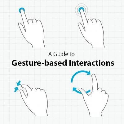
With each new app and phone, the range of gestures is increasing, prompting backlash from some users and phone critics. It’s likely that most of us don’t even use anywhere near all of our phones’ gestural capabilities. Take a look at this list of core phone gestures created by Luke Wroblewski. How many were new to you? Developers working on mobile learning need to ensure that the touch interactions they design are intuitive—or well explained at the beginning of the course.
As you’re developing mobile learning content, look to your favorite apps for inspiration
For instance, the “pull down to refresh” gesture is very common and widely familiar to smartphone users. Often an app will show a user interface walkthrough when first launched. This is a great idea to borrow for your m-Learning, as long as you keep it short and sweet. Show only the most important interactions in the walkthrough. If you try to explain everything at once, users will skip the walkthrough.
Another idea is to gradually introduce hints as a user is going through your course. I recently upgraded to a new smartphone and frequently get hints via pop-up windows that help me adjust my settings and preferences. This is known as “progressive disclosure” and is a great way to help your users by providing relevant instructions only when they need them. You could do this with automatic messages that appear, or a subtle information icon in a corner that users can elect to touch for more information. The latter option is shown in the screenshot below of a course that was developed specifically for mobile delivery through the new Lectora Mobile solution.
Keep in mind these main questions that users typically have when using a new product or app for the first time:
- What can I do?
- Where? How?
- What happened?
- How do I get back (undo)?
- Where can I get help understanding how it works?
Your mobile content must answer these questions if you want your m-Learning initiative to be successful. In addition to including hints about how to manipulate your content via touch gestures, give your user feedback, so they know that the device recognized a touch. This can be done with the traditional loading animation for a pull down to refresh gesture, or perhaps by a color change or a sound. You can even use status indicator icons to reward your users with positive feedback when they complete a section. This isn’t specifically a touch function, but it’s a good way to keep your users on track.
Exciting times are ahead for mobile learning, but a good user experience is paramount. If users are frustrated by your m-Learning or can’t figure out a touch gesture, they will disengage and most likely not complete the learning. That’s bad for you AND them! Start with an authoring tool that publishes to HTML5, like Lectora Inspire, and be sure to test, test and test some more to ensure your users are getting a good m-Learning experience! For more helpful tips on m-Learning development, check out this blog post: Thursday’s Trending e-Learning Topic: mLearning.
To make sure you’re ready for m-Learning, check out this post for 5 Things to Consider Before You Go Mobile.
Already have m-Learning developed? Sign up for a 30 day free trial of Lectora Mobile for simple and secure m-Learning delivery and tracking.


