

Responsive Design Benefits For Your Website
Think about the amount of time you spend on your phone, whether you’re scrolling through Instagram, messaging, checking out the latest news, or searching through a website. There’s no doubt that we spend a large proportion of our days on screens.
In the last few years, mobile usage has skyrocketed to the point where almost half of all website traffic is now coming from mobile devices. And with smartphone users only continuing to grow throughout the world, this statistic comes as little surprise to the impact that phones are having on our day-to-day life.
What this truly highlights for the business community, and more specifically, the web designers of the world, is the ever-growing importance for online platforms to become more user-friendly on a range of devices.
Ultimately, this is where responsive design comes into play. Responsive design gives designers the flexibility to create websites that fit a range of dimensions, without having to manage multiple websites and be limited in device restrictions. In our current world, this technique may be the kickstart to getting your website ahead of the game and in front of your competition.
But what exactly is responsive design, and why is it beneficial to your website’s health and success?
What Is Responsive Design?
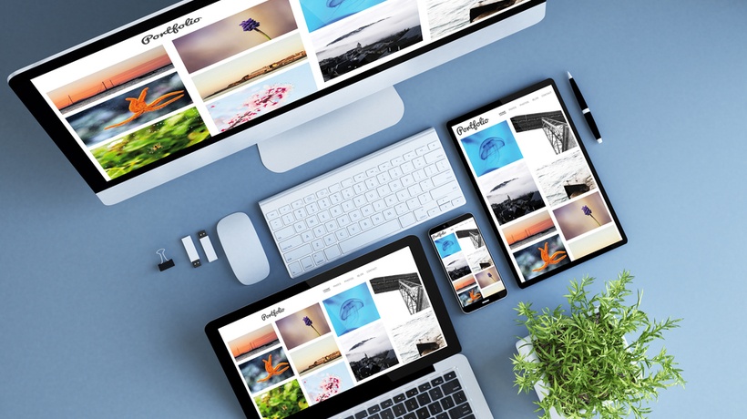
Brought down to its truest form, responsive design allows a website to optimally respond to its users, according to the device and screen size they are operating on. Through the use of flexible grids, adaptive images, and intelligent CSS media queries, it allows users to easily switch from a laptop to a smartphone while having the website accommodate the environment and screen size of their device.
In this way, responsive design is all about flexibility and versatility.
It is also used to evoke a sense of comfort and stability within users. People are not only prevented from having to zoom or scroll across a webpage to find information but are further secured in the knowledge that they won’t be missing out on content simply because they are using a smaller screen.
How Can Responsive Design Benefit Your Website?
1. Downsizing Content
Often, there is a tendency to overload websites with content and information, resulting in the website appearing crowded and overcomplicated. However, when you consider designing a website to be flexible for a smaller device, this same luxury cannot be afforded. You don’t want to overwhelm your users with too much information on a small screen, nor do you want to restrict the amount of information you provide.
In this way, responsive design can help you prioritize the visual hierarchy of your information, making you more selective, and allowing your website to appear more streamlined and clearer for viewers.
2. Consideration Of The User
When employing responsive design, you are constantly aware of the accessibility for, and fulfillment gained by users. Someone could argue that this concept allows you to shift your perspective and propel user-friendly techniques forward. Perhaps there are areas of your website you had never considered changing or modifying before.
Not only will this benefit the way you approach the adaptive features of your website, but in the long run, can also help you understand your website from the perspective of a user and what it needs to succeed.
3. Higher Conversions
Did you know that almost 85% of adults think that a company’s website on a mobile, should be equal to, if not better than, a desktop? Particularly with so many consumers participating on mobile devices, ensuring that you are creating a website that is user-friendly across all is a key way to attracting new customers and maintaining a relationship with them.
Furthermore, 88% of consumers who search for a type of business on a mobile device are likely to call or go to that business within 24hrs. This will, in short, increase your website conversions and sales, as a more responsive website will attract a larger target audience.
4. Increased Website Speed
If you don't optimize a site for smartphones and tablets, it will also take more time to navigate, decreasing the website’s speed, and ultimately lowering a viewer’s engagement. Responsive design will not only aid the speed of your website but will further incentivize you to make your webpages as optimal and quick as possible.
5. Lower Bounce Rates
It can also impact the bounce rate of your website. Users, particularly mobile users, want their information presented to them as quickly and efficiently as possible, and as such, are more likely to bounce between websites if they are unsatisfied. This means that if your site isn’t responsive, it’s much harder for people to stay engaged and interested.
Providing an enjoyable website that is clear in its content, mobile responsive, and fast will give visitors a much better experience and decrease the chance of them jumping to another webpage.
6. Improved SEO/Google Rankings
Ultimately, stronger backlinks, better bounce rates, and improved SEO will result in higher search rankings for your website. In 2015, Google Search announced that it would be increasing ranking signals related to mobile responsiveness. Essentially, Google will look at the mobile version of a website, and subsequently rank it before the desktop version.
SEO and Google rankings are essential elements to garnering website traffic and increasing credibility, so by utilizing responsive design, you are only increasing your website’s chances of success.
7. Lower Maintenance Needs
Maintaining multiple websites tailored to different devices requires a lot of time and energy that you could otherwise devote to more important elements of a business. Employing responsive design essentially means you only have one website to maintain, rather than multiple. This allows you to prioritize your focus and lower your maintenance costs and needs.
It’s clear that responsive design has more benefits than just simply allowing a website to be accessible from a mobile device. In the long run, this technique can significantly impact the success and health of your website, and the relationships you establish with your users.
Regardless, however, there's no doubt that as the market for smartphones and their use only grows, that web designers will have to continue to meet the requirements of the user and be flexible in their design approach.
Are you interested in more marketing resources like this article? Join our newsletter and stay updated regarding recent news.

