Training and Responsive Design
Your smart device isn’t a tiny tv.
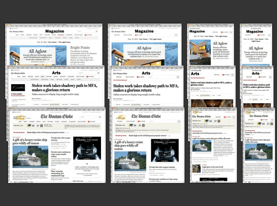
It seems that when we try to create responsive pages for training, we don’t actually think about how people use these different devices. When adapting your content for smart devices, it’s important to keep in mind that your smart device isn’t a tiny TV. Smartphones and tablets aren't used the same way as desktops, and they certainly shouldn’t all be treated the same way. A common error is to throw all your content onto your smart device screen in the same format as a desktop. This might be helpful - if you’re a mouse - but you’re not, and neither are your employees.
It’s important to take into consideration what your employees are doing when they are using different devices. This information will guide you in deciding what format and design is appropriate for your video and web pages.
1. Walk Along Smartphone.
Take into account where most people are using their smartphones. They are mostly used “walking along” when people don’t have access to a desktop. This could mean on the bus to work or out on a project.
In addition, People are expecting more from their phones than ever before. According to Pew Internet, 55 percent of Americans said they’d used a mobile device to access the internet in 2012. A surprisingly large number — 31 percent — of these mobile internet users say that’s the primary way they access the web. In these cases, smartphone users need or expect the same amount of information in a touch screen format. Rather than browsing for content and scrolling through pages, they often want what they need as quickly as possible. If you want employees to continue their training “on the go”, make sure it’s easy to do so on a smartphone. They may not be able to read long documents on a tiny page, but they may be willing to listen to/watch a training podcast or video.
2. Lean Back Tablet.
Mobile use doesn’t always mean “on the go”. In fact, Google reports that 77 percent of searches from mobile devices take place at home or work, only 17 percent on the move. Most of this data is attributed to tablets, which are most used at home for entertainment purposes. Shopping, engaging on social media, and watching videos play a big role in tablet use. When designing for mobile use, keep in mind that tablet users might be kicking their feet up - or “leaning back” - after a long day at work.
For online training, you can expect that your busy employees might be using their tablets in this “lean back” fashion to take tests and watch training videos. HTML5 video is a great option for work on tablet devices, especially those that don’t support Flash. With the right player, you can deliver a lean-back video experience that also supports the interactivity your employees need when engaging with a training video.
A look forward
While adults primarily use tablets for entertainment, an increasing number of students use tablets for work. According to a survey by Pearson Ed, “About half of the students surveyed have used tablets or smartphones to do their school work during the school year (49 percent and 47 percent, respectively).” In addition, “51 percent of elementary and 52 percent of middle schools students own a tablet, but only 36 percent of high school students do.” This means that the younger the student is, the more likely they are to own a tablet and expect to be able to do schoolwork and, in the future, business training on their tablets. In the near future, these students will enter the workplace and continue change the way we look at tablet use for training.
3. Lean Forward Desktop.
Users at their desktop are typically in a task-oriented mindset. They often have a goal in mind - or several - when they access content on their desktops. They may need access to supplemental, downloadable material. Even with the rise of BYOD in the workplace, most people use desktops to get the bulk of their work done. Those using tablets generally “lean forward” into the content to discover the information they need. They are typically more engaged and willing to explore more in-depth content. For this reason, you can give them access to a lot of information.
Your training content for desktops can and should be connected to documents, photos, and video. Having access to all of these tools will help your engaged viewer connect the dots on their training topics.
Flash is not dead!
For desktops, its important to remember that Flash video still is a vital part of business infrastructure. A lot of interactive video content still exists in Flash, so make sure your video partner supports both HTML5 and Flash.
BYOD is already a large part of our corporations and will continue to grow within the coming years. It is important to be responsive to these changes—and create responsive content, especially within our training.
Different devices are used in different ways. We must use this information to inform our decisions about designing for each device. For video content, a responsive HTML5 player such as Viddler’s Arpeggio makes sure your content is easy-to-use on most (if not all) devices.

