
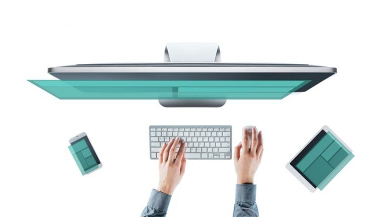
Answering The Top 6 Responsive Design FAQs
Mobile learning is the new norm. Smartphones, tablets, and wearable gadgets are now our trusted companions. However, there is still a high percentage of online learners who turn to their PCs and laptops for personal development. So, how do you cater to both audiences and give them the full benefit of your eLearning course? The answer is by using a responsive design authoring tool. Here are the top Responsive Design FAQs that every eLearning pro should know:
1. What Is Responsive Design?
Responsive design platforms automatically adjust the layout and object placement based on the user's device. The browser, resolution, and other device specifications dictate the overall look and feel of the page. eLearning professionals use breakpoints to create different layouts for different screen widths. For example, the smartphone version may feature the same images, but they are placed further down the page. As such, mobile learners are able to get the information they need without scrolling through a collection of images. The ultimate goal of responsive design is to give every learner the same eLearning experience. No matter what device they use to access the eLearning content.
2. What Are The Most Common Breakpoints In Responsive Design For eLearning?
eLearning professionals can customize their breakpoints to create a variety of different layouts. However, there are a few "go-to" breakpoints that you may want to consider:
- 320 pixels: standard for smartphones. You can also opt for a mobile landscape display, which is 480 pixels.
- 1024 pixels: standard for tablets. The tablet portrait breakpoint is typically 768 pixels.
- 1280 pixels: standard for desktop PCs and laptops.
3. Can You Create Different Versions For A Responsive Design eLearning Course?
One of the perks of creating different breakpoints for your eLearning course is the ability to customize each layout. For example, you can omit certain graphics or change the font type on your smartphone version to simplify the eLearning design. Likewise, you have the ability to change the navigation options based on the device. For instance, your PC breakpoints feature a traditional menu, while your smartphone version has a pull-down menu icon.
Quick Tip: It's important to research your target audience beforehand. Each version of your eLearning course requires time and resources. You don't want to create 10 different layouts, only to discover that your online learners use the same 2 or 3 breakpoints. Conduct surveys and polls to learn as much as you can about their accessibility requirements and personal preferences.
4. What Are The Top Benefits Of Responsive eLearning?
Here are just 3 benefits that responsive design brings to your online learners AND your organization:
a. Improves Online Learners' Engagement
Online learners who access the eLearning course on their mobile devices get the same benefits as PC users. This means that everyone gets the information they need as quickly and conveniently as possible. As a result, online learners are more engaged and motivated to learn. They don't have to worry about swiping through a library of images or searching for hidden navigation icons. Every object on the screen is placed for optimal viewing. An increase in learner engagement translates to an increase in eLearning effectiveness and ROI.
b. Makes eLearning Content Easily Accessible
There are some members of your audience who are new to the world of mobile learning. They may not be as familiar with smartphones and tablets. Responsive design ensures that these individuals get the same opportunities as their tech-savvy peers. There is no need to adjust their resolution or wait until they get home to use their PCs. This makes them feel like they're an active part of the learning community, instead of being excluded because they can't navigate your eLearning course.
c. Easy To Maintain And Update
You typically only have to create a few different breakpoints for your audience. This is in stark contrast to the "pre-responsive" days when you were required to develop a separate layout for every browser and device. For example, multiple PC versions to accommodate different screen sizes. As such, responsive design helps you quickly update and maintain your eLearning content. You simply make the necessary modifications to each breakpoint and then deploy your newly revised eLearning course for online learners to enjoy.
5. What Is The Difference Between Mobile And Responsive Design?
The terms "mobile" and "responsive" are often used interchangeably in eLearning. However, there are distinct differences between them. Mobile learning refers to eLearning experiences that are accessible remotely. For example, when an employee is away from the office, or they are using their tablet to access "moment of need" resources in the workplace. Responsive design refers to eLearning content that is accessible on any device, at any time. The system automatically shifts the page elements to provide an optimal viewing experience.
6. Can You Preview The Responsive Design Before Launch?
There are a variety of tools that allow you to preview your responsive design before deploying your eLearning course. There are even some browsers that feature testing tools. You simply type in a command and the screen mimics the screen size and resolution. Testing the responsive design before you publish your eLearning course is of the utmost importance. It helps to ensure that every item is in place, the text is readable, and online learners can navigate with ease. This is also your opportunity to make minor adjustments, such as removing extraneous images that clutter your eLearning course design.
There are a number of responsive design eLearning authoring tools that simplify the process. These tools give you the ability to create a master layout that automatically adjusts to the fit the screen. As such, you can save time and resources without excluding your mobile learners. Just make sure that your tool of choice has a built-in previewer so that you can customize every aspect of your eLearning course.
Before you develop your first multiplatform-friendly eLearning course, read the article The 8 Golden Rules Of Responsive eLearning Course Design to create portable and knowledge-packed mobile eLearning experiences.