
How To Design Responsive eLearning Courses
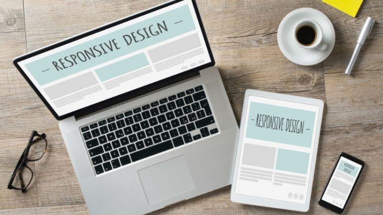
Millions of people rely on their smartphones, tablets, and other tech gadgets to stay in the loop. As such, eLearning professionals must be able to deliver content that is easily accessible and fully adaptable. This requires a robust responsive design tool that allows you to create a master eLearning course that’s viewable on all platforms. Once you’ve found the perfect eLearning authoring tool, you can use these 8 golden rules to produce a winning responsive eLearning course.
1. Rethink The "m" In mLearning
Traditionally, mLearning stands for mobile learning. However, modern learners are using a wide range of devices to access eLearning content, including laptops and PCs. eLearning course layouts that are ideally suited for large monitors may not have the desired effect on smaller screens. Thus, multiplatform-friendly eLearning content is the ideal solution. Online learners can benefit from your eLearning course and get the information they need whether they are using a smartwatch or desktop.
2. Simple Is Best When It Comes To Navigation
eLearning course navigation menus usually occupy a significant amount of screen space. This makes it easier for online learners to read the buttons and peruse submenus. Mobile navigation controls, on the other hand, must be simple and compact. Otherwise, the icons and drop-down menus would take up the entire screen. Consider using a condensed menu that features your main topics or lessons. Online learners then have the option to click on the section and choose from a list of sub-categories. You can also feature icons on your home page that redirect to eLearning activities and modules.
3. Trim Bulky Pictures And Graphics
Online learners are busy. They don't have time to sit around and wait for the eLearning course page to load. In fact, they are probably accessing the eLearning content on their mobile device because it's quick and convenient. Trim bulky images and graphics by using an editing tool and use mobile-friendly formats. JPEG and GIF are your best bets, while PNG should be avoided. Find the perfect balance between quality and compression so that your pages are accessible right away. You should also preview the images on a variety of devices to make sure that they don't stretch or blur.
4. Only Include The Bare Necessities
You have some extra leeway with traditional eLearning course designs. Adding extra eLearning content or tips isn't such a big deal, because you have more screen space to work with. That is not the case for responsive eLearning courses. They need to be accessible on ALL online platforms. As such, you should only include the bare essentials and cut out the rest. Analyze all of your eLearning content, both text and visuals, to determine what's important and what is unnecessary. Every sentence, image, and graphic must earn a spot in your responsive eLearning course design.
5. Size Up Your Buttons And Text Blocks
Like Goldilocks and her infamous porridge, button and text block sizes must be just right. Online learners won't be able to read them if they are too small. Likewise, you won't be able to fit much onto the screen if they are too big. Use 12 or 14 pt. font, depending on the typography, and pad all of your navigation buttons. This prevents click errors and streamlines eLearning navigation. In addition, make hyperlinks stand out by using a different color font.
6. Customize Your eLearning Content
Online learners get the same eLearning experience, no matter what device they are using. However, the layout will completely depend on their platform of choice. It's important to customize your eLearning content based on the device type. For example, your PC-friendly layout may have several images embedded within the online text, but the tablet version only has one. Consider designing a master layout for mobile devices and another for PCs and laptops. Also, preview the layouts on multiple browsers to ensure that everything is in order before you deploy the eLearning content.
7. Mobile Design Should NEVER Be An Afterthought
This goes hand-in-hand with the last golden rule. Start thinking about mobile design BEFORE you begin the eLearning course development process in order to avoid lengthy revisions. Analyze how every image and piece of text is going to look on different resolutions and screen sizes. Are online learners going to be able to find your navigation buttons on smartphone? Will they have to zoom in to read tiny fonts? Are you going to have to cut out 50% of your eLearning content to make your eLearning course mobile-friendly? Address all of these concerns from day one so that you can determine how many versions you'll have to create.
8. ALWAYS Do A Test Run
Most responsive design tools now feature built-in previewers. You can choose from a wide range of devices, and the eLearning platform automatically adjusts the layout to provide a sneak peek. You'll be able to make minor modifications and manually shift elements in order to polish the eLearning course design. But don't just take the eLearning authoring tools' word for it. You should also do your own user testing and view the eLearning course on a variety of different devices. Enlist the help of your eLearning team and colleagues to test out the buttons. Pay close attention to the placement of images and text. Make sure that everything is clearly legible and intact. You might also consider asking a group of learners to try out the eLearning course so that you can get their feedback.
Responsive design tools save time, money, and resources by allowing you to create eLearning courses for EVERY member of your audience, even for tech-newbies. Research your options, take advantage of free trials, and write a list of must-have features before you make your final decision.
Are you looking for the best responsive LMS for your next eLearning project? Read the article 5 Things To Consider When Choosing A Responsive Design LMS to learn about the 5 things you should consider when choosing a responsive design Learning Management System.