
Why Responsive eLearning Design Is Important
Picture this: You’ve always wanted to learn Japanese. But with two kids and a full-time job, you don’t want to commit to weeknight classes. So you sign up to an online, distance learning course. The course asks for three hours of commitment per week, so you earmark Sundays to sit down at your desktop computer and go through the weekly lesson step-by-step. On the first week of the course, you’re half an hour through when your smartphone rings. It’s your son wanting a lift from the station. You jump in the car and wait for him there. His train is delayed, but rather than waste this time, you pull out your phone to continue learning some new vocab. The course looks slightly different on your phone, but the content is the same, and you happily continue swiping between learning objectives.
This scenario is far from uncommon, both in terms of eLearning and general technology use. Google’s latest study (2012) on multiscreen device usage shows that a whopping 98% of us move between different “screen” devices every day (from PC to smartphone to tablet and so on).
What kind of device we begin with and continue to depends crucially on our aims and objectives. For example, Google also found that 24% of our daily interactions with media are with laptops/PCs, and most people begin with laptops/PCs to engage in more complex activities than they would on smartphones. This might be to plan a trip, manage your finances, or, in the example above, undertake eLearning. But as we get busier and take on more at once, we rarely have the luxury of focusing our attention on one activity, especially not on one device. Moving between devices like this is called “sequential usage”, and is key for eLearning developers to keep in mind.
How Responsive eLearning Design Works
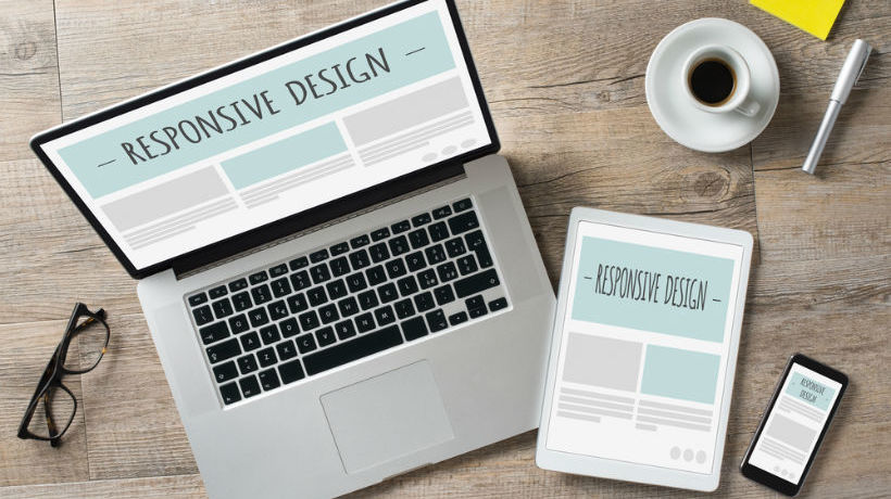
The term “responsive eLearning design” comes from the term “responsive design”, which effectively describes the process whereby the same content is accessible across multiple devices in an appropriate format – resizing to fit a particular device’s dimensions and creating an optimal viewing and learning experience for the end user.
Developing a responsive eLearning course is a conscious choice by developers to cater for an audience they know are not going to simply sit at a desktop for three hours doing their Japanese homework. Not only do they realize that users will move between PCs to smartphones to tablets, they also realize that users often bring their own devices (BYOD) to their learning – meaning that while one user will interact with content on a Microsoft Surface tablet, the other will browse on her Android Samsung phone and so on and so on.
This sounds like a nightmare, but with the introduction of responsive eLearning design frameworks to the market, developers are able to work in HTML5 to produce one version of a course that is automatically responsive to a range of different kinds of devices (both in type and manufacturer) and operating systems.
Take open-source, free software Adapt as an example. Adapt drops the traditional “next” button format of eLearning “slides” and uses deep vertical scrolling. On a desktop, that is, users will be able to scroll down their browser window to view more content, while the width of their screens means they can view multiple images arranged horizontally at a time. When transformed to smartphone or tablet with less screen width, this content becomes “stacked” so that images are still visible, but arranged vertically. This means that no content is lost, it’s just rearranged intelligently in line with the dimensions of the device currently being used.
Using responsive frameworks like Adapt, Captivate, CSS3, FRED, and Respond5, developers can also use techniques like “tagging” to ensure that users on smaller devices aren’t overloaded with content. To ‘tag’ means you can ‘hide’ some content on mobile devices which may be superfluous to learning aims (such as decorative images). This helps users feel less overwhelmed by content, and more capable of meeting smaller learning objectives, thus feeling a sense of accomplishment in their learning goals.
Different Kinds Of Devices For Different Kinds Of Learning
So far we have discussed transferal of the same content across multiple devices, but eLearning developers can also consider the way that different kinds of devices facilitate different kinds of learning. In Google’s report, for instance, smartphones were used in 38% of our daily interactions, most often “on the go”, for “short bursts of time”, and when we “need information quickly and immediately”. In the example of learning a language, it is unlikely that an end user would use a smartphone to sift through detailed information about grammar. In the case of Japanese, however, where they must learn three different scripts and thousands of characters, they may well benefit from apps and gamification that assist in rote learning. In this case, a smartphone app could be developed that is complimentary to the “original” course.
The best kind of responsive eLearning design thus not only resizes and reorders content to a particular device and its dimensions, it also understands learning from a user perspective, and assists them in the most effective use of the particular device they are using at the time.
Reference: