
Responsive eLearning Design: Creating Great Learning For Mobile Devices
These days all eLearning content should be viewable on mobile devices - unless there is any particular corporate or technological reason why not. In 2016 mobile devices overtook desktops and laptops for web browsing and this trend will only continue as data speeds increase and devices improve. Many people, especially the young, no longer possess or use what we might term “traditional” computers and instead only use mobile devices -tablets or smartphones- to access the internet.
With people leading ever busier and complicated life styles its no longer sustainable for course materials to only be accessible on a traditional "static" computer. Learners will need materials they can dip in and out of when they have spare minutes and materials they can fit around their busy lives.
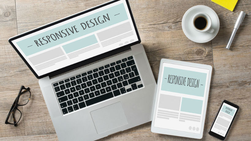
Responsive eLearning, mLearning
First of all lets define some terms. Responsive websites are designed to be equally (or close to) usable on both desktop and mobile devices. There is just one version of the website needed which is correctly rendered depending on the device the user is viewing it on, the days of having to maintain separate desktop and mobile versions of websites have now thankfully long gone.
However creating a responsive website entails a whole new set of considerations and complications. This article will look at some of these as they relate to creating responsive eLearning and mLearning. It will not go into specifics about the sort of tools you can use, as that will depend on your own situations; though you need at least to have authoring tools which can create responsive courses in HTML5, such as Adobe Captivate. Older tools such as Flash are a big no-no as far as mobile development is concerned.
Why Not An App?
You could of course create a learning app instead of creating responsive HTML5-based eLearning. Many companies do this for their staff training and there are valid reasons why apps are a good idea in some training scenarios such as when you have control over the learners’ choice of device or require bespoke specialized functionality.
However, if you do go down the app route for the general public, you will need to provide multiple versions of the app (iOS and Android at least) and have to rely on your learners keeping the app up to date. This is a big investment. Installing an app is also another obstacle between your content and the learner beginning to study. With responsive eLearning materials, the only app you will need is the web browser built into every mobile device.
Mobile Learning
So how do we start? The first thing you should do before you do any design work or create any slides is think about how the learner will consume your content. Using a mobile device is quite different to using a traditional computer.
Using a mobile device is a much more personal experience; the screen is generally held much closer to the learner’s face than a static screen. Its also a much less predictable computing environment. Your learner may be interrupted regularly, they maybe learning while commuting to work for example, or receive Facebook notifications! Therefore, you need to make sure your content can be digestible in the few minutes they may have between interruptions.
Using a mobile device is also a much more tactile and immediate environment for interaction. The learner will generally be using their fingers to navigate through your content not a mouse pointer; they may also be pinching and zooming to see more of your content.
Try viewing some websites on a mobile device, sites you are familiar with on your desktop. See how the content adjusts, what works well, and -perhaps more importantly- what does not!
Tips For Creating Great Responsive eLearning Design
1. Think Mobile Upwards Design Desktop Downwards
If I was to sum up my approach to designing responsive courses in a single phrase it would be “think mobile upwards design desktop downwards”. By this i mean you need to firstly think about the constraints of the mobile screen in terms of content. On a mobile screen your textual content will be best displayed in short, easily digestible paragraphs of no more than 4 or 5 lines long. Therefore, when creating your learning materials, starting on the desktop slide with long blocks of text is a bad idea (large blocks of text are a bad idea for reading on screens anyway). Remember it's a responsive eLearning course, so the same content is used for all modes of learner.
Your desktop view of the content will therefore also have short paragraphs of text. This, however, is where you need to design downwards, making the best of your content by using space and clean lines to best present it, and then gracefully reworking your design downwards for smaller screens. As you have first set the correct amount of content to display this will be a much simpler process.
2. Optimize And Refine
Although 4G networks are spreading fast across the country, many learners may be accessing your content through slower 3G connections. You need to take this into account when creating your learning materials (unless you know for sure they will be accessed under predictable and controlled conditions such as via company wi fi).
While we always want our learning materials to look as good as possible, putting in a lot of graphics may make the eLearning unusable for mobile learners. The last thing you want is for your learners to waste the precious minutes they have to do some study looking at progress bars or loading animations.
Therefore try and keep graphics to a minimum, especially graphics which are just used for illustrative purposes. If you do have graphics, make sure they are optimized (some authoring tools do this automatically for you). You can also remove unnecessary graphics from the mobile versions of the course if you want to keep them for desktop.
You can save a lot of bandwidth by using HTML5 animations and CSS in lieu of graphical animations and effects. A HTML5 animation may be much smaller in size than an animated gif (and probably look superior too).
3. Swipe Left
Your learners will likely be familiar with using mobile webpages and devices, so they will use gestures to navigate; swiping left and right through the learning material even if a more traditional navigation that requires clicks or taps is also available.
Swiping through course content can be much quicker than finding and clicking on a button. With this in mind, it could be easy for your learner to pass through slides without realizing it especially if they look very similar.
Small visual cues to confirm to the learner they have moved to a new slide are a good idea. These may include slide counters, using different colors (though bear in mind people with visual impairments may not be able to distinguish between some colors - online tools are available to test for this), or simply varying the amount of content on slides. For example, if you have a lot of text to get through, you may find alternating between one and two paragraphs of text per slide useful.
4. Point The Finger
Your learner will usually be using their finger to interact with the eLearning on a mobile device. A finger will tend to be less exact (and a larger area) than a mouse pointer. While mobile devices are designed to handle this kind of interaction you need to take this into account when developing your responsive materials.
Try to avoid putting links too close together for example as it may be difficult for the learner to tap on the intended one. If you are using drag and drop in an activity, ensure the items to drag are big enough and separate enough so the learner can select the item they want and not others. Again, you need to make the most of the learner’s time, which may be short; you want your learning materials to be streamlined and hassle free!
5. Portrait, A Different Landscape
If you are used to creating eLearning materials for desktop, then you will usually be designing for landscape. Most people however use their mobile devices in portrait mode. Good responsive eLearning will automatically adjust, so the content is correctly displayed on the target screen.
However, some content may be difficult to display in portrait. For example, a rectangular diagram showing a company organization when scaled down to fit in portrait mode (which may be only a few hundred pixels wide) could be unreadable. What you can do is design your content so it will work in portrait mode; for example rework your diagram for the different orientation. It will still work in desktop mode.
This is not always possible. In these situations, what you can try perhaps is embed the content in the mobile view, so the learner can side scroll to see the content. It is not an ideal solution, though it can work pretty well.
6. User Input
If your learning requires the learner to input values, such as in an online test, bear in mind how mobile users input into their devices; using an on screen keyboard. This means that some of your valuable screen real estate -already at a premium on a small screen- will be taken up by the keyboard.
You also need to bear in mind the mechanics of input into a mobile device. Drop down lists for example can be a bit fiddly for the learner, especially if the list is long; is there a better way?
7. There Will Always Be One
It goes without saying that you should test your learning materials as much as possible before unleashing them on your learners. Testing for mobile adds a new complication: What should you test it on? There are dozens of phone manufacturers and hundreds of smartphones which can view your content. Unless you have specified hardware in a corporate environment, you will not know what your learner is using to view your course.
Good responsive eLearning design should work on all devices; that is the theory anyway! In practice, there will be exceptions and oddities. You may be caught out by new versions of phones with slightly bigger screens. All you can do is apply good responsive eLearning design to your course and test as much as possible. There will no doubt be someone who has a phone which has problems. Try not to let it keep you awake at night!
It is hoped this short article will help you create responsive eLearning courses which work just as well on mobile devices. The best advice is just to start building, by gaining experience you will learn how to apply your content to mobile screens. And think mobile at all times.