How To Create Responsive Design For Mobile Learning
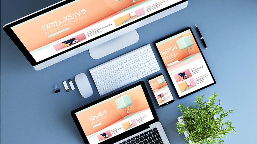
Mobile device usage is on the rise, and so are the number of online learners who want to access information on-the-go. The question is how do you offer them the same user-friendly, aesthetically pleasing mobile learning courses as your computer learners? Responsive design gives you the ability to create a single eLearning master course that automatically adapts to any browser or device. This allows every member of your audience to benefit from your eLearning course, without having to worry about screen size and resolution.
- Select mobile-friendly layouts.
There are some eLearning course layouts that simply don’t translate well to smaller screens. This is why it’s essential to choose a layout that is suitable for all devices and browsers. Whether your learner is accessing the eLearning course on their laptop or their smartphones, they should be able to enjoy the same eLearning experience. Multi-platform layouts are all about simplicity. Create simple HTML code and ensure that the layout, in general, is clutter-free. Also, avoid JavaScript, Flash, and div tags that complicate your mobile learning design. - Compress content to reduce loading times.
No matter what device or browser your online learners are using, they don’t want to sit through lengthy load times when accessing the eLearning course. This is why it’s wise to compress your eLearning content to reduce loading times. For example, packaging your content in a ZIP file allows you to deliver an abundance of eLearning course materials in a fraction of the time. This decreases the amount of bytes that you send and gives learners the ability to login to the eLearning course with limited bandwidth. You should also condense your eLearning content down to the basics. This means eliminating excessive white space, unnecessary graphics, and borders that do not add any value to the eLearning course. - Opt for fonts over image-based icons.
Icons can add aesthetic appeal to your eLearning course, but they may not be ideal for mobile-friendly modules. This is due to the fact that many vector icons do not resize when they appear on the screen. As such, they may be too large on a tablet screen or too small on a laptop. Fonts, on the other hand, can adjust to fit the screen size. Using a fancy font instead of a vector icon for a bullet-point list can improve the visual appeal, as fonts do not blur or bunch together on the screen. Just make sure that you use a font that is viewable on all devices. - Focus on the key takeaways.
It may be tempting to include any and all information about the topic, just in case your learners need to know more details. However, in order to make your eLearning course responsive, you must focus on the key takeaways. Avoid including information that does not serve the learning goals and objectives. Go through every aspect of your eLearning course and decide what knowledge is essential and what can go by the wayside. Removing extraneous content is necessary even when you are creating desktop eLearning courses, but it is doubly so when developing responsive design content. This is due to the fact that your eLearning content needs to fit on a wide range of screen sizes, or else your learners may have to scroll through pages and pages of material when accessing the eLearning course on a smaller device. - Navigation should be a priority.
Confusing navigation is one of the major pitfalls of responsive design. A pop-out menu might look great on a mobile device, but it might not have the same effect on a laptop. The same goes for navigation icons that are too large or too small, as well as clickable links that are clearly visible. Ideally, you shouldn’t be focusing on one specific device when you are designing your navigation. Instead, you should be creating a navigational flow that is suited for all devices. Keep it simple, avoid using clickable images that clutter the page, and always include text buttons that point the learner in the right direction. - Ensure that text is ideal for all screen sizes.
Large text may look great on a big screen, but that may not be the case for smaller screen sizes. However, if you make your font too small it may not be visible on computer screens. Generally, a 16 to 18pt font size is the ideal range, and headers should be slightly larger. Also, make sure that you have a good contrast between your background and your font. For example, black font will simply blend into a dark colored background. - Preview your eLearning course on multiple platforms.
Before you click that upload button you need to be certain that your eLearning course is viewable on all platforms. Many Learning Management Systems have built-in previewing tools that allow you to test out the layout on multiple different screen sizes and resolutions. Ensure that every aspect of the eLearning course is finely tuned, from the images to the placement of the text on the screen. If anything appears off, then you may need to go back and make the necessary adjustments before previewing it again. This process may require several revision rounds, especially if you are trying to design for a variety of online platforms and devices, or have an abundance of images and graphics.
Take the time and expense out of developing mobile courses by using these responsive design tips. Give your learners the chance to achieve the real benefits of your mobile learning course, no matter what their device of choice might be.
Want to learn more about how to create successful mobile learning courses? Read the article How To Create A Successful Mobile Learning Strategy to discover 6 secrets to improve your Mobile Learning Strategy.


