eLearning Production Quality Standards: Ensuring Quality In Your eLearning Courses
My earlier articles focused on eLearning Courseware Interface Standards and Compatibility Standards. Today’s article will focus on the third cluster of standards, i.e. eLearning Production Quality Standards.
eLearning production quality standards examine the quality of the courses in terms of text, graphics, grammar, and visual presentation. These are very important because they contribute to the enhancement of the efficacy of the course. These standards act as eLearning production guidelines, focusing on fulfilling your quality requirements.
There are two standards in this cluster; let’s see how these standards contribute to the quality of an eLearning course.
Standard 1: Legibility Of Text And Graphics
This standard says the text should be legible and graphics clear. Legibility measure show easy it is to distinguish one letter from another in a given typeface. It also describes the design of the graphics. It deals with the legibility of text and graphics in terms of:
- Backgrounds, callouts, graphics, text, and text labels.
- Headings, sub-headings, style and font, and the colors used.
For example, a course with a black background and white font on the screen is not recommended. You need to use a white or light background and dark fonts. But many people are not aware of this. They confuse eLearning courses with promotional presentations or advertisements.

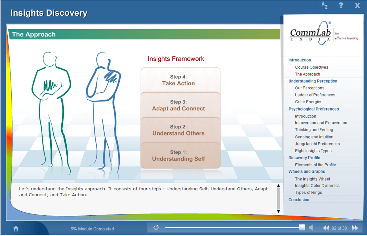
In this screenshot, the titles are in a particular font, and a particular color. The body of the content is in a different font-size compared to the title. The color of the content is also different compared to the title. Headlines and titles (including subtitles) are written in title case, even in complete sentences.

* Adopted from ASTD eLearning course certification standards
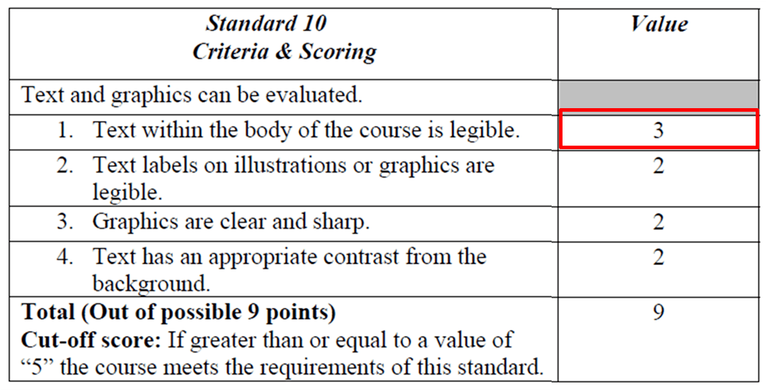
Now as far as text and legibility are concerned, the total possible score is nine, and here are some requisites:
- “Text within the body of the course is legible” is of top most importance.
- “Text labels, illustrations, or graphics are legible”. This is something people fail to understand. They use graphics but the labeling is not legible.
- Graphics are clear and sharp.
- Text has an appropriate contrast from the background. This is something that looks very simple and obvious, but there are many developers and designers who just don’t know about this standard.
Standard 2: Formatting And Internal Consistency
If a course complies with this standard, it means the course exhibits appropriate language, formatting, and internal consistency to minimize distractions from learning. So, the whole point of ensuring consistency is to not distract the learner from his learning. If there is an inconsistency in formatting, an inconsistency in spellings, or the font, sizes, or colors, it distracts the learner from the main task – learning. And people tend to find out or get distracted by mistakes more than anything else.

In an eLearning course, a style guide helps ensure consistency in the course, as it enables you to use the same style, language, and fonts throughout the course. Using a style guide minimizes confusion in the usage of certain abbreviations, symbols, grammar, etc. and makes your course look professional. There is a chance of committing errors if we do not follow a style guide, and this may distract learners. Furthermore, these bugs increase the course development time and thus result in cost issues. 
* Adopted from ASTD eLearning course certification standards
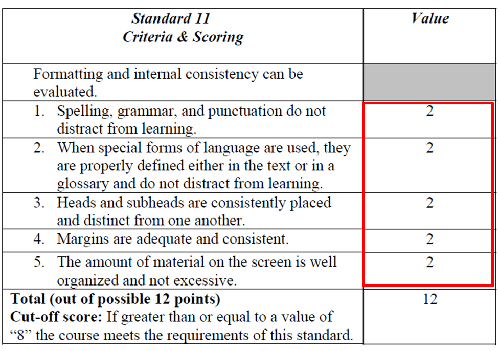
Now coming to the guidelines:
- Spelling, grammar, punctuation do not distract from learning.
- When special forms of language are used, they are properly defined, in the text or in the Glossary, and do not distract from learning.
- Heads and sub-heads are consistently placed, distinct from each other.
- Again, an important point that people miss. Margins are adequate and consistent.
The amount of material on the screen is well organized and not excess.
Following these standards will help ensure the optimization of production development time and thus result in the optimization of cost. It is to be noted that without these standards, the eLearning course might lose its aesthetic sense.
In the next article, we will take a look at Instructional Design standards which will examine the relationship between the course purpose, its objectives, the content, methods, and the learner.
To know more about the standards followed in eLearning courses, download our eBook Instructional Design 101: A Handy Reference Guide To eLearning Designers. The book will provide a thorough understanding of how eLearning must be approached and implemented across your organization. You will also learn how you can build an eLearning culture in your organization and get your employees to embrace eLearning.


