

Summarise this page with your favorite AI assistant
How To Choose The Right Text For Your eLearning Course
For a start, text needs to be easy to read. When text is difficult to read it puts the learner off progressing further into the course. Difficult to read text detracts from well written content. The first impression of your course is set even before your audience has a chance to digest any of the content.
Here are some tips to get started:
- Reduce the amount of text
I'm a minimalist when it comes to text, the less the better. A picture is worth a 100 words and a video or animation is worth 1000.Avoid content dumping and having large blocks of text. Ask your subject matter expert what the desired behaviors are and what these look like in the real world. Then look for ways to replicate these behavior choices rather than writing them. - Use a good font size
Use font size 16/18 or bigger for body text. Headings should be even larger. Text that is too small is an instant turn off for many people - it is a no compromise design flaw. Nobody wants to be squinting to read the text - make it easy for your audience.If you have been designing the course it's a good idea to test your font size and style on someone else before committing to it throughout your course. Also test how it will look on the device/s that your target audience will be using. - Contrast your text color
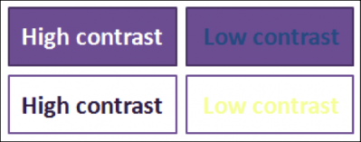
Color contrast is important to make text easy to read. This is where either dark text is placed on a light background or light colored text is placed on a dark background. See how the high contrast text is so much easier to read than low contrast text:
- Avoid CAPITAL text
As well as having the risk of yelling at your audience (unless that is what you want to do) text in capitals is very difficult to read. Imagine you aretraveling in a car, capitals are like applying brakes to your reading journey, the mind has to stop to read capitals. This is why I don't use capitals for all but the first letter in headings - it makes them much quicker and easier to read. Of course, there are compromises when organizations insist on capitalized headings in their style guides. Where I have the choice however, I choose not to capitalize each word in a heading.
 No-one wants to work that hard to read text!
To make a good first impression of your eLearning you need to make sure your text is easy to read. Hard to read text through using large blocks of text, small font size, poor contrast, and excessive use of capitals is off putting to your audience and will detract from well designed content.