
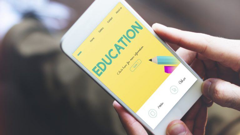
Mobile Learning Design Strategies To Create And Control Mobile Layouts
Employing mobile learning design strategies is achievable with modern authoring tools that incorporate responsive design for screen size adaptation, such as Elucidat's eLearning authoring tool.
Most people use two or more devices daily, making multi-device use essential to the modern learner. This infographic dives into more detail about the behaviors of modern day learners. Because time is often limited for learners on the go, it's vital to think beyond courses and consider resources. Some content works better than others for mobiles, such as video content and social polls.
Here's how you can create and control mobile layouts.
1. Same Course, Different Image

Customize your learning content's layout for varying screen sizes. You can use Elucidat's eLearning software, with its amazingly responsive features – including using different images that adapt to the user’s screen – to achieve this. The Health and Safety course demonstrates how image quality is maintained by swapping images for mobile view.
2. Using An Image Explorer? Fix The Width
While many Elucidat layouts default to a grid layout that provides responsive design for mobile screens without extra editing, additional variations for flexible layout need more care in different modes.
For instance, this single-page demo shows you how a fixed-width variation applied to image explorer templates offers hot spot positioning accuracy in each view mode. Elucidat's Layout Designer also simplifies the editing of default page setup if you want a fixed-width image field applied to all image explorer layouts.
3. Simplify For Mobile With Layout Designer

Use Elucidat's Layout Designer to apply the settings of global layouts to various view modes. Keep the navigation bar simple by removing unnecessary elements. The Using Skype course uses this strategy to prevent elements from taking up screen space on mobile devices. It applies variations to hide the progress counter and logo in the bottom navigation bars for screens with widths less than 480 pixels.
4. Plan Ahead Now, Save Time Later
Think about responsive design from the start by determining if your learners are using a particular device versus every possible device. You can target specific screen sizes when creating and testing layouts. Just use the drop-down device list located adjacent to the view mode slider. By considering adaptive design from the beginning, you can save time.
5. Keep Graphics Simple

Steer clear of images that may lose quality on small screens. If you can't avoid including complex images, consider uploading them as part of a supporting PDF document instead.
6. Choose Interactions Wisely
Pick interactions that work well across multiple screen sizes. Think about this in the early design planning stages to avoid issues, such as lost image details on smaller screens. Minimize the frequency of drag-and-drop page types to keep mobile interactions simple.
7. Edit Image Settings

Utilize different image modes to accommodate different screen sizes. For instance, keep images from getting cropped by using the Contain image mode for smaller screens. Control the X and Y positions to decide which image section gets cropped when using the Original view mode. You can also completely remove images from smaller screens to save space by choosing "Remove This Image" instead of deleting the complete image box.
Final Thoughts
As mobile and multi-device use expands, employing mobile learning design strategies increases in importance. Discover more with Elucidat's free Masterclass HQ training product, including its 17 courses for improving design skills.
Ready to create better mobile learning? Try Elucidat for free – get started with a full-access, 14-day trial.