Why Good eLearning Design Is A Must
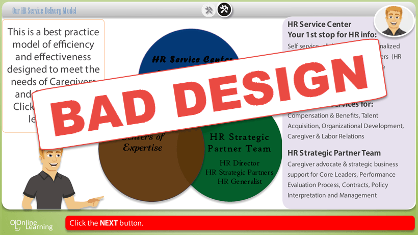
You bet, a lot of people judge books (or magazines) by their covers; the same applies to online courses and corporate eLearning modules. Crummy graphics, confusing navigation, and discordant colors equal a terrible digital course.
Oftentimes, it doesn’t matter how good the content is because very few people can put up with terrible visuals to get a scoop of your excellent content. That’s how easily a good course is put to death by poor eLearning design.
It is, therefore, a common-sense approach to put more effort into eLearning design. If a course is visually appealing, it will attract participants and keep them engaged better than a poorly planned design. Though it takes a lot of details and tons of effort to create the perfect eLearning design that brings out the best from your learners, it is worth it.
In this article, we share 7 helpful tips that can quickly take your eLearning design from average to highly engaging.
1. Apply Visual Hierarchy
How would you enjoy a magazine if all font styles, font sizes, and images sizes were just alike? That’s going to be a difficult read for sure. The same with your eLearning course.
Distinguish your texts starting from headlines, to subheadings, to the body, and the rest. The idea is to guide your learner from the most important content to the next important, and so forth. That way, the learner picks the crucial information at first glance and flows through the entire content.
You can create this emphasis by altering font style and size, image size, positions, placeholders, and similar elements. It is equally important to have a focal point that stands out on the screen where users’ eyes can fall back to. This anchor could be the navigation bar or a well-placed image.
2. Exhibit Consistent Style
Ensure your graphics and design elements follow a consistent style throughout each module. The last thing you want to do is to confuse or distract your learner but that’s exactly what disjointed style does.
In practice, use similar fonts, shapes and color combinations. Ensure the brightness and contrast of images or color deviations aren’t noticeably different. You want the learner to flow with the content and pause only around signposts you have added intentionally. It is standard practice to use a uniform theme throughout an eLearning module.
3. Keep It Simple
It is true for eLearning design as it is for presentation slides, less is more. Keep each page as simple as possible, declutter, and cut out unnecessary fluff. A crowded page is only going to distract and frustrate your learner and probably take his attention away from important information. Use tables, charts, and graphs to simplify information and remember, it’s better to have more simple slides than few crammed ones.
4. Use Plenty Of Whitespace
Akin to the previous point, plenty of white spaces help declutter your design and help users to focus on the main content of the course. White spaces, which are not necessarily white, refer to the spaces in the page which are left blank. In design, they are used to make texts and other elements stand out.
5. Use Legible Typefaces
This is almost a no-brainer but it is worth a mention. While trying to make your text beautiful and attractive, make sure they are equally clear, professional and easy-to-read. Experts advise you use sans serif fonts of at least 16 pixels for online content. Also, it is best to use only 2 or 3 typefaces on a page.
6. Make Navigation Easy And Intuitive
Make it easy for learners to go back and forth within your eLearning course. It is best to go with a more conventional navigational structure; one that is intuitive. To do this, ensure you have hard-to-miss navigational pointers and a clickable bar that allows users to easily switch to important sections like quizzes, resources, forums, etc.
7. Ensure Color Harmony
Finally, use colors appropriately to help your learners flow with your content. Choose a color scheme that is balanced and creates emphasis using bright colors. Monochromatic colors help prevent disorder but can be boring while bright colors can distract learners. Strike a balance. Here, we discussed how to use specific colors to motivate learners throughout the eLearning program.
Bonus eLearning Design Tip
There are eLearning automation tools that can provide you with ready-made easy-to-use templates for the best eLearning designs. This is part of the automation which helps L&D teams create excellent courses in a matter of minutes.


