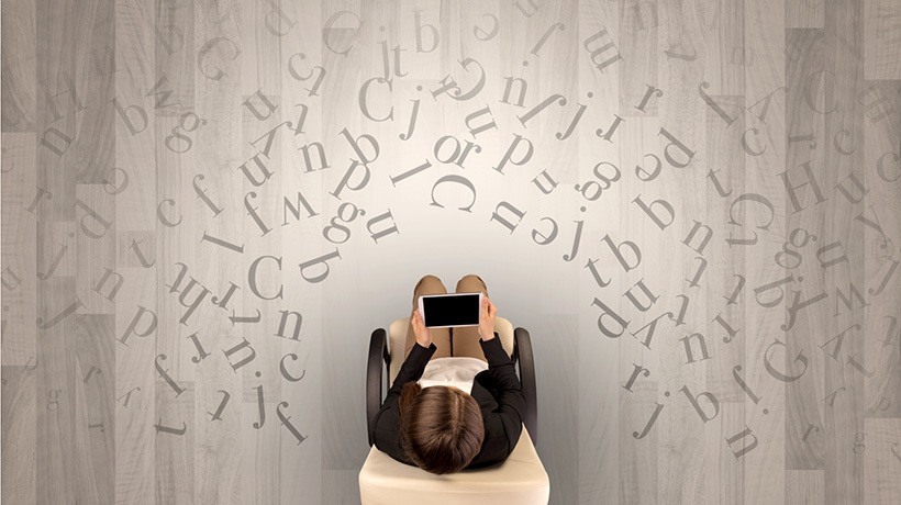


How Fonts Influence Learning And How To Find Your Type
Do you have a favorite font? How about fonts you hate (Times New Roman, anyone)? Do you ever leave a webpage because you don’t like the fonts? (An estimated 75% of web users do!) Do you find yourself playing around with fonts to get the right look and feel for an online product...?
We may not give them a lot of thought, but the modest little font is a powerful part of online learning and the overall online experience. In this article, we discuss the power of fonts in online learning. But first, a quick overview of Fonts and Typeface 101.
A Font By Any Other Name…
Figure 1: A few of the fonts in MS Word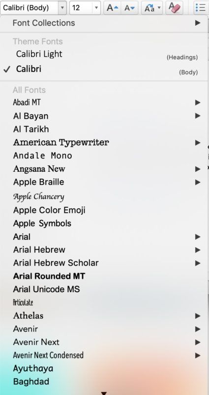
In fact, what we call “fonts” are actually “typeface.” For example, if you look at Figure 1, a normal list of “fonts” in Microsoft Word, what you see in fact is typeface (Abadi MT, Arial, etc.). In our Digital Age, we now use “typeface” and “font” interchangeably. But they are actually different.
Two analogies may help in understanding the difference. A “typeface” is like a song. The font is like an MP3. In other words, the typeface is the creation. The font is the delivery mechanism (Sherman, cited in Vartanian, 2010). Alternatively—the font is what you use; the typeface is what you see (Florendo, cited in Vartanian, 2010).
There are tons of typeface. Let’s take Helvetica, the world’s most common typeface (and the subject of its own movie!). Helvetica 10 is a font. Helvetica 11 is another font. Helvetica 12 is yet another font. Helvetica bold is another font. I think you’re getting the idea…
So, essentially “fonts” are collections of all the characters of a typeface (the specific letterform design of an alphabet), including capital and lowercase letters, numerals and punctuation marks (BBC News, 2010). Going back to Figure 1, if you were to click on the arrow to the right of the typeface names in that image, you’d see the various fonts associated with that typeface (normal, bold, italic, oblique).
As you may know, if you have taken calligraphy, typography, or graphic design course, each typeface has a specific structure. To understand parts of the typeface, go here.
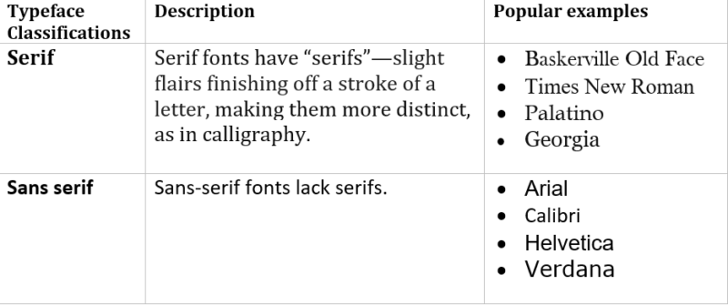
There are two broad classifications of typeface—serif and sans serif fonts. Figure 2 explains the difference and shows the subtle differences among each.
Figure 2: Typeface classifications (Serif and Sans Serif)
All of this—types, structure, typeface, fonts—is part of “typography”—the art and technique of arranging type—that is, letters and characters (Leaning, 2014).
Fonts Of Knowledge
Well, okay. Interesting enough, you may think, but what does this have to do with online learning? Well, quite a bit, actually. Online course designers may not believe we face the same design pressures of commercial web developers who must carefully select fonts to encapsulate the essence of a product they want to sell. But, in fact, we do. Online course designers are selling a learning experience, and our choice of fonts communicates something about that learning experience. In fact, research suggests that typeface (fonts) have a powerful, though understated and not entirely understood, role in online learning.
Typeface Influences Engagement And Attitude
First, typeface gives personality to a website or body of text. Typeface subliminally provokes emotional responses that affect how we perceive content—as clean, crisp, elegant, modern or cluttered, chaotic or outdated (BBC News, 2010). Obviously then, since so much online course content uses text, the typefaces we use to present information affect the learner’s initial perceptions of that content.
That initial emotional reaction affects the learner’s direct engagement with content. Essentially, online learners will engage more with content that is presented in a typeface that they like. Conversely, users are far more likely to leave a webpage or website whose typeface they do not like (Wheildon, 2005). This fact creates a good deal of design pressure, but also offers a lot of design flexibility. As an online course designer, you can take a piece of online content and use different typefaces to give it a more appealing, professional and attractive look to keep eyes on your site (and do with little cost).
To illustrate the above point, in February of 2019, I spent time along Bavaria's (Germany) Romantic Road. Every time I was hungry, I found myself immediately drawn to a Ratskeller or Biergarten (not because I like meat or drink beer—I don't) but because I love the old German Gothic and Fraktur typeface—an old German serif script with thick letters and thin strokes (See the image above). If you have ever taken a calligraphy course, you have probably used these scripts. These typefaces just ooze “Teutonic,” “authentic,” “traditional,” "boiled pig shoulder." I mean, who can resist? Not me! So despite not being a German food fan (Es tut mir Leid), I found myself frequently drawn to restaurants signed in Germanic script. Such is the emotional pull of typeface...
Typeface Determines The Legibility, Readability, And Organization Of Content
Next, more practically, typeface influences legibility, readability, and the organization of online text. Readability is how easy it is to read words, phrases, a book, a web page or an article. The readability of text as a whole is determined by the font style, size, denseness, and color choice of each letterform. Serif typeface (or fonts) are typically best for printed materials since the serifs (the embellishments) make the letters flow together and enhance readability (Wood, 2011).
Legibility is a measure of how easy it is to distinguish one letter from another in a particular typeface. Font size, shape and contrast all impact legibility, which is critically important to the user staying on a website and interacting with content. For instance, one study showed that the legibility of an online shop’s website directly affects the likelihood of the buyer completing a purchase (Yong, Minir & Wei, 2011).
Sans-serif typefaces typically enhance legibility and are best for reading off a screen (Wood, 2011). Aging, the distance at which you sit from a screen, font size, lighting, screen resolution and vision issues all impact the ability to read. Some research suggests that '16 pixels' is the most appropriate font/typeface size for a screen (Bnonn, 2011). And again, repeating myself, research shows that online users are far more likely to leave a website if they find the typeface unreadable or illegible (Wheildon, 2005).
The typeface also influences the organization of a web site and our ability to navigate the site. Using the same font and font family and different sizes of fonts for headers cue the reader to the organization of text and navigation of the site—important markers for reading from a screen.
Typeface Affects Credulity
Third, if you really want your online learner to adopt a behavior, really believe something, or do a certain something, you might consider using a serif font. Several years ago, the filmmaker Errol Morris ran an experiment using three serif and three non-serif fonts to present information. He wanted to find out if certain fonts changed the way we perceive what we read, and if the mere appearance of letterforms had the power to sway us to believe a given statement was more or less true (Morris, 2012).
As it turns out in this (admittedly, non-scientific) experiment, Morris found that readers were more likely to believe information if it was written in serif fonts (apparently because Times New Roman and Cambria seem more “formal” and authoritative) and less likely to believe information written in non-serif font (which seems less formal and more unassuming). So, for those most important pieces of information, you may want to drop Comic Sans in favor of Times New Roman!
As a corollary to this, for you online learners who turn in essays or products for grades, you may want to examine how font choices affect grades in the 'The Secret Life of Fonts'.
Typeface Serves As Memory Aids
Fourth, what we do with typeface has been shown to impact memory. Literacy research indicates that readers remember what they have read if keywords are highlighted by different colors and font styles (though not font sizes). Color coding is also an effective visual mnemonic (Viau, 1998; Carey, 2011).
Typeface Is Associated With Learning
Finally, research demonstrates that typeface impacts learning (and yes, there is a distinction between memorizing and learning). Diemand-Yauman’s (2010) study with 222 high school students (and later with university students) demonstrated that student retention of material across a wide range of subjects and difficulty levels can be significantly improved by presenting reading material in fonts that are slightly more difficult to read. This has to do with what educators and psychologists call “desirable difficulty.” When reading online in a familiar or a simple typeface, readers have a tendency to skim quickly through material and not pay attention. In essence, our “fluency” with the font (or typeface) tricks us into thinking we know the material or that the content is “easy.” The brain automatically associates perceptual fluency—how easy a piece of information is to process or store—with retrieval fluency and ease of recall (Carey, 2011; Diemand-Yauman, 2010).
With an unfamiliar typeface, “disfluency” kicks in. Disfluency involves deeper processing because hard-to-read typefaces are more distinctive and involve greater attention to the task of reading, and thus more cognitive processing on the part of the online reader. This, in turn, results in increased measurable outcomes in terms of learning (Diemand-Yauman, 2010). Lest we get too excited about these findings, research cautions about the very fine line between disfluency of fonts (which helps learning) and illegibility of fonts (which hinders it). So hold off on publishing that article in Zapf Dingbat!
Further, the impact of disfluency wears off over time. Still, with this research in mind, a group of researchers and designers in Australia have created a new typeface, Sans Forgetica, that they claim improves learning and retention.
Finding Your Type: From Abadi MT To Zapfino
Finally, there’s a font of font sites out there (sorry). Some great places where you can to begin to download and play with typeface/fonts are Font Squirrel, 1001 Fonts, and Google Fonts. If you are using any Adobe product, like Storyline, I cannot recommend highly enough the E-Learning Heroes site and the fabulous, knowledgeable developers and designers there who will share all kinds of design tips using fonts.
I'll conclude here with a caveat: I’ve only ever designed online text-based content in languages that use the Roman alphabet (English, Spanish). I don’t know how applicable what I’ve written above is to non-Roman alphabets. It would be terrific to hear from readers who do know.
References:
- BBC News. (2010, July 20). Do typefaces really matter? Retrieved from https://www.bbc.com/news/magazine-10689931
- Bnnon. (2011, October 7). 16 pixels font size: For body copy. Anything less is a costly mistake. Retrieved from https://www.smashingmagazine.com/2011/10/16-pixels-body-copy-anything-less-costly-mistake/
- Carey, B. (2011, April 18). Come on, I thought I knew that! New York Times.
- Diemand-Yauman, C., et al. (2010). Fortune favors the bold and italicized: Effects of disfluency on educational outcomes. Cognition. doi:10.1016/j.cognition.2010.09.012
- Leaning, B. (2014). Typography tutorial for beginners: Everything you need to learn typography basics. Retrieved from https://blog.hubspot.com/marketing/typography-terms-introduction
- Morris, E. (2012, August 8). Hear, all ye people; hearken, O earth (Part 1). Retrieved from https://opinionator.blogs.nytimes.com/2012/08/08/hear-all-ye-people-hearken-o-earth/?_r=0
- Vartanian, H. (2010, October 15). The idiot’s guide to typefaces … and fonts. Retrieved from https://hyperallergic.com/10831/idiots-guide-to-typefaces/Viau, E. A. (March 1998). Shades of meaning: Using color to enhance reading. Journal of Adolescent & Adult Literacy, (41)6, pp. 476–77.
- Wheildon, C. (2005). Type & layout: Are you communicating or just making pretty shapes? Victoria, Australia: Worsley Press
- Wood, J. (2011, October). The best fonts to use in print, online, and email. Retrieved from https://www.awai.com/2011/10/the-best-fonts-to-use-in-print-online-and-email/
- Yong, J.W., Minor, M.S., & Wei, J. (2011, March). Aesthetics and the online shopping environment: Understanding consumer responses. Journal of Retailing, (87), 1, pp. 46-58