5 Tips For Choosing An eLearning Font
Have you ever seen just part of a billboard or a tv advert and known, just from the font, which brand it is advertising? Even if you haven’t noticed it consciously, you can be sure something in your brain will have recognized it.
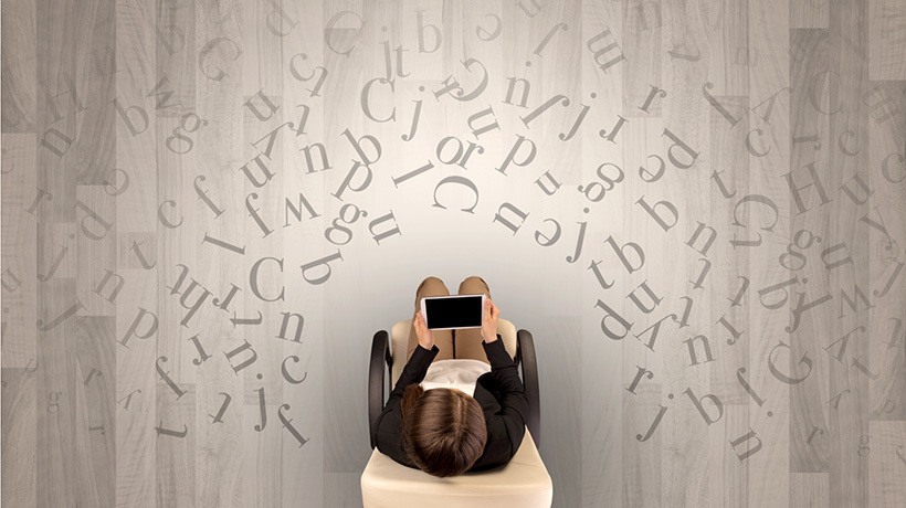
Fonts are often overlooked when we think about designing eLearning, but actually they play a large part in how people interpret content both consciously and subconsciously. Fonts can be a significant visual aid for learners when it comes to eLearning, as well as helping to enhance the overall design of the course, which is why we allow people to choose their own font when creating courses in thirst.io eLearning authoring tool.
So, where should you start when choosing a font? These 5 tips will help you select the font for your eLearning course.
1. Try Sans-Serif For Clarity
At a basic level, there are two main styles of fonts, called typefaces. Most standard fonts that you will be familiar with tend to fall into the serif or sans-serif categories. These both have neutral undertones which makes it simple for us to read. As quite standardized fonts, it’s easy for our brains to process large bodies of text. Here’s an example of two you’ll know:

Serif refers to the decorative flicks or tails that you see on each letter. Sans-serif fonts (literally “without serif”) have simpler styling for each letter. Sans-serif is generally preferred for digital texts because the simplicity of the font means the letters remain clear to read even when resized. If your content is responsive (and it should be), you can’t always guarantee that the user will be using the same screen size or resolution that you were when you created it. So, using a simple font will help keep it readable on whichever device your learner is using.
As a general rule of thumb, using a sans-serif font will make sure the bulk of your content is clear and easy-to-read, especially if you have to include long passages of text.
2. Only Use Decorative Typefaces For Impact
Decorative typefaces can also have their place in eLearning content, but they should be used sparingly. Decorative typefaces have a unique style and don’t comply to conventional font designs. These can be great for titles and headings where the reader isn’t having to look at large pieces of text, and can help to draw attention to areas of the page. Some examples of decorative fonts are:

Decorative fonts are not ideal for longer pieces of writing, and be aware that while they can be great for adding impact and style points, they can also hinder understanding at first glance.
As you can see, decorative fonts can sometimes help convey different emotions and grab the attention of the reader. A study done by Usability News found that most people thought that Impact was bold and assertive, for example. Other fonts were light and playful, others gave an old-fashioned impression, and some have even more specific connotations such as spooky, childlike, or retro. It’s worth thinking about who your target audience is at this stage and what type of feeling you want your content to have.
3. Make Your Text Dyslexia-Friendly
6.3 million people in the UK have dyslexia. So, chances are there will be some people taking your course who suffer from dyslexia. Studies show that some characters are easier to recognize when they are shaped more like their handwritten versions.
For example:

It is worth considering using those fonts that will suit everyone in order to make your content as accessible as possible.
4. Use Multiple Typefaces With Caution
Multiple typefaces are something that can go wrong quite easily. Switching fonts can start to look messy, become unclear to the reader and dilute the strength of your visual impact. However, just like colors and shapes, font styles can complement each other if selected wisely. Here’s a list of font pairings from Creative Bloq that work well together. It’s critical that you try and maintain the flow of reading by using fonts with complementary designs. Using a more decorative or impactful header font with a simpler paragraph font, for example, can work well.
5. Be Generous With Sizing And Spacing
Our eyes scan the page when we read, we don’t look at every letter. Our brain recognizes the shape of words and letters and registers the content extremely quickly. With this in mind, you need to consider line spacing and font size with respect to the font you have chosen. Generally speaking, bigger is better for clarity (within reason). Getting it right will make reading easier and quicker for the user.
Finally, try some! Get feedback from as many people as possible, and remember to take a step back and look at the page as a whole—does that title give off the right tone and emotion? Always keep your audience in mind. A sign that you’ve picked the right font is that the learner won’t even notice it most of the time, they’ll be too engaged by what the text says.
At thirst.io, our priority is to give you the flexibility to create engaging eLearning, efficiently and easily. thrist.io's theme editor includes an integration with Google fonts, so you've got 960 fonts to choose from when creating your content!
Additional Resources:
[3] Fonts & Feelings: Does Typography Connote Emotions?

Originally published at thirst.io.
