

Mobile Learning Strategy: How Can You Deploy One Successfully?
There are many ways to deploy mobile learning in an organization. You don’t have to choose just one. But if you want to both stay sane and deploy successfully, you need a mobile learning strategy. These 7 points will help you build one that works for you:
1. Verify That Your Organization Is HTML5- And Mobile-Ready
For content to work on mobile devices, it MUST be HTML5-safe (native or not). Critical, basic questions to ask before you dive in:
- Can your LMS host and distribute HTML5 courses and content?
- Is your company’s standard browser HTML5 compatible? (For example, Internet Explorer 8 does not fully support HTML5.)
If the answer to either of these questions is no, it doesn’t mean you can’t use mobile learning. But it does mean how you use mobile elements will be limited.
Other questions to consider:
- Will users be able to get through your firewall to access content on mobile devices? Can they do it with their personal devices, or only with company-issued devices? What policy and practice changes would be necessary to make accessing mobile content easy yet secure?
- Do you have a lot of Flash content in your learning library? Even if you “wrap” Flash content in an HTML5 package, the Flash animations will not run properly on mobile devices. Strategically speaking, will it be more powerful for you to update your existing Flash content to HTML5-ready formats? Or to start mobile deployment as you roll out brand new courses, and catch up your existing library later?
2. Make Mobile Learning Part Of Your Larger Learning Strategy
Mobile devices open up possibilities for how to reach and interact with learners. It’s tempting to dive right in and start throwing content out there to see what sticks. That’s not a bad thing to try. You can learn a lot that way. Just don’t think you’re done, because that is not a strategy. And the strategy is how you leverage good ideas into ongoing organization-wide successes.
One powerful key to mobile learning is to integrate it instead of treating it like a separate province. Adding mobile elements to your existing training can create opportunities for reinforcing content, learning about challenges learners face after training, and increase the impact of your blended learning courses.
3. Target Content By Device. One Size Does NOT Fit All
Mobile devices have nifty advantages over desktops, like the way learners have them handy when problems or questions arise. And mobile devices have not so nifty limitations, like small screen size. Not all content is suited for deployment on mobile devices. A 200-page reference document might be useful on a desktop, but it’s maddening on a cell phone.
Learners expect mobile content to be short, easy to access, and legible without straining (especially important for older workers). They expect mobile content to work with little or no interaction, because typing, tapping in precise locations, and navigating between fields are all harder on a cell phone. Design to delight them, not disappoint them, and you will be rewarded with requests for more mobile content.
So, which devices work best for which content?
- Desktops and laptops are good for first-time content exposure, in-depth learning, long content (text and video), complex or detailed graphics, web-based training modules, and anything with high interactivity. This example WBT demonstrates a sophisticated data analytics tool. The design is simple, but there is too much detail for comfortable viewing on a phone. The tool is meant for desktop use, and so is the WBT that shows how to use it.
- Tablets are a middle ground with more screen real estate and ease of typing than phones but less than desktops and laptops. WBT can work well on tablets, depending on the complexity, detail, and interactivity of the specific modules.
- Phones are good for short content such as refreshers, on-the-job Performance Support, how-to videos under three minutes (preferably less), and simple graphics that read well on small screens. Phones are also ideal for podcasts, text messaging, chat, and social interactions like posting quick responses on forums.
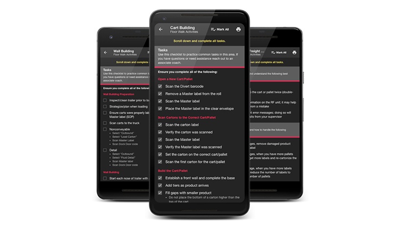
This example is a floor walk checklist app which helps new managers practice skills learned previously via a webinar.

4. Keep Content Simple To Accommodate The Multiplicity Of Devices
Sometimes, you need content to work regardless of whether it’s accessed on a desktop, phone, or anything in between, and that’s where things really start to get tricky.
Even if your organization has single standards for company-issued tablets and phones, learners will likely also use their personal devices to access learning content. That means that in addition to different screen sizes (desktop vs. phone), your content also has to work on a variety of browsers (Safari, Chrome, Internet Explorer,…), operating systems (Android, iOS, iPhone,…), and device brands, each with its own customized interface flavor.
Different devices handle content differently, so whiz-bang content on one device may just go BANG on another.
To design across devices, you have to keep all the device constraints in mind, and design to balance them. This example video uses simple, clear visual design and no text to show good vs. bad role models for workplace safety. The visual simplicity that makes it effective on a phone is still impactful on a bigger screen.

TIP: Some interactions that work on desktops don’t work on phones and tablets. For example, mouse over/hovering works great to layer information in graphics on desktops. On phones and tablets, there is no such thing. You must design for learners to click/tap instead of hover if you want layered content to work well.
Keeping mobile content short and simple with limited interactivity will improve usability for learners and reduce your design and technical support headaches and costs.
5. Design Mobile Content That Works In The Learners’ Workflow
The work environment matters when it comes to designing effective training. With mobile learning, you have to design for more environments than ever before. What works well for a salesperson sitting at a desk will not necessarily work for a lab technician, nurse, or field hand mixing hazardous chemicals. Questions are your best friend to get this challenge right. Here are a few to get the ball rolling:
- Are mobile devices allowed in this particular workspace?
- Do the devices have to be medical grade or intrinsically safe (meaning they can’t ignite chemicals in the air in a dangerous environment)? If yes, are the devices otherwise different from other devices deployed in the organization?
- Would using a mobile device be distracting instead of supportive during delicate procedures? (If yes, frame learning nuggets as preparation for a task instead of “as you go” support.)
- Will learners be wearing latex gloves or other personal protective equipment (PPE) in the workplace, which makes using a touch screen or other interactions impossible?
Getting answers to questions like these up front will streamline your design, development, and deployment—and also help avoid embarrassing mistakes.
6. Test, Test, Test
No matter how straightforward your design, it’s important to field test your deliverables. Test them in the delivery environment, on all the various browsers and devices. You will learn a tremendous amount about how learners actually access and use your material, as well as uncovering technical issues. In case you missed something in #5 above, this may be the way you find out that these learners wear ear protection in the workplace, which makes podcasts a terrible choice for on-the-job support.
7. Evaluate To Evolve
There is a lot to consider as you develop your mobile learning strategy. And the technology is always changing. It can feel like you’re aiming at a moving target—because you are. So embrace it. Make changing technology and workplace requirements your reasons to gather learner feedback regularly.
TIP: Use a mobile feedback strategy. The response rate on one-question text surveys is much higher than on email surveys.
Use learner feedback to make strategic course corrections. When you do it proactively, you can get… well, maybe not ahead of the fast-changing mobile learning curve, but you can at least get on top of it. In the learning world, that qualifies as brilliant mobile learning success.