
Development And Outcomes Of A Mock xAPI Project
Design and data are two of my favorite things right now. Over the past year, I have been focusing on building my skills in UX/UI and working with data using xAPI (Experience API). With xAPI, you can collect any data you want, anywhere, and you don’t need to rely on a Learning Management System.
I found that the two areas complement each other beautifully. In my personal time, I have been using xAPI to test User Experience inside eLearning and learning content. I’ve also been using xAPI "more traditionally", to be able to measure the performance of users based on how they have interacted with learning products.
Jumping into xAPI is easier said than done. However, there are a ton of great resources out there to help folks get started. Take, for instance, my Big List Of xAPI Resources.
In the past, when it came to xAPI, I had created tutorials, written blog posts, put together resources, joined podcasts, shared my xAPI related projects. Next, I really wanted to create an experience where users could experience working on an xAPI project with a realistic scenario.
The Workshop Scenario
I put together a presentation and workshop on xAPI. I had just gotten back from a speaking engagement in Belgium. I noticed tons of Pasta takeaway places in Belgium, and it really piqued my interest.
I decided to create an xAPI workshop around employees at a mock pasta to-go company, Presto Pasta. Customers of the takeout company had been complaining on Yelp, through email, and on various social media platforms, about the rewards system being presented inconsistently and some customers not even receiving the rewards. This was due to employees being unsure of how to present the rewards and also due to the confusion about the new process and update to the POS (Point of Sale) system, where they entered in rewards. The employees would need to present a rewards program to customers and enter the rewards in their POS system. You can read the full scenario and goals here.
In the scenario, xAPI data would be collected on how the employees interacted with the POS system, the rewards program guide, and more.
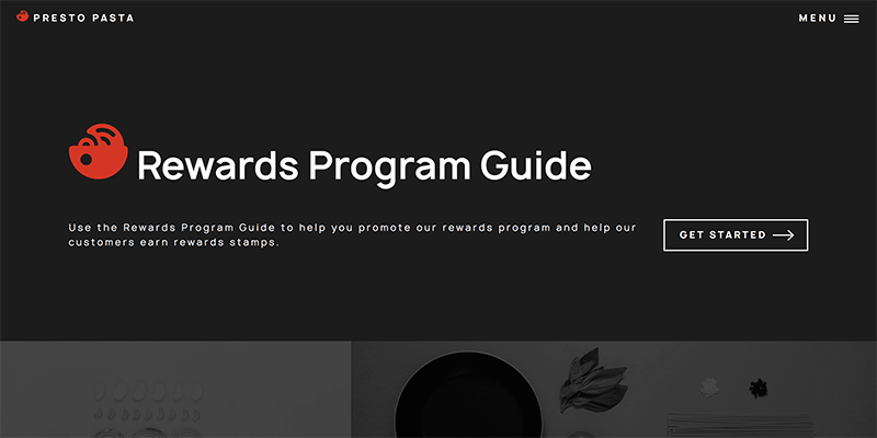
The Rewards Program Guide
In order to design for the data, I wanted to create a realistic example of a Rewards Program Guide that would allow workshop attendees to plan what they would track in the system. Check out the Rewards Program Guide and xAPI statements!
The Data Planned
Some things that I tracked in the Rewards Program Guide include:
- What pages a user views.
- When a user experiences and completes the video on the Simulation page.
- When a user clicks on accordions in FAQ page (when they are opened and closed).
On the live website, I recorded all of the above and let learning professionals try it out. Other than the main page, learning professionals were most likely to view the Simulation page and test out the video. Learning professionals also went to various pages and returned to the main page, and that made the stats for the main page spike up.
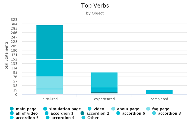
The video object of a simulation has interacted with more than the accordions.

After designing what data would be collected through the Rewards Program Guide, we planned the data that would be collected about the actors (employees) at Presto Pasta.
What we decided to track about the actors was:
- The store location.
- Region.
- A shift of actors.
Finally, we discussed what else we would track, including in the POS and also from other platforms/outlets. We planned to track:
- The number of rewards being entered in the POS per location/shift in comparison with orders entered.
- Negative reviews by location/shift (on Yelp, through email, and on social media).
- Positive reviews by location/shift (on Yelp, through email, and on social media).
All reviews would be categorized by type.
The Outcome
So what does all of this mean?
When planning for data, you want to have questions and/or hypotheses to help you plan for that data.
Initially, we wanted data to measure against, so we wanted to know what stores/regions/shifts are not promoting or entering rewards programs properly.
Next, we want to be able to prove that the use of the Rewards Program Guide boosts correct use of redeeming rewards in the POS and helps clear up any confusion about presenting rewards.
Now that we know where the areas (by shift/region/location) of opportunity lie, we can test out how the Rewards Program Guide works. We are able to see how users (in specific store locations/regions/shifts) are interacting with the Rewards Program Guide and also the system. We bring that data into the Learning Record Store, alongside data on negative/positive reviews, and sales data. We chart all of it together.
After using the Rewards Program Guide, we should then be able to see if rewards are being entered into the system, if negative reviews drop, and see if sales eventually increase. Of course, that would be the ideal situation, but sometimes data tells us a very different story.
Once you have that data, you have to investigate the cause of it. The data is only the tipping off point. It's the questions we ask before and after gathering data that will lead to its meaningful use.