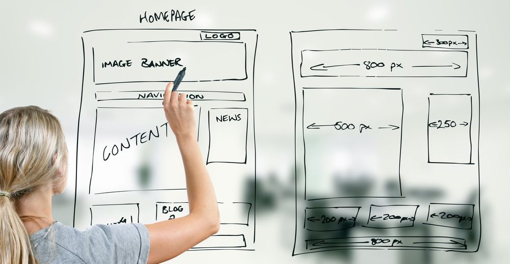

What Is The Web-Style eLearning Design?
Web-style design presents content in a scrolling style, inspired by the structure of websites. It’s pretty different from traditional eLearning designs, which often involve a series of pages that learners click-through horizontally. Using web-style design, content and interactions are stacked vertically underneath each other on a single, scrolling page.
This type of design is being used more and more by elearning providers. One reason is that, due to the amount of time we all spend on the internet, it’s become far more intuitive to the user.
Watch this behind the scenes video of a web-inspired piece of eLearning.
If you’re considering web-style design for your eLearning, these 4 tips are for you:
1. Check If The Web-Style Is For You
The first thing you need to do is check whether the web-style design is really fit for your purpose.
This type of design is well-suited to content that you’re happy for learners to browse through, interact with, and answer questions at their own pace.
Successful eLearning providers often choose web-style design when creating product knowledge sheets or process guides. In both cases, it is helpful for the learner to be able to see the bigger picture or the whole concept on one page.
2. Visually Separate Content To Enhance Recall
Dividing your content visually will not only make it easier for your learner to understand; it will also help them to remember it. We often find it easier to group separate categories of information in our minds if it has been presented differently.
One way to do this is by highlighting different sections with unique background colors, helping break the content into separate chunks. You want to avoid everything blending together on the page.
If varying topics crop up repeatedly throughout your content, you could signify each one with its own text or background color. For example, if your project is a product knowledge sheet, you could use blue whenever you talk about features and benefits and orange whenever customer-related content is mentioned.
This is a perfect example of visually separating content on one page.

3. Track Progress And Set Expectations
Maximize the chance that your learner will complete your content by making it easy for them, allowing them to pick up where they left off in case they need to go away and come back to the learning later.
Another way to do this is by featuring the headings of different sections in the page menu bar and pairing this with a navigation aid. This means that your learner can jump straight to specific content with just one click.
A page menu bar is also useful for setting your learner’s expectations as they can see what’s coming up and how long the learning will take.
Check out the column layouts and page progress indicators used in this eBook style example.

4. Accommodate Everyone
It’s a good idea to make your web-style content available in multiple languages to cater for learners across the globe.
You don’t necessarily need to change the visual or structural experience of the learning. Simply ensuring that all text is translated into a learner’s native language will make it much easier for them to understand it.
If you’re an Elucidat user, you can ease the chore of translation with the variations manager. The feature allows you to create a master version of your content in one language, which you can then export, translate and re-import to create a "child course" in a different language.
Get inspired by this multi-language preboarding one-pager. The navigation tool and visual breaks used in this project also make it a great example of how learners can quickly scan content and find the key information they need.

Watch this short video on the design decisions for web-style eLearning.