5 Rules Of More Effective Information Communication
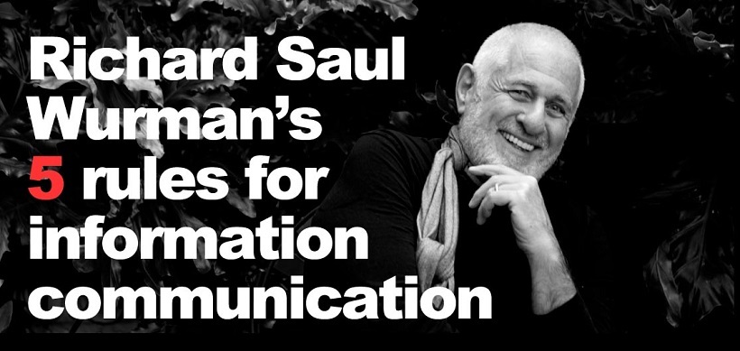
The iconic and irascible information architect Richard Saul Wurman has some great wisdom to impart about effectively communicating large amounts of information visually. He is the founder of the popular Technology Entertainment and Design (TED) conference, a consummate information architect, and the author of nearly 100 books that exhibit a high degree of design excellence. He offers 5 simple rules for more effective information communication in any form.
1. Understanding Is Relative
People are only able to learn new things in relation to what they already know. This observation is echoed in the recent cognitive science literature on learning. “For most things in everyday life, scale is best understood if it's based on a relationship to a human being”, according to Wurman. “Scale always relates to us.”
2. LATCH
Systematically organizing the information may help in structuring it into a more useful form for communicating meaning is the first step in communicating. Wurman has tried many different organizational schemes over his 30 years of designing, but they always can be reduced down to a few basic dimensions for organizing data. “I've tried a thousand times to find other ways to organize”, Wurman says, “but I always end up using one of these five”. His catchy LATCH acronym proves to be a useful way to organize information:
Location.
Geography or proximity, particularly when combined with time, is one of the most useful ways to organize information. Location can be concrete, such as a position on a map, a part within a system diagram, or a step in a flowchart, or more abstract senses of space such as a grouping of images together to convey their relation to one another or a relative size in a drawing.
Alphabet.
Alphabetizing along one or more factors is less useful in more visually-based communication, but it does provide a way to organize large amounts of data. Although “A” fits nicely in his LATCH acronym, this dimension represents any scheme in which information is organized by an arbitrary symbol, such as a number or table of contents index.
Time.
Organizing things temporally allows for the suggestion of causality. This approach is most valuable when combined with other schemes, such as location. Time is often represented by graphical timelines and calendars.
Category.
Classifying an item as a member of a group helps identify patterns in data. Groups can include distinctions such as color, gender, and other item attributes. Once categorized, the items can be counted and have a variety of statistical techniques applied to tease out patterns.
Hierarchy.
The relationship of items according to one or more factors helps reveal the internal structure and relationships among data elements. For example, one kind of hierarchy would involve a simple ranking of an item’s attribute, such as its size, order of importance, or number. More complex hierarchies include family trees, organizational charts, and other kinds of relational data types.
3. Do Not Beautify, Clarify
In resonance with visualization guru Edward Tufte’s design ideals, the goal of information design is to facilitate communication by avoiding the addition of extraneous graphics. “The goal is to clarify—make it easy to understand.”
4. Focus On What You Really Want To Know
Figure out what you really want to know about the topic and focus in on that by asking questions. “We're taught when we're young that we're not supposed to look stupid. So we don't ask questions. Well, you'd better ask questions, and you'd better ask about things you really want to know. That way you'll convey your fascination”.
5. Get Rid Of Useless Information
According to Wurman, most information is useless and will not improve the viewer’s insight and understanding. People can only remember a half-dozen things in working memory at any given time. Get rid of the extraneous information to let the salient points have a chance to be absorbed. “It's worthless to read something you're not interested in because you won't remember it anyway.”
It’s not often that such simple rules yield so much clarity, especially when applied to such a difficult task a communicating complex information clearly. I’ve found that applying Wurman’s guidelines, particularly LATCH, has helped me get started in parsing through a large amount of information and lead the way to communicate it more effectively.
* All quotes from Richard Saul Wurman’s Information Architects, 1996, Graphis Press


