Visual Design Best Practices You Can Use Even If You Have Zero Visual Design Experience
All over the world, a large majority of the organizations implements eLearning programs, as they consider this approach quite effective in successfully guiding and training their geographically dispersed and diverse workforce. Surely, having an expert visual designer ready to create eLearning that has significant impact is not always easy. But I say you don’t need to depend on an expert designer: You can simply spend a small amount of time to comprehend what makes an eLearning course sell right away. Let me share with you 7 visual design best practices you can follow and start making a strong impression on your target audience.
1. Always Use Meaningful And Influential Images
It doesn’t matter if you have enough or little experience in design; you should know that with text as the primary data, images play a complementary and pivotal role in creating the crucial touching impact. In fact, there is no need to hire an expert designer or to be an expert designer to meet this goal successfully. You simply need to make sure the use of right images that can support your content. I have found that the right image has the potential to assist retain information. In this regard:
- Use a series of images rather than bullet points.
- Use photographs rather than clip art images to make a professional impression on your audience.
- Choose and use influential and meaningful images rather than random images to provoke emotions.
2. Design A Template Free From Distraction
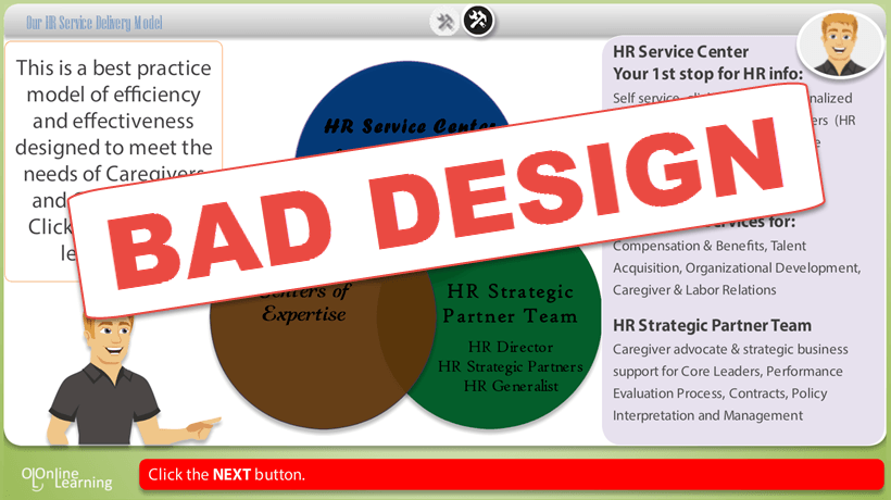
Remember, design is not only beautification. Effective and meaningful design really promotes and encourages learners to pay strong attention to the content instead of the decoration. I have found that 90% of what you develop as an eLearning developer is destructing. You need to gradually and cautiously peel away every single unnecessary element. Further, sticking to the nuts and bolts of the course design is necessary when developing a template, and at this point you need to avoid the distractions that always cloud the minds and emotions of your learners.
3. Always have An Adequate Amount Of White Space
I have found that all experienced and celebrated designers consider white space in an eLearning course as very crucial and imperative, just like the content. The importance and significance of white space is that it really assists learners in understanding what is highly crucial and what is not. Moreover, white space also helps comprehension as well as the presentation of new and innovative thoughts, concepts, and ideas, in conjunction with effective learning design.
4. Break Up The Content
It has been seen that most people frequently make the mistake of using only one slide to cramp all the content. If you want to present your content, use several slides to present it; this means you need to divide the content. Along with ensuring better readability, it also strengthens and boosts the look of course.
5. Always Use Colors In Clever Ways
In fact, one of the highly crucial and important elements of visual design is color. Color can really evoke the emotions and minds of the target audience while stirring up the appropriate reactions from them. So, use of soft backgrounds for the course and dark colors for the text will be best. Keep in mind that adding lots of different colors is not appropriate. Use maximum three colors, because maintaining simplicity is a wise approach that will really make the course appealing to your learners.
6. Ensure Consistency
I have also found that most people with less experience in learning and designing frequently make the mistake of developing courses that are not consistent with color themes: When learners change the theme in slides, they find it quite difficult. At this point, ensuring consistency is very crucial; as an eLearning developer you will have to use only one color palette to guide your learners towards the focus of the course, without distracting them with conflicting design elements. Fonts and background are also very important. The overall feel and the entire look of the course should be attractive and appealing to encourage learners to take the course right away.
7. Maintain Learners’ Attention And Focus
When you come to design an eLearning course successfully, you need to remember that the focus of all elements should be on motivating and moving the learners towards their goal. So, focus should be your basic goal.


