
Visual Design Tips For eLearning Professionals
The visual design of your eLearning course should help learners understand and retain the content, as well as minimize confusion. Nowadays, with all the relatively easy-to-use graphic design and eLearning authoring tools, all of us who don’t have a degree in design can create good-looking courses. Of course, if you want to create more complicated things, such as custom illustrations, custom animated videos, custom characters, etc., you need more in-depth knowledge and skills.
However, if you don’t need to create any of the prior, you can make your eLearning courses look good without spending years learning design. You need to take time to learn how to use some of the most popular eLearning design tools, such as PowerPoint, Articulate Storyline, Abobe Captivate, Photoshop, and Canva—they’re not as scary as some of you might think. Keep in mind that most of them have amazing content libraries, full of high-quality images, templates, and videos that ease the work.
The other thing you need to do is to learn the main principles of visual and eLearning design. There are a lot of factors to be considered when designing an eLearning course. However, following the most important guidelines, you can create courses that will appeal to your learners’ eyes and help them remember and apply their new knowledge and skills.
Now, let’s see what you need to do to make your course design learner-friendly.
Main Principles Of Visual Design
There are 4 main principles of visual design: contrast, repetition, alignment, and proximity. If you learn to use them, your training will become not only more eye-catching but also more useful for the learners in the long term.
1. Contrast
Contrast is a technique that visually distinguishes one element from another. You can use it to guide your learners' attention to a specific part of your slide. You can use contrasting colors, opposing sizes, or differing font combinations.
2. Repetition
When you use one specific design element this is called repetition. The purpose here is to create a sense of cohesion. To achieve this, you can use consistent fonts for your titles and subtitles, consistent background colors for your slides, etc.
3. Alignment
To make your slides look synchronous and well-balanced, you need to use proper alignment. Line up each element with at least one other element. Every graphic design tool/eLearning authoring tool has a feature that draws vertical and horizontal lines to help you align all elements.
4. Proximity
Proximity is the fourth basic visual design technique. Simply said, proximity is the distance between the elements on your slide. It is recommended to place related elements closer to one another, and unrelated elements farther apart.
eLearning Design Tips
1. Choose Your Color Palette Carefully
Don’t follow your personal preferences, but think about the audience, your course topic, and don’t forget to ask about any brand considerations. Read about “color psychology” to learn more about how different colors affect people’s perceptions. Also, read about “color theory” to choose colors that complement one another. Take time to think about what is the basic “feeling” that your course has to evoke, choose a main color and two complementary colors. You can use any of the free web services called “palette generators” to find the best colors for your training.
Never sacrifice readability. A lot of newbie designers make the common mistake of choosing a color combination for the sake of creativity. However, don’t forget that learners have to read your content, and to do this they need to see the text. A combination that always works is a light background and a contrasting font color, such as black or dark grey. To make your titles stand out, you can use bolder colors. Choose a different background color or font color for your important notes and instructions. Use your colors of choice consistently throughout the course.
2. Pay Attention To Typography
Content is the main element of your course, so you need to choose easy-to-read fonts, such as Arial or Verdana. Don’t use too big or too small font sizes. The same applies for the paragraph and line length.
It is a good idea to choose different fonts for your titles and body text because this will make both elements stand out. Find additional resources to learn how different fonts can be combined to complement one another.
3. Use White Spaces
White space is the area between the elements on your slide. White spaces make slides look lighter, so you have to learn how to distribute the content. You can use shorter paragraphs and bullets as well as leave enough white space between text and graphics to make your slides less cluttered and overwhelming. Focus your learners’ attention on an important element or piece of information, leaving white space around it. Never fill white spaces with text or graphics if there is no reason for this.
4. Make Sure All Elements Have A Purpose
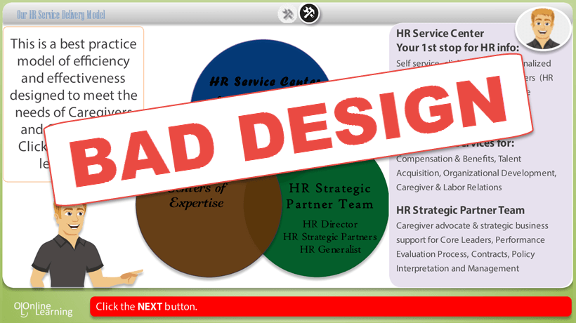
No matter whether you add an image, animation or interaction, you need to put meaning in your choices. Never insert a photo just to fill in a blank space. Never animate an object that has to be static. Never design a click-and-reveal interaction, because clicking will make your course more engaging. None of these are true. On the contrary, such decisions can wreck your course.
5. Prototype Your Main Slides
Before you start developing your course, think about the design of your main slides. This will help you build a consistent look for your course. Prototype the most important slides in your favorite design tool.
6. Make Your User Interface User-friendly
Take time to learn about how people are used to working with desktop and web-based products. Make your navigation simple and clear, and make sure your buttons look like clickable elements. If your learners find it hard to move through your course, they might miss important information or associate your training with a negative experience.
Conclusion
If you’re an eLearning professional with no design experience, don’t worry. You can learn to create relevant and easy-to-use eLearning courses. Everything is possible as long as you put time and effort into it.