
The Importance Of Visual Design In eLearning
Instructional Design has attracted professionals from diverse fields such as education, psychology, business/management, and computer science. The function of an Instructional Designer often encompasses multiple roles when developing eLearning courses including project manager, researcher, instructor, writer, video producer, artistic designer, and web developer. Often, Instructional Designers are stronger in technical or education areas (where they had previous education/experience) and may not have a solid understanding of design principles. In this article and interactive, you’ll read and see how to take your instructional design to the next level by using key visual design guidelines.
Design is a visual language of your course. Effective visual design in an eLearning course sets the tone or mood of the content and conveys a sense of professionalism and clarity. These courses are clear, easy to read, and readily comprehensible. Effective visual design is based on specific style guidelines that, when adhered to, not only make courses look professional, but can support the learning process for the users, and can even increase efficiency in course production (saving you time and therefore money).
So, what are these guidelines for effective visual design? Here are ten guidelines that help you emphasize the visual design in your Instructional Design.
Content Copy
1. Display < 120 words at once.
Page layouts should display no more than about 120 words at any time so the learning space does not become cluttered or difficult to read. If more content is needed for the topic on that page, either allow the learner to show/hide some content in the same space or break up the content into multiple pages.
2. Chunk the content.
The course content should be written in a manner that aids comprehension and retention. The brain digests information quicker if the content is broken into smaller sections. Rather than using one or two long paragraphs, break the content into smaller chunks of one to three sentences or use bullets to emphasize key learning points.
Font Formatting
3. Size fonts for readability.
Although font size of 10 or 11 may work well for print or emails, increasing the font to 12, 13 or 14 for the body content will make the content much easier to read for all learners. Double the font size (to 24 to 28) for section headers and step up 1 to 2 points (i.e., 12+2=14) and Bold for page headers. You want the content to be as easy as possible to read and digest- especially for adult learners who have challenges when viewing information on a screen.
4. Use two fonts.
The formatting of the fonts support learners to understand the purpose of the text (i.e., title, subtitle, body content). Use Sans Serif fonts such as Arial, Veranda, or Tahoma for body content and subheadings since these are much easier to read on screens. Use Serif fonts such as Times, Palatino, or Garamond for titles to make them stand out.
Layout
5. Incorporate white space.
White space is a visual design concept that allows the content (whether it is words or graphics) to stand out and more readily be comprehended. White space, or negative space, doesn’t need to be white, it just needs to be the color of your background and devoid of any graphics or text. White space is usually thought of as a blank space at the top, bottom, or side of the page. However, it can also be incorporated throughout the elements on a page, such as cell padding within a table or buffer areas around shapes. In blocks of text, the spacing between the lines (also referred to as "ledding or leading") can include white space to make reading easier. Setting line spacing to about 1.2 so allows the text ‘to breathe’ and makes it more visually appealing. In most authoring programs, you can manually change paragraph spacing to Exactly 16 (if your font size is 12). In addition, adding a 10 point space before each paragraph visually breaks them apart.
6. Utilize guides and grids.
When designing page layouts, employ guides to establish specific boundaries for elements such as body text, titles, graphics, and navigation elements. Most authoring tools also provide tools to set the exact location of the elements using X,Y coordinates. These coordinates refer to the number of pixels from the top left corner. For example, titles may be placed at 60,60 and sub headings below it at 60,120. To make calculating the page borders and placement of elements much easier, use grids. Grids can be toggled on or off to allow you snap objects to the grid, so your elements are arranged proportionally and are automatically aligned. Set the grid spacing to increments that are easy to work with, such as 10 points.
7. Design from top left to bottom right.
Learners look at a page beginning at the top left, which is the best placement for the page title. As they progress through the content, they will finish reading at the bottom right, which is an optimal place for a navigation or response button. Since Western text is read from left to right, it is read and comprehended easier if it is justified left. The eye naturally goes to the same starting place in each line for left aligned text, as opposed to different places for centered aligned text. This guideline applies to body text as well as sub headings, basically anyplace where there is multi-lined text.
Color
8. Limit your color palette.
Choose no more than five main colors to use throughout the course. Use lighter and darker shades of those colors as needed for accents or backgrounds. The colors should be complementary and visually attractive. There are online tools such as color scheme generators and color combination libraries to help you create a professional palette for your course. Be mindful to create enough contrast between the colors you use (especially if your course has to meet accessibility requirements). For example, if there is black text over a dark purple background, consider changing one color to increase the contrast between them to make reading easier. You can check your palette with an online contrast checker.
9. Indicate meanings for colors.
Sometimes colors can just be colors. However, colors can also indicate specific things to your learners. Teal might indicate a response is needed such as a ‘Next, ‘Play’, or ‘Click to Reveal’ button. Very light shades of your color palette can be used for background behind text blocks while darker shades of those colors can be used for buttons. If you do decide to employ color for meaning, make sure that color has only one meaning (i.e., don’t use red buttons to indicate ‘Next’ and a big red check to indicate wrong answers).
Consistency
10. Be consistent in your visual design.
These guidelines support great visual design only if they are used consistently throughout your course. It may take some additional work up front to establish a visual style for your course- but once you do, it will provide benefits. For you, it will make design decisions in new page layouts much easier since you have a guide to help you. It will also increase efficiency since you can re-use and modify layouts for multiple sections. For the learners, the course will have a unified look and feel and basically get out of the way. The visual design allows them to focus on the content- which will be easier to read and understand.
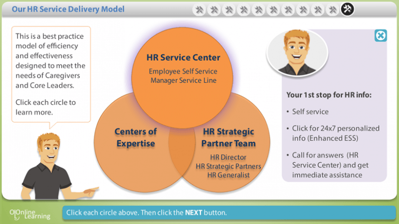
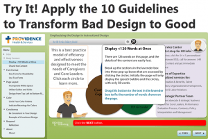
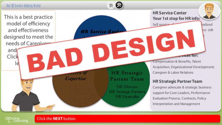
Try It Now! Use These Award-Winning Interactives To Practice Applying The 10 Design Guidelines
Now that you’ve read the 10 visual design guidelines, click the links below to practice applying them in a poorly designed eLearning page. This interactive won the 2015 Best of Show at DevLearn's DemoFest. Apply each guideline in the online interactive and see how the page is transformed in each step. There are two versions to choose from; one developed in Storyline and the other in Lectora.