
The Learnnovators And Quinnovation Project: Learning Design Principles
The links to the course, as well as a series of blog posts by Clark Quinn explaining the underlying process, are provided at the end of this article. The idea of the project was to develop a course under practical constraints typically faced by learning design and development teams, and show that it is possible to adhere to good learning design principles. So, here they are, the learning design principles that we employed in the development of the course:
1. Activity-Centric Design
The entire course is decision-based. It is full of practice activities, with minimal content that can be pulled by learners if needed.
Learners who enter the course see some initial context-setting content, and then are placed in a scenario where they need to take decisions to move the conversation forward. The "content" is made available only as reference, and can be accessed if needed (not mandatory). However, the scenarios are challenging enough that learners have to access the content to understand the underlying logic of the decisions they are faced with. The decisions also include misconceptions that are likely to have been entrenched in the minds of learners.
2. The Right Amount Of Challenge
We believe that the decision points in the scenarios are neither too easy nor too difficult. Learners need to ponder over them to make a choice, and accessing the reference content makes that decision more informed. This engages learners’ intellectual curiosity, motivating them to interact better with the course.
And, the right answer is not too obvious, to make learners want to access the content, in order to be able to take the scenario forward.
3. Intrinsic Feedback
We’ve added intrinsic feedback at the end of the scenarios; by this, we "show" the consequences of the learners’ decisions once they reach an endpoint. This we provide through a simple description of what happens in the organization a few weeks / months after they reach the end, and follow it up with an explanation why this happened.
4. Duration Of The Experience
Though this course is on a topic of importance, we didn’t want to make the experience overly long. Hence, we stuck to about 30 minutes. This is the duration that a learner would have to spend, in order to get the most out of the course.
5. No Audio
The course does not have audio. We did dabble with the idea of using audio, either for the dialogs or as ambient sounds, but we dropped the idea since we did not see value in it, and also because we were conscious that the course might be viewed in a public environment.
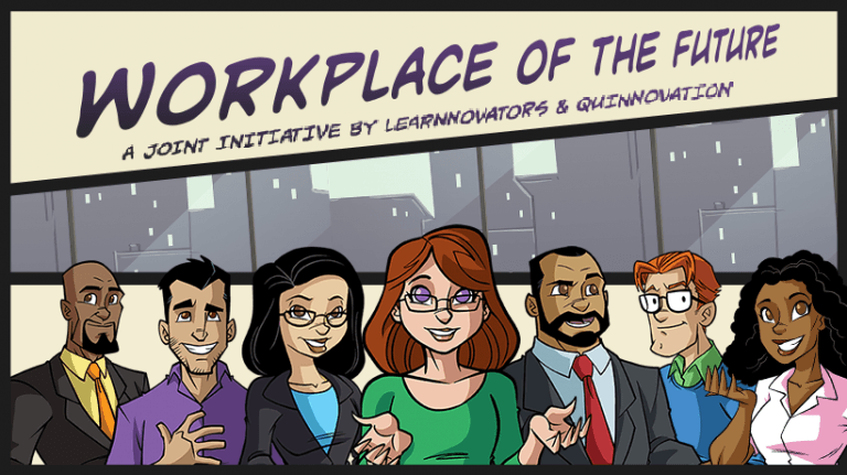
6. Visual Style
We have used a graphic novel approach for the visuals – it’s new and fresh, and not used enough in eLearning. Moreover, we ensured that we could get a fair representation of characters from different backgrounds and cultures.
7. Interface And Navigation
We have taken into account that learners are intelligent, and that they will be able to deduce how to navigate the course and interact with the elements. So, while we’ve provided an initial heads up on the navigational elements, we have refrained from indicating, at every juncture, to "Click Next to continue". While we have left it to the learners’ discretion to sense the availability of the Next button and click on it when they want to move forward, we have presented subtle visual cues for other interactions.
The course, in addition to the characteristic navigational ingredients like Menu and Previous & Next, includes a couple of novel elements. These are:
a) My Chat.
Through this, learners can track the discussion in the scenario. It provides the dialog that has taken place so far in the form of a chat transcript.
b) My Path.
This is an iconic representation of the complexity of the scenario, with a set of dots that changes color as a learner progresses along. This is to indicate to the learner that their path is not linear, and that there are multiple other paths available.
c) Reference.
This is the content of the scenario, and is presented as a scrolling document. Learners who access the reference from a point in the scenario are taken to the section of the document that is relevant to the decision point they are in.
The course follows the open navigation model, wherein learners can move freely between the scenarios and the sections.
8. User Testing
This turned out to be one of the most critical components of the course design process. The feedback we received from testers (a representative audience group) was deep and insightful, and we were able to make several improvements to the content as well as the structure as a result of this.
Here’s a very brief overview of the underlying process:
- Very often, we diverged and then converged, taking the best of ideas from all quarters and adding them to the course.
- For every objective, we developed the practice first, and then the associated content. If there are multiple practices, then we developed the final, most difficult one first.
- As scenarios got more complex, we made flowcharts in PowerPoint to understand where each link was leading.
- We decided to use Articulate Storyline (the most appropriate tool for development in this case) after careful consideration.
- To ensure that we all had a fair idea of the outcome of a scenario, we decided on a few parameters before starting to write a scenario:
- The role played by the learner, and who they would be talking to in the scenario.
- The decisions that they would have to make.
- The misconceptions they are likely to have.
Here are the links to the four blog posts written by Clark Quinn on Learning Solutions Magazine:
- Post 1: Deeper Design: Working Out Loud
- Post 2: Deeper Design: Beyond Traditional Instructional Design
- Post 3: Deeper Design: Tweaking The Media
- Post 4: Deeper Design: Putting It All Together
- Post 5: Course Launch: Learnnovators And Quinnovation Launch Demo Course Based On Learning Design Best Principles
And, here’s the link to the free course: Workplace Of The Future.
Please check out the course and let us know what you think!