

The Importance Of Design
Product demos can make or break any learning technology company. An amazing amount of time is spent getting ready to do demos, coordinating them, and getting people ready to deliver them to prospects. When we deliver a demo, we want complete control of the parts of the product we want to show, so the buyer can appreciate the great features and gloss over any product gaps we have. We want to establish a great first impression.
Every time someone visits your website, you are essentially demoing your LMS. This is because prospects subconsciously think the quality of your website is equal to the quality of your LMS. They figure the same developers who did your LMS also designed your website. So, if your website is hard to navigate and cluttered, then your LMS will be too, in their mind.
Not all website visitors are like this, but a bad website will leave some doubt in their minds, which will make it harder to sell.
On the opposite side, if your website is clean, simple, modern, and easy to navigate, that positive first impression will make it easier to sell.
Key Components Of Great LMS Website Design
1. Focus On Your LMS Features
Most marketing people will tell you that you need to focus more on benefits than on features. But sometimes we can take this too far and not talk enough about the features.
Serious buyers who are considering your learning management solution have a list of requirements when they visit your website. Their list includes things like eCommerce, content authoring tools, xAPI, gamification, responsive mobile, etc.
When they visit your site, they want to see those things. If they cannot find the features they need, you will probably not make the cut.
Most buyers begin their LMS search with a list of 10+ vendors, with a goal to reduce it down to 3-5. So, they are dying to shorten that list. Not having the features they need is a great reason.
You have to understand that you should not turn your website into one big data sheet with a long list of features. You still have to convert your features into benefits and talk first about their challenges to set the stage for your product.
For instance, when describing something like gamification:
Say this: An easy and effective way to promote your courses and communicate the right learning behaviors with badges, tracking, and leaderboards.
Not this: Leaderboards, badges, points, prizes, progress tracking, and social learning.
2. Your Website Design Must Be Modern
To generate a positive first impression, there is nothing more important than modern design. Open any LMS RFP and you will find the requirement: “modern LMS.” Nobody has ever asked for an “old, outdated design.”
They all want modern because to them, modern equals “easy to use,” and that’s what everybody wants. You can learn more about the clients' needs and preferences in the eBook Top LMS Websites For 2020 along with selected website examples to give you an idea of the market.
They also equate modern with attractive looks. They want something to be proud of. Something that will make them look good. Something cutting-edge will make them look good to their learning audience and company executives. Your website must communicate this.
This is a more important requirement for software and other high-tech companies. They are all in the business of software. Your LMS will be facing their customers and their customers will think that your LMS is their software. So, when their customers and partners visit their website for training, they will see it as an extension of their brand.
Here are some great examples of modern LMS websites:
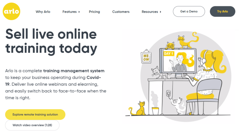
The Arlo website has a modern, clean look with inviting graphics, clear messaging, and good navigation.
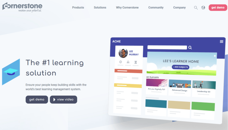
The Cornerstone website is a great place to visit, with open, airy design and animated screenshots that bring the product to life.
3. Think Mobile-First
How many of your prospects visit your website for the first time on their mobile device? It is probably more than you think. Unfortunately, most of us focus most of our energy on the desktop version of our site. We work hard to make everything fit perfectly on our big screens and when it translates into a small screen, it can look like an afterthought.
Having responsive design is critical, but that’s the minimum requirement for a good mobile version of your website. A lot of LMS vendors take it one step further. They use a mobile-first approach to design the mobile version first, then move to desktop.
Here are a few great examples of mobile-first LMS sites:
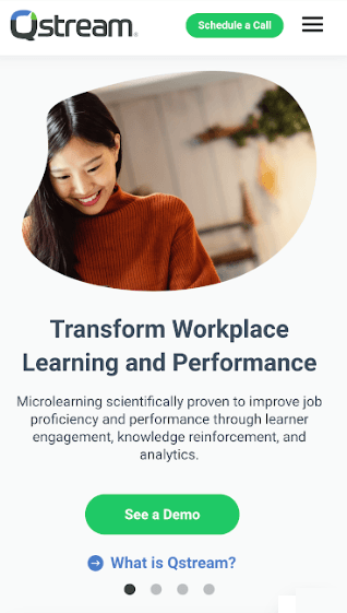
The Qstream website is a page-turner, with fluid, easy navigation and scrolling. It feels good to be there and move around.
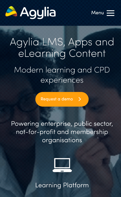
The Agylia website is optimized for mobile devices. It looks great on a phone and a tablet. Design-wise, it does a good job balancing text and images.
4. The Clean And Simple Website
When we set out to build a new site, we all want to build it “clean and simple” because that’s what we want in the websites we visit. We get annoyed by websites that tax our brains. And probably, when we decide to redesign our website, it is almost always because our current site has become cluttered and difficult.
When you think about a clean and simple website, you might first think about the Apple website or at least the Apple products. They are the popular example of clean product design.
But there is an important reason Apple is so good at this. With incredible discipline, Steve Jobs exhibited a relentless determination to create products that were clean and simple, often challenging everyone who worked for him. His philosophy and stubbornness filtered down to the rest of Apple and it has stuck, even after his death.
Most websites are created to be easy to navigate, but then we add this and that. Before long, it is a cluttered mess. Years later, we decide the only solution is to start again, and this time, make it clean and simple.
Remember that to achieve “clean and simple,” you need strong discipline now, 6 months from now, 12 months from now, and forever.
One way to avoid creating a mess over time is to remember that if you add something to your site, then you must take away something. If you want something to stand out, then you must de-emphasize something else.
Here are a few good examples of clean and simple LMS sites:
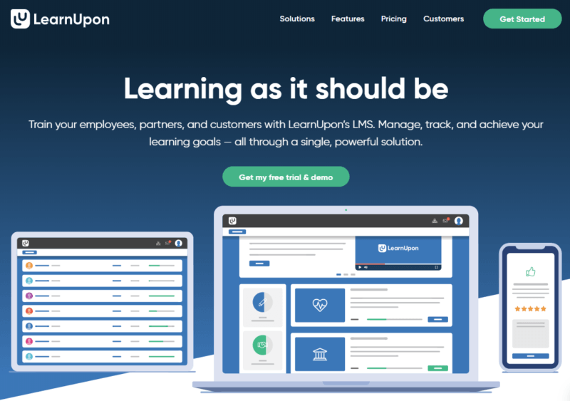
The LearnUpon website is simple and classy but not boring. You can spend a lot of time on their site without getting tired of being there.
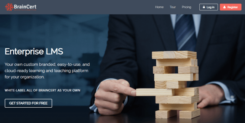
The developers at BrainCert showed great discipline by reducing their messaging down to the essentials and filling open space with large and clean images.
5. Show More And Say Less
Speaking of clean and simple, what is the number 1 thing that messes up open and airy design? Text. Large blocks of text!
Mark Twain once said, “If I had more time, I would write a shorter letter.”
All of us tend to write too long. When we do not know what’s important to buyers, then we write everything. This becomes too much text and too much information for prospects to get through. Your most important messages—and features—will get lost.
So, learn what your customers care about so you can write less and be more focused. The result should be more graphics and white space and less text.
It helps to know that the purpose of a website is to give buyers just enough information to generate a response. So, do not say everything. Leave some mystery. Give them the better half of the story and make them contact you for the other half.
6. Calls-To-Action (CTA) Throughout
Your website is mostly designed to educate visitors, but beyond that, it should be all about converting those visitors into leads. Converting visitors into meetings and converting qualified buyers into opportunities, setting demos, beginning free trials, and consuming blogs and other resources.
Give your Calls-To-Action prime real estate. As they say, “always ask for the sale.” On your site, always ask visitors to take action.
There are great tools to help with this, like “exit intent” popups and live chats. Try them all and see what works.
Here are some great examples of LMS vendors who are adept at generating response:
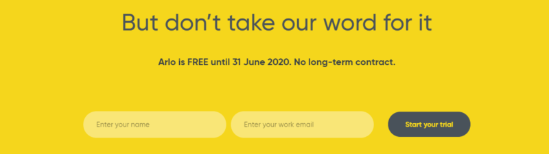
The Arlo website is the best designed LMS site we reviewed and part of the reason is their Calls-To-Action, which are conversational and inviting.

Litmos is one of the fastest-growing LMS vendors in the world, and you can see this in the design of their website. They know how to sell and they make their Calls-To-Action as simple and straightforward as possible.
You will be in great shape if you do all these things well since very few learning technology sites do everything well. If you can be one of the good ones, then good things will happen.
The Top 10 Best LMS Website Designs
After reviewing 350+ learning system websites, we selected the following as the 10 best, plus 10 bonus sites. The main criteria we looked for were simplicity, modernness, great looks, mobile design, and navigation.
Best Designed LMS Websites 2020—Gold Award
Best Designed LMS Websites 2020—Silver Award
Best Designed LMS Websites 2020—Bronze Award
Interested to learn more? Join the webinar How To Build A Powerful LMS Website: Lessons From The Top 10 LMS Websites In Content, Design, And SEO and find out how to build an effective marketing strategy by following the insider tips and know-how it has to offer. Make your LMS solution stand out and become a leader in your niche.

