


Drawing Inspiration From Video Game Approaches
Every video game is a journey. Whether you’re venturing through fields of pampas grass in Ghost of Tsushima, or over snowy mountains in God of War, you’ve embarked on a quest of discovery. Your travels are meant to challenge you, but they aren’t meant to hinder the completion of your journey. Similarly, eLearning whisks you on journeys of exploration and learning. As eLearning designers, what can we do to challenge our learners without hindering their progress?
Let’s draw inspiration from the approach used by Santa Monica Studios to build the accessibility features in their action-adventure epic, God of War: Ragnarok. This video game includes visual, auditory, motion, and motor accessibility features that players can toggle to customize their experience, according to their play style.
Rather than first building a complete game and figuring out how to make it accessible, Santa Monica incorporated feedback from players at the early stages of its production, to embed accessibility features as part of the game experience. "Nothing about us without us," a popular slogan championed by disability rights groups and advocates for inclusion, lies at the center of this approach.
The features Santa Monica implemented aren’t simply used by people with visual or motor impairments. They are being universally enjoyed by all players to create an experience that brings them the most satisfaction. The high-contrast settings available made my own game play sessions more enjoyable, as I could use it to spot hard to see objects. Similarly, by providing opportunities to personalize learners’ experiences to their comfort and convenience, we can allow them to make the best use of their learning. Our learners should not be forced to learn in discomfort. Our products need to put more personalization features in the hands of the end user.
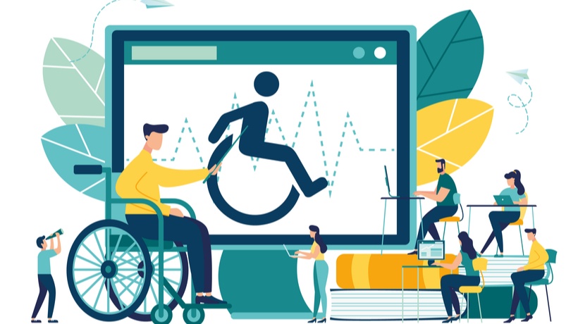
Accessibility is the design of products, devices, services, or environments in a way that they are fully usable by and understandable to everyone. It’s achieved through effective product design, so that it can be used by anyone, regardless of the barriers they face. And personalization plays a big role in that. As accessibility features and recommendations are personal to everyone’s needs, this article isn’t an exhaustive review of every possible design decision. However, it's a good place to begin our journey to create eLearning for everyone.
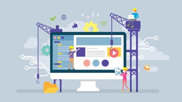
Accessibility Features For eLearning, Inspired By God Of War: Ragnarok
For Learners On The Autism Spectrum
Designing eLearning for learners with autism spectrum disorder (ASD) follows the fundamentals of design. Chances are, you’re already building according to these principles—but it always helps to refresh your memory on why you're doing so.
- Simple colors instead of bright saturated tones benefit learners when it comes to interpreting visual information.
- Calming, non-intrusive music in videos benefit learners sensitive to noise.
- Eliminating jargon, confusing language, and idioms benefit learners with different pragmatic language abilities. So that whole sentence? Turn it into this: learners stand to benefit from jargon-free, clear language choices.
And that’s not the whole of it! Creating consistent, simple layouts that are easy to navigate, ensuring buttons are properly identified with text, using bullet points as opposed to walls of text: they’re all standard principles of User Experience (UX) design, and they all benefit our learners. In Ragnarok, the option to turn off the background music helped me concentrate during the most challenging battles.
For Learners With Dyslexia
15% of adults go about their lives with dyslexia. So, are our courses written with them in mind? Learners with dyslexia have varying struggles with reading, leading to difficulty in comprehension. Here are some principles we can follow:
- Use high-contrast colors
They help distinguish between objects and improve readability. It also helps to use single-color backgrounds. - Use sans serif fonts (like this one!)
It helps distinguish the individual letters. Font size, inter-letter spacing, and inter-word spacing all improve readability. - Use left align for text
It’s easier to find the start and end of each line. - Use images, diagrams, infographics, video, and audio to bolster textual content.
There’s more. Enable zoom for images and infographics. Consider a toggle feature or a slider that allows learners to change the contrast between the background and text or images; maybe even include a toggle or slider to make the text larger. As an example, in Ragnarok, having the option to use high contrast settings to solve puzzles throughout the game significantly improved my game play experience.
For Learners With Low Vision Or Color Blindness
Some strategies used to design for low vision, like the use of high contrast objects and larger font sizes, overlap with the design choices for dyslexia. Let’s consider a few new ones:
- Avoid using color as the only way of communicating a message
While green for "go" may be a trivial choice for some people, for others it can mean missing out on important cues. Consider using arrows instead. For charts, instead of relying solely on color, include patterns and textures. - Build in consideration for screen readers
Ensure headings are included and pertinent, use alternative text to describe both the image as it appears and the message it intends to convey. Idea: try a free screen reading software with your course and reflect on what can improve the experience. - Include recordings of the text
Providing alternative ways to access the same content is a principle of universal design for learning (UDL) and good design.
With so many reasons to be on our devices, it’s no wonder digital eye strain is so widespread. Learners may have blue-light filters enabled on their devices to protect their eyes, which alters the colors displayed on the screen. Consider allowing learners to choose from set color themes to alter the learning content. Ragnarok offers players plenty of options: to toggle icon sizes, play with color selectors, reduce flashing, menus for screen readers, screen color filters, and many other choices.
For Learners With Physical Or Motor Difficulties
Not all of us use a mouse to navigate our devices. Just imagine the different devices that can be used to access this article! Designing with this in mind ensures our products are navigable from any device, both at present and in the future.
- Enlarge interaction fields
This makes it easier for learners with alternative devices to select and interact with the fields. - Design courses navigable by keyboard or speech
Assistive technology has made tremendous progress over the years to include speech recognition software, mouse alternatives, and on-screen keyboards, and so can we! - Ensure course interactions do not require extensive motor skills to complete
Yes, this does mean you will have to revisit your super cool drag-and-drop activity, but it’s all for the good of the learners—we promise.
Also consider incorporating keyboard shortcuts into your course (wouldn't it be great if learners could press "M" on their keyboard and be taken to the course menu?) and including a "table of contents" section where learners can easily skip to previous sections, rather than having to scroll/select the back button repeatedly. In Ragnarok, I had plenty of motor accessibility features turned on to help me play the game the way I wanted to, such as auto-pick up, traversal assist, button holds, etc.
For Learners Who Are Deaf Or Hard Of Hearing
We’ve explored audio materials as supports for visual or reading impairments, but audio content should also be made accessible to our learners.
- Provide captions and transcripts
Essentially, avoid sound as the only way of communicating a message. Consider including captions for videos that include environmental noises—or better yet, allow learners to select the depth of the captions, by giving them the option to decide what noises they would like to be captioned. - Eliminate nonessential music
That guitar riff may be quality music, but it may aggravate those with hearing impairments like tinnitus. - Allow playback at different speeds
Some individuals may take longer to process auditory information, while others aren’t stimulated by the regular speed.
Technology has ushered in a new era of accessibility. It is no longer simply about including sans serif font and video captions (though they are fantastic steps!). As learning experience designers, let’s go deeper. Providing our learners the opportunity to customize their experience, whether through color-coded captions, playback speed, overall color schemes, scalable text—or any other idea not discussed in this article—allows them to better personalize their learning journeys.
Having the option to caption non-speech audio and using direction indicators of sound actually helped me get the platinum trophy in God of War: Ragnarok, as it made hunting down those pesky ravens so much easier!
Conclusion
Perhaps you are already in the process of implementing these features, or you’re working with your team to figure out how to include a certain feature without breaking anything. You can overcome these challenges, and it is worth the effort. The inspiration to do better can come from anywhere—a video game like God of War: Ragnarok, or an article like this!