


7 Ways To Effectively Improve Your eLearning Course Cover Design
People will judge your eLearning course based on your cover design. So, this implies that crummy graphics, inconsistent texts, color, and grammar errors are equal to a flawed eLearning course. However, this is because people won't want to open course content with a shabby cover design. It is therefore wise to put effort into improving your eLearning course cover design so it can attract more participants. In this article, we will talk about steps to improve your eLearning course cover design.
1. Apply The Visual Hierarchy
Distinguish your text from the top to the bottom design to allow learners to pick the most vital information at first glance. For example, if you see a course cover design that has font sizes, styles, and colors that are all the same, how would you rate such a cover design or eLearning course? And compare it to when you develop a cover page by adding text font styles and sizes, adjusting the text position, text color, and background color.
2. Get Ideas From The Internet
If you search Google, you will find a lot of internet resources that can help you with your design. The internet has several resources that can give you inspiration on how you can design your eLearning course cover. Furthermore, make sure you do not copy ideas directly but look for inspiration.
Also, an authoring tool has many presets that you should make use of when designing your eLearning training course. Another thing you can do is to combine ideas from two or more different design ideas. For example, you can copy the layout idea from one design online and copy text style from another to build your cover design.
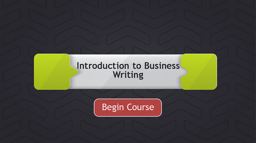
3. Keep It Simple
Less is more, so keep your cover design as simple as possible. Don't bore your learner with too much unnecessary information on your cover page. On your cover page, add the most vital information that describes your eLearning training course. For example, if your cover page is full of unnecessary text, your learners may get distracted and probably take their focus away from the eLearning course content.
4. Use Plenty Of White Space
To avoid bombarding your cover page with too much text, make use of white space. After a line of text, you should add a line or two before another line of text. It will help your cover page be as neat as possible. Make sure not to overdo it because it can cause your cover pages to look ridiculous. The spaces will make your design elements stand out.
5. Play Where Appropriate
Why you are concerned about being professional, your cover page should be fun to read. Play around with the content (if necessary), and depending on the subject, humor could make your eLearning cover page stand out from the rest and increase its chances of getting clicked. Don't do too much because it can make your work look childish. Try to keep it as simple as possible.
6. Mix Mediums To Help Your Design Stand Out
Be creative when designing your eLearning cover page. You don't necessarily need to do things the same way you had been doing them. Video and animations can be incorporated into your cover pages to tell your audience what your eLearning training course is about. And, it will allow you to display multiple scenes and characters instead of just adding only text and images. Nowadays, people prefer video to text.
7. Think Interactive
Always remember that you are designing eLearning interactive content and not static learning. The designs need to be interactive. However, you will need to ask yourself some questions before you design your eLearning course cover page. What kind of animation can I add? What elements will be clickable on my course cover page? How can I nest information behind interactions to make my designs more fascinating and engaging? How will this interaction work on different devices? When you answer all these questions, you will be able to design an interactive and responsive cover page for your eLearning course.
Conclusion
Many people judge books (and even eLearning courses) by their cover page. However, the cover page is an opportunity for you to sell your learning training course to your audience. If the cover page is good enough, most of your audience will subscribe. On the other hand, if the cover page is shabby looking, many will click away from the course without going through the eLearning training course. It is commonsense to invest money and time into designing a quality eLearning training cover page.