


Accessible Visual Design In eLearning
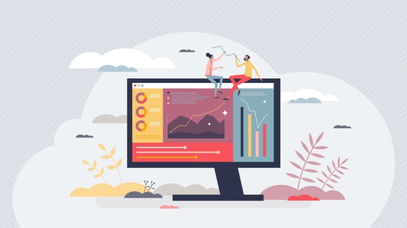
Modern eLearning must include visual design. It is crucial for drawing interest and getting a learning experience off to a good start. Some learning sites have designs and fonts that are old or disorganized and, as such, do not get the attention needed to keep their audience to stay and learn. Most people focus on just the content of the courses. However, they fail to realize that the design and visuals are also just as important.
Research shows that 94% of first impressions in digital communications are design-related. This further shows the fact that design is very important, and not just design, but also great design. Additionally, visual design in eLearning can raise course completion rates, learner engagement, information retention, and the navigational experience for users.
Accessible design is a design technique that explicitly takes the needs of all individuals into account. Accessibility is frequently defined as the ability of people with a range of disabilities to use facilities, services, and products on their own. Creating accessible visual design must therefore also cater to people with disabilities.
A Simple Guide To Creating Accessible Visuals
To build visually attractive and accessible eLearning courses, you don't need to be an expert graphic designer. But you do need to understand the basics. Let's look at a few visual design pointers to advance your eLearning program.
1. Colors Are Important
Your eLearning course's colors each have a distinctive effect and appealing appearance. Colors can be changed into different moods and emotions by the human brain. HubSpot found that posts and tweets with colorful graphics significantly improve readers' inclination to read, by an astounding 80%! When carefully chosen, colors may make dry information appealing and compelling, helping students to quickly absorb and digest the knowledge.
Using an accessible color palette generator to create color schemes for your designs is a great approach to ensuring visual design optimization for your course. Readers with visual impairments can see and understand your design thanks to this accessible color scheme. To accomplish this, contrast is essential. Even people without visual problems find it challenging to discern elements with low contrast. The brightness or vibrancy of a color or element in opposition to another element is known as contrast. A few guidelines for using colors for your course:
- To draw attention to crucial information, use contrasting colors. But avoid becoming very contrastive.
- Avoid using contrasting colors since they could cause students' brains to become confused.
- If there are too many colors used throughout the design, it will appear chaotic and disorganized. Therefore, it is advised to stick to three or four colors for the duration of the course.
- Before choosing colors, consider the learners' backgrounds, including their age, education, and religion, as these factors directly affect how they perceive and enjoy colors.
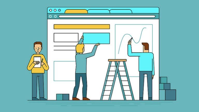
2. Select A Simple Accessible Graphic Design
Put yourself in the learner's position before you design any graphics for your eLearning course. Ask yourself: "What kind of graphic would make this topic easier for me to understand if I knew nothing about it?" Be practical, focus on simplicity, and consider the basics. Creating a few sketches of your thoughts also helps. Then, choose your greatest concept, and make it a reality.
For example, making an infographic on a topic about import and export gives a visual representation of what is being taught and makes it easier and simpler to understand. Accessible infographic examples are easy to understand for those with cognitive disabilities, identifiable by screen readers, and easy to read for those with visual difficulties, such as color blindness. With your focus on simplicity and practicality, you can find various graphics design tools online. Consider using graphics design software or providers as well.
3. Use Applicable Pictures
There are a lot of useful stock images on the internet today that you can use with your eLearning courses, and they don’t always have to be boring, black and white, generic pictures. Choose pictures that will resonate with and be relatable to your readers. Keep your visuals current and consistent with your brand. Research helps us understand that only 10% of the information that people hear is likely to be retained in their memory 3 days later [1]. However, when the same knowledge is combined with a pertinent image, individuals still remember 65% of it 3 days later. A few tips for creating accessible pictures:
- Make sure that each image has a clear, detailed caption.
- When written content could convey the same message, avoid utilizing images.
- Make connections to concepts by using icons as helpful visual clues. Use icons only when necessary; do not use them as ornaments.
- Use well-known icons that people are used to connecting with typical acts, such as a trash can to symbolize erasing something.
- If you want to utilize text over a picture, give the image a solid background or a dark overlay.
4. Pay Attention To Font Size
Clean and thin fonts are common in contemporary design. Although lovely, lightweight fonts are difficult to read. Maintaining a font size of at least 12 points is crucial. Any user will find it challenging to read anything with text that is smaller than that. Your website's User Experience can be greatly impacted by the font and color choices you make. Try out different fonts, font sizes, and font weights. You might find that adjusting the font offers a superior User Experience for everyone who visits your website.
5. Make It Interactive
A straightforward yet effective technique to improve your learning program is to include interactive aspects in your course. With the help of components like quizzes, flip cards, and sorting exercises, you may transform a lackluster eLearning course into a potent learning occasion. Software such as screen readers make interaction easier for people with disabilities. It allows for a person who is blind to have the website's content read to them.
A screen reader is unable to interpret many elements of a webpage. A screen reader won't be able to communicate content to the user that is contained in text that is contained within an image. In this case, alt tags are necessary, because screen readers are unable to read or understand images. Therefore, adding alternative tags to pictures are also very important.
6. Be Consistent
A fusion of all the guidelines listed above is what this is point is all about. A well-organized course, with great theme colors and appropriate images, will get the attention of everyone. On the other hand, a poorly put together course, with generic and boring images, might not have the same effect. As much as you want to be creative in your design, consistency must also be your watchword.
Alt texts must also be consistent and not confuse the screen reader or the listener. Colors, fonts, and designs must look the same and be easily understandable and accessible. Otherwise, readers can become easily bored or even frustrated at the course. Designers frequently concentrate solely on the visual components, such as the logo's appearance, the most efficient layout, the colors of the call-to-action buttons, the presentation of the content, and the like.
Making sure that the site design is accessible for those who are visually impaired is one area that is sometimes overlooked. When presenting changes over time, for example, make sure your timeline design is attractive and accessible to people taking your eLearning course. Although some may view this as "additional" work, there is an ethical component, and it can also have long-term benefits.
Components That Make Up Accessible Visuals
- Title
Certain designs may be challenging for visually impaired individuals - Language
May be challenging to read for visually impaired individuals - Keyboard navigation
May be challenging for people who have motor issues - Text
May be challenging to read for colorblind individuals who experience learning challenges - Links
May be challenging to read for visually impaired individuals - Images
May be challenging for visually impaired individuals - Videos
May be challenging to follow for hearing-impaired individuals - Responsiveness on mobile devices
May be challenging for people with motor issues if not very/extremely responsive - Forms
May be challenging to navigate for people with visual or movement impairments
Importance Of Accessible Visuals In eLearning
Why are visuals important and why do we need them in our eLearning courses? Accessible technology can make website navigation possible and/or easier for a large percentage of computer users.
Inclusion Inspires Innovation
- Everybody feels seen and wants to relate with your eLearning course that accommodates them
- Learning is closer to people and more accessible
Conclusion
Many websites and digital platforms are now inaccessible, making it challenging or impossible for individuals with impairments (including those involving vision, hearing, physical ability, speech, cognitive ability, or neurological impairment) to utilize them. Applying necessary visuals to your eLearning course greatly improves the experience of your training and tutoring. As much as it is not a shortcut to getting things done, it is very essential. Getting a grasp of it will ensure success in learning.