


Learn Why You Shouldn't Offer Tutorials For eLearning
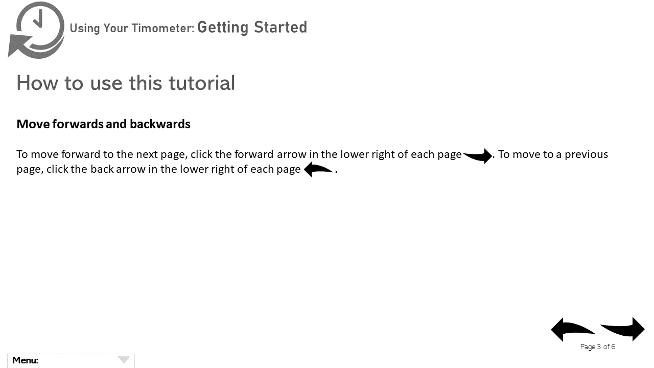
I’ve built hundreds of online courses and wondered if the common practice of providing instructions on how to use each course is a good idea. Below is an example of how to use the course page from a hypothetical eLearning course. Part of the tutorial, as shown below, is how to move forward and backward within the course. Good idea? Here’s what very current research indicates: Maybe not.
Research On Using Tutorials
Did tutorials help? Here’s what usability research showed.
Nielson Norman conducted a usability test with 70 users using four simple and new (to the user) mobile apps. Participants were randomly assigned to one of 2 groups:
- Group A (35 participants): used the tutorial before completing the tasks
- Group B (35 participants): skipped the tutorial before completing the tasks
A user analytics app gathered data on:
- Success rate: completion of the task
- How difficult users found the task on a 7-point rating scale (single ease questionnaire or SEQ)
Here’s how this common usability measure appears to users:
Overall, how easy or difficult did you find this task?
Very difficult 1 2 3 4 5 6 7 Very easy
- Task competition time: how long it took to complete the task
The tasks users were asked to perform were described in the tutorials, so theoretically, Group A should have had more success in doing these tasks. But that’s not what happened.
- Success rate
Researchers calculated task success for the tasks: 91% for Group A (read the tutorials) and 94% for Group B (skipped the tutorials) were successful. Statistics performed on these results showed that both groups performed equally. So nope, Group A didn’t have a higher success rate. - Single ease questionnaire (SEQ)
Researchers asked participants to rate the difficulty of the task on the SEQ 7-point rating scale. Group A (read the tutorials) had an average SEQ of 4.92. Group B (skipped the tutorials) had an average SEQ of 5.49. That means that Group B rated the tasks as easier than Group A. Statistics performed on these results showed that participants who read tutorials perceived the tasks as more difficult than those who skipped tutorials.
Wait, what? Shouldn’t Group A have perceived the tasks as less difficult? That seems logical but it’s not what happened. Researchers felt that having a tutorial tells users that the task is difficult, so we need to explain it to you. Researchers thought that the tutorials may have overloaded viewers and made the tasks seem harder. Tasks that aren’t complex probably don’t need and likely shouldn’t have tutorials.
- Task completion time
Task completion time was calculated only for completing the tasks and did not include using the tutorial (for Group A). Group A (read the tutorials) had a mean task-completion time of 93.49 seconds. Group B (skipped the tutorials) had a mean task-completion time of 85.17 seconds. Statistics performed on these results showed reading the tutorials did not make users faster at completing the tasks.
Yeah, But…
This study focused on four simple iOS applications. As a result, it’s possible that these results may not apply (or apply fully) to Android applications, other applications, or more complex applications. They may not apply to eLearning courses because of the differences between mobile apps and eLearning courses. And the number of people studied was relatively small.
I usually report on the preponderance of results from many studies. Lots of people. Robust results. Preferably from training studies. Why did this study catch my attention? And why discuss it?
It’s super easy to think we are doing the right thing when we are actually making it harder to learn. In this case, showing people how to use the apps increased unnecessary cognitive load, and increased cognitive load made learning seem harder and lowered results (speed, perception of effort, ability to complete the task). This result helps us understand that we must design so we don’t overload people and make it harder to learn. That’s one of the reasons why I so often discuss how to get rid of unnecessary cognitive load in our writing and in multiple-choice questions, and elsewhere.
Implications
The chief implication cited by the author of this research article is to think hard when considering developing a tutorial for a simple application. She says we’d be better off making the interface easy to use than developing a tutorial and asking people to use it.
Here are just a few of the issues:
- People are unlikely to remember what we tell them upfront because they have little context for using it yet. Showing a lot of how-to information before they even get started simply adds unnecessary cognitive load.
- Many people are unlikely to read these tutorials and will try to figure it out on their own anyway. That means we’d better make navigation simple (and consistent) regardless.
- Adding a how-to-use section may cause anxiety because most people think this section means it’s hard to use.
Interestingly, these researchers did similar research on adding instructions in mobile applications earlier and found similar results. They said that we simply can’t expect users to read instructions before using applications. People are usually there to get something done in the least amount of time using the least amount of effort. Adding a tutorial adds effort that isn't needed.
In the earlier, related research, they also showed that we must be careful of pushing frequent hint screens because they also cause overload. How many times have you closed the hint screen without even reading it because it was in the way of what you wanted to do? Working memory has a very limited capacity for taking in this kind of information, and when we try to add too much information, too fast, we simply can’t handle it. As with the app tutorials, they found that pushing out hints makes people anxious about the complexity of the application.
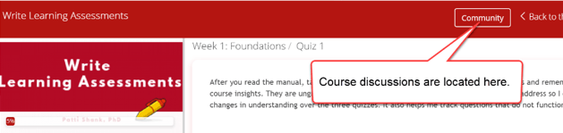
Rather than providing tutorials, the author recommends context-sensitive help, which offers specific and context-sensitive help at the moment of need rather than just in case.
Context-sensitive help provides answers to questions that need to be answered right now without requiring the user to locate and then read the documentation. And, it can be simple. For example, in the first few sections of my Write Learning Assessments course, I show how to get to the discussion area when people need to use that course feature, as shown below.
 Bottom line: Don’t add content that increases unnecessary cognitive load. Design for simplicity and use conventions people already know. Make it easier.
References:
Joyce, A. (March 8, 2020). Mobile tutorials: Wasted effort or efficiency boost? Nielsen Norman Group.
Nielsen, J. (April 24, 1994) 10 usability heuristics for user interface design. Nielsen Norman Group.
Harley, A. (February 16, 2014). Instructional overlays and coach marks for mobile apps. Nielsen Norman Group.