
8 Strategies To Use Scrolling Page Designs In Your eLearning
Online content that uses scrolling really isn’t new – it was big in web design way back in the 90s. Now, in the era of multi-device content, it’s having a resurgence. When we open digital content on our mobiles or tablets, our fingers and thumbs twitch as we wait expectantly to scroll through it. This is such an embedded behavior that even children try to scroll TV monitors and books. The trick is to make the usability of your scrolling design obvious and easy – using the top part of your page to grab attention and "advertise" what’s below. Why might you use a scrolling page over lots of smaller pages connected with buttons?
Scrolling designs are particularly great for:
- Visual storytelling.
- Creating cohesive, branded experiences.
- Processes and linear content.
- Quick glance and performance support content.
- Marketing your learning.
- Coaxing learners to find out more.
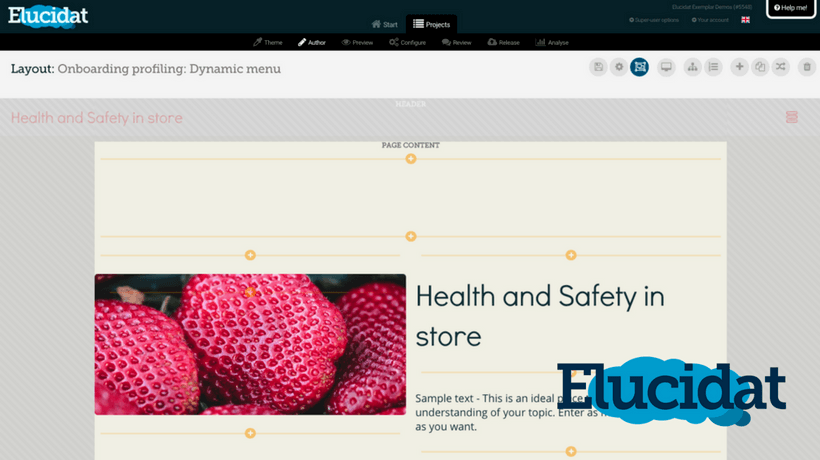
It’s easy to create scrolling pages in Elucidat using Layout Designer, where you can lay out longer pages however you like, and even use animation effects to drive visual interest as content appears.
But, as with anything design-related, just because you can doesn’t mean you should. If you’re going for the scroll, you need to consider page length, layering, and complexity of page components – and when to say "enough is enough." Sometimes, you just need learners to click to another page, because it’s a whole new chapter.
So, how can you use scrolling page designs in your eLearning? Let’s look at 8 tips, tricks, and demos to help you create scrolls that rock 'n' roll:
1. Use Scrolling Pages To Grab Attention

Scrolling pages are great for grabbing your audience’s attention. For example, follow this visual magazine style layout, which plays with fonts as well as graphics within a scrolling layout.
This example by tech giant Atlassian uses scrolling pages to deliver some key facts in a concise and clear way, grabbing attention and beginning a process for behavior change.
The site draws on key stats and facts about how we all waste time at work. Chances are, you’ll only remember one of these – but it’ll get you talking and probably make you follow the link at the end to find out more.
Click here to see Atlassian's scrolling page example.
2. Use Scrolling Pages To Enhance Your Content

Grab attention and support more campaign-based learning projects with comms-style scrolls.
When you need to change people’s behaviors, there are different routes you can take. Sometimes, your audience just needs information to help change their thinking.
But there are ways and means to do this. Smart Serve Heroes’ campaign-like approach is designed to grab the attention of their customers (to drive a change in their attitudes toward bar staff). It is a great example of using scrolling page designs to get the point across in seconds – memorably.
Why we like it:
- The layout is broken up into discreet eye-catching panels, each with a slightly different background color.
- It pays attention to the use of fonts and font size to grab attention and make points quickly and clearly.
- The images all have subtle animation effects when the panel first scrolls into place.
Check out this scrolling page example.
3. Use Scrolling Pages To Enhance The Navigation Of The Learning Experience

Modern web experiences often use scrolling, either as a form of navigation or to clearly present information within one window. This is easily achievable in Elucidat.
For example, this lovely scrolling website from Volkswagen uses some great design techniques to offer a clean, clear and effective content experience.
You can’t help but click a car to find out more.
Click here to see the Volkswagen scrolling page example.
4. Use Scrolling Pages To Give Your eLearning Better Flow
Create learning content that seamlessly flows, with a strong sense of brand story.
This Elucidat demo shows how you can neatly combine interactions, questions and strong visual presentation to make a discreet topic about a subject. For example, a course could have five or six of these discreet pages about specific topics.
Click here to see the "How to make a cup of tea" demo.
5. Don’t Worry About Designing ‘Above The Fold’
There’s a temptation to present a lot of content above the fold (the top part of your page, and the natural amount of content that shows on a mobile device). But research actually shows that it’s best to have a small amount of eye-catching content that intrigues learners to scroll down for more.
Go for white space, strong fonts and imagery – with a hint there’s more below.
As per this advice, avoid stark horizontal lines – particularly high up, as they mentally "block" people from scrolling.
6. Make Sure All The Content Connects
If you’re creating a scrolling page, it’s important the content all belongs and connects together.
Use your page to tell stories, walk through a new process, introduce a team, give a tour to new starters, explore a company’s values and more.
7. Keep Your Content Bite-Sized
Even the most amazing scrolling sites need to know when to stop. Don’t be tempted that just because you can keep stacking content down your page, you should keep going.
Chunk your content down, thinking about what action or objective each bit aims to meet. Think of a page as a mini topic and make it focused.
Five or six elements is probably enough.
8. Mix Up Your Content With Long And Short Pages
Can you mix up scrolling pages with non-scrolling ones? Sure. But have a strategy to ensure you are consistent in how you’re using longer scrolling ones and pages with just one item, so users know what to expect.
For example, you could have a topic as follows:
- Overview of 5 steps to running a performance review - long page.
- Watch a video and vote on how well the conversation went - shorter page.
- Add depth to the 5 steps - long page, same format as before.
- Watch another video and vote on which steps they nailed - shorter page.
- End with some quick tips/actions - short page.
Final Thoughts
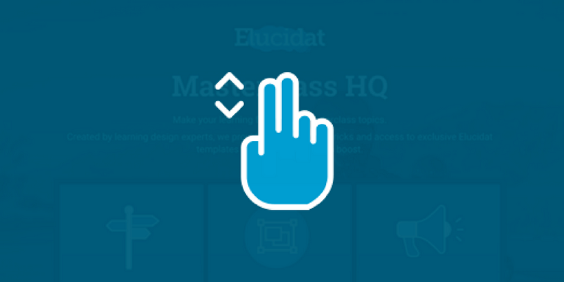
Ready to improve your learning design skills? Consider registering for our Masterclass training series. Learn more about using scrolling page designers, Elucidat’s Layout Designer and Styles to create better eLearning for your organization.
Click here to learn more about Masterclass HQ.