

Why Your Smile Sheets Are So Ineffective
Before we jump into this, let me acknowledge the many names we use for the survey-like questions we present to learners: I call them smile sheets, but they are also called happy sheets, response forms, reaction forms, evaluations, level 1s (after the Kirkpatrick Model), and so forth. I’ll mostly use the term “smile sheet”, but sometimes I might use one or more of the other terms as well - just to keep things interesting.
So, this is the second article in a series on how to improve our smile sheets. Article #1 highlighted the troubling fact that traditional smile sheets are virtually uncorrelated with learning results!
If you get high marks, you might have a fantastic learning initiative; or a terrible one. Get low marks, your Instructional Design could be disgraceful or wonderful. With traditional smile sheets, we just can’t tell. And that’s more than sad, isn’t it?
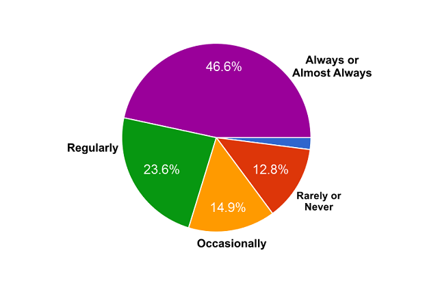
Let’s review what we found out last time. When we asked you –the readers (148 in total)– whether your organizations used response forms, 70% said regularly or almost always.

When we asked you –the readers– what you use your smile sheet data for, you responded:
- 61% -- We decide what to improve in our training programs.
- 46% -- We give your instructors specific feedback about how they can improve.
- 28% -- We decide whether to invest in improving a training program or not.
- 21% -- We decide whether to keep a training program or get rid of it.
- 10% -- We decide whether to invest in improving our Instructional Designers or not.
- 10% -- We decide whether to keep our instructors or not.
- 3% -- We decide whether to keep our Instructional Designers or not.
When we asked you and other readers to respond about why you gather smile sheet data, you responded:
- 49% -- To demonstrate/prove the value of or training programs.
- 37% -- Because the organization wants to see learning data.
- 25% -- To demonstrate/prove our value as purveyors of learning.
When we asked you about the approach your organization takes in using the data, you said:
- 34% -- We mostly skim the data, looking for out-of-the-ordinary results.
- 15% -- We mostly ignore the data.
- 10% -- We mostly fail to collect the data.
Before we draw firm conclusions, we should reflect on a couple of things. First, we don’t know much about who responded to our questions. Researchers call this a “convenience sample” and are leery about drawing firm conclusions. Second, we have no way of knowing how accurate people can be in answering our questions. That being said, it’s still fun to think about what the data might mean. Feel free to leave a comment below with your reflections!


Several things strike me about these findings. First, it looks like trainers and instructional designers are NOT held accountable for smile-sheet results. Only 10% of you said your organization used smile sheet results to determine whether to fire trainers. Only 3% said the data is used to determine the future employment of instructional designers. Apparently, while few trainers are at risk, almost no instructional designers are at risk. What’s the fun of that? Indeed, accountants may have a reputation for being dull and playing it safe - but in fact, it’s us Instructional Designers who are risk averse!


I also note that a ton of us seem to skim the data looking for out-of-the-ordinary results. This, of course, is a major freakin’ problem! We shouldn’t have to skim data to look for problems, the data should provide its own red flags. Bias is introduced when our data is so fuzzy that we have to look for “out-of-the-ordinary” results. This is a problem with Likert-like scales and numeric scales, by far the most common method used on our learner response forms. More about this below!
The two most popular responses are the ones that make me want to dive deeper into the responses.
- 61% -- We decide what to improve in our training programs.
- 46% -- We give our instructors specific feedback about how they can improve.
I’ve talked with myriad learning professionals over the years –and I’ve reviewed hundreds of traditional learner response forms– and what I’m dying to know is how we can look at the fuzzy data that learner response forms generate and intuit specific ideas for improvement. It doesn’t really make sense, does it? Here’s my hypotheses on how some of us do this – even in the face of the obvious difficulties:
- Perhaps some of us get feedback in open-ended questions – feedback that is specific enough to enable guidance for trainers and Instructional Designers. I myself have benefitted from such feedback when I was a middling leadership trainer.
- Perhaps when we notice red-flagged results we dig deeper and/or audit the learning program to look for areas of improvement.
- Alternatively, perhaps when asked about how we use smile-sheet data, we choose socially-desirable answer choices; those that suggest we use the data to make improvements in the learning. We know we should use the data, so we select answers that reflect that.
Because this is worth investigating further, I’d love your input.
Have you been able to gain wisdom from smile sheets to enable you to know how to improve the learning program being evaluated?
Answer this question and another in the box below:


Fantastic! Together, we will learn!
Here’s more data from article #1:
When we asked you and your fellow readers to rate your organization’s smile sheets, here’s how you responded. Note that the questions come in pairs.
- 53% -- They give us good information about learner satisfaction.
- 16% -- They give us poor information about learner satisfaction.
- 21% -- They give us good information about the benefits of learning.
- 30% -- They give us poor information about the benefits of learning.
- 22% -- They give us good information about the effectiveness of learning.
- 36% -- They give us poor information about the effectiveness of learning.
- 42% -- They give us good information about what to improve.
- 21% -- They give us good information about what to improve.
- 22% -- They meet our needs in providing our organization with learning data.
- 26% -- They do not meet our needs in providing our organization with learning data.
The data is internally inconsistent. Most folks said that smile-sheet data gave them poor information about the effectiveness of learning, yet the majority also said that their smile-sheet data gave them good information about what to improve. Maybe we’re just improving things that don’t impact effectiveness - perhaps things that only affect the reputation of our courses. Egads!
The Problems With Traditional Smile Sheets
Why have traditional smile sheets steered us wrong? There are myriad reasons. Here’s a list from my book:
- Research on traditional smile sheets finds that they are unrelated to learning results.
- Subjective responses are not carefully analyzed to minimize their most damaging effects.
- Likert-like responses hurt learners’ decision making as they respond.
- Likert-like responses are transmogrified inappropriately, losing information.
- Likert-like responses produce unclear guidance for action.
- Numerical averaging of smile-sheet data is inappropriate and conveys results in a way that hurts stakeholder decision making.
- The timing of smile sheets introduces bias.
- The context of smile-sheet deployment introduces bias.
- Smile-sheet questions focus on factors that are only weakly related to learning.
Let’s delve into the biggest problem with traditional smile sheets – the use of fuzzy answer choices.


Typically, we give our learners statements and ask them to respond using either a Likert-like scale (i.e., strongly agree, agree, neutral, disagree, strongly disagree) or a five-point scale from strongly agree to strongly disagree – or some variant. There are several devastating problems with such response choices.
1. There’s very little granularity between the answer choices.
This makes it difficult for learners to communicate their true perspectives.
2. The fuzziness between the answer choices opens up responding to bias.
When respondents aren’t sure, their biases are more likely to affect their decision making.
3. The calculations we make are mathematically illegal.
Mathematicians and statisticians tell us that taking nominal data (i.e., descriptive answer choices) and turning it into ordinal data (i.e., rank-ordered) or interval data (i.e., numeric) is egregiously inappropriate, particularly when one takes the data and averages it. It’s just not allowed, and yet that’s exactly what we do when we take Likert-like data and get a course average out of it. “My course is a 4.1” is not something we should ever hear.
4. Producing smile-sheet results that have no actionability is a recipe for bias and paralysis.
When we see that a course is rated at 4.1 on a five-point scale, we know virtually nothing about what to do. It puts us in a state of ignorance; too often blissful ignorance. The whole goal of evaluation is to get feedback to enable change. Traditional smile sheets fail miserably in that regard.
There are more issues with traditional learner response forms, but I don’t have enough space to delve into them here. Suffice it to say that we can definitely do better. In the next article in this series, I’ll describe how to build a more effective smile sheet - a Performance-Focused Smile Sheet. In the meantime, I invite you to get my book. (SmileSheets.com).
Can You Tell A Bad Smile Sheet Question From A Good One?
The following challenge quiz will test your mettle. Before you take it, let me emphasize something critical; something I mention in all my learning-measurement workshops. There is no perfect measurement instrument! There’s no perfect smile sheet! There’s no perfect smile-sheet question! Our goal in creating smile sheet questions is to create ones that (1) focus on factors that matter for learning effectiveness, (2) enable learners to make thoughtful decisions, (3) limit bias, and (4) give us a reasonable chance of capturing the information we’re targeting.
I’ll give you a series of questions and ask you to assess the questions.
Okay, all four of these questions suck! They all use some variation on Likert-like scales, which, as we’ve seen, produce poor data. Also, each of the question stems has dubious merit itself. Remember, learners have to be able to make good decisions as they interpret our questions.
Here are the question stems and their problems:
I felt the amount of information provided was appropriate for the day.
First, training should not be just about providing information. Second, it’s unlikely that learners can give us good feedback about this. Research shows that learners don’t always know their own learning, so it’s pretty clear we shouldn’t trust them willy nilly.
I understood the objectives that were outlined during the course.
Learners can learn without objectives. Whether they understand them or not is not particularly relevant to whether they comprehend the concepts to be learned, whether they got enough practice, etc.
The overall design was appropriate for the intended audience.
How the heck are learners competent to evaluate learning designs? And the wording of the question is so academic… “the intended audience” indeed!
The instructor promoted class participation and interactive learning.
These can be good things for instructors to do, but participation can be poorly conceived. Also “interactive learning” is gobbledygook to most people outside the learning industry.
One more thing. All four of these questions were recommended by folks in our industry. More troubling, two of the four questions were suggested by well-known learning-evaluation entities.
Okay, now that we’ve gotten the easy ones out of the way, try the next question.
Okay, this was a trick question. It appears, on the surface, to be a good question. First, it does not use the dreaded Likert-like fuzzy answer choices. Second, it gives concrete answer choices that seem reasonable and relatively easy to answer with some accuracy.
Unfortunately, this question is extremely biasing because it only offers positive answers. When people answer the question, the results are positive. Indeed, there is no way to get a negative result with a question like this!
Alright, try the next set of two questions.
The questions above are good ones. First, they focus on factors that matter for learning effectiveness. The first question in the set looks at perceived on-the-job competence. The second question looks at after-learning supports - something critical to training transfer.
Second, the questions have concrete answer choices -some positive, some negative- that learners can clearly understand and decide between.
Third, the answer choices will produce clear results. The questions will reveal much more than some non-specific average. Better than “My course is a 4.1.”. When learners tell us that they are not likely to be supported by their managers in applying what they’ve learned, we’ll know that some other post-training intervention may be needed. When they tell us that they are fully competent to put the learning into practice, we’ll have more confidence than if they gave us a 4.5 on some Likert-like scale.
In the book, I offer 26 candidate questions such as these last two; questions that readers can use in their own learner response forms. However, I warn folks, not to take the questions as written, but to instead modify them, tailoring them for the audience, content, and circumstances of the learning intervention.
Next Article In The Series
In the third and final article in this series, I’ll go into more depth about how to design better smile sheet questions. I’ll also talk about delayed smile sheets, stealth messaging... and more.