
Educational Institutions Pay Attention To Trends In Learning Analytics
1. Learning Analytics: An Overview
- Learning Analytics (LA) aims—above all—to improve student success in all learning contexts.
- It is also asserted to be one of the most sought-after technologies for online programmes (Kelly, 2018, Campus Technology).
1.1 Learning Analytics Is A Complex Discipline
It uses a growing number of methods for tracking, capturing, modelling, analysing and interpreting various data sets competently (e.g. learner data, personal data and academic data). Leveraging such data longitudinally can also provide early-warning indicators of ‘at-risk’ and facilitate timely interventions, reflections or recommendations intended to enhance overall retention, rates of graduation, and teaching-and-learning-environment engagement, effectiveness and success.
1.2 Learning Analytics Can Use Machine Learning Or Even Deep Learning
Learning Analytics, which can be subdivided into the analysis of structured data (i.e. easier to search/analyse data such as click streams) and unstructured data (i.e. harder to manage/analyse data such as text), can also use Machine Learning (ML) or even Deep Learning (i.e. for analysis of ‘more nuanced and complex behaviour than machine learning offers today’ Sperling, 2018).
1.3 Machine Learning Can Make Predictions About New Data
Machine Learning is usually segmented into supervised learning/predictive analytics (classification, regression), and unsupervised learning/descriptive analytics (clustering), or a combination thereof.
Machine learning uses (such) 'algorithms to find patterns in data and then uses a model that recognizes those patterns to make predictions on new data' (McDonald 2017).
1.4 A Much Wider Gamut Of LA Data Can Now Be Analysed
Essentially, in this era of improved cloud-based analytics, where 'massive amounts of computing power can be acquired for short periods at low cost' (Davenport 2017), educational institutions can now theoretically improve the effectiveness of their services real time or over time by drawing on and analysing a far wider-range of student life-cycle (big) data.
1.5 Learning Analytics In The Future: Some Pointers
- Improved institutional interconnectedness
The future of Learning Analytics will lie in the way institutions gauge the importance of having a unified, dynamic and interconnected educational structure. This challenging idea also resonates with Brown (2017), who states that the key to the New Generation Digital Learning Environment (NGDLE) is the interoperability of its component bricks in a unified learning ecosystem.
- Computers understanding at an equivalent level
Breakthroughs in Natural Language Processing (NLP) have the potential to transform Business Intelligence (BI); Tirosh (2017), for example, holds that the ability of machines to interact as well as humans (e.g. through chatbots) will have ‘tremendous ramifications for BI usage’.
- Trying to find out what 'the' humans are ‘really’ thinking or feeling
The ‘Holy Grail’ of Learning Analytics will be attempting to understand the human qualitatively; however, approximately 200,000 anthropocentric years on Earth have made battle-tested humans extremely cunning, and so very talented at hiding their true thoughts and intentions—this is going to be really difficult, so good luck trying! Moreover, even though currently, biometric solutions (e.g. iMotions) are developing rapidly, and are thought to hold great potential in Learning Analytics, the interpretation of said data is challenging.
- Research paradigm assumptions are actually important
In a world (and Universe) of illimitable structured and unstructured data, research approaches will need careful consideration in LA analyses; for instance, is the nature-of-reality ontology, objective and singular (with a deductive cause-and-effect methodological approach) or subjective and multiple (with an inductive emerging-patterns’ methodological approach)?
2. A Code Of Practice For Learning Analytics
A Learning Analytics code of practice is a critically important good-practice policy-framework document that aims to improve transparency and build trust by addressing relevant legal (e.g. GDPR or see example of Moodle GDPR terms of use) and ethical issues. Moreover, Welsh & Mckinny, 2015[1] maintain that Learning Analytics ‘could represent a risk to universities to the same extent that it represents an opportunity’ considering legislative restrictions, mounting concerns regarding online privacy and the affordances of the data being collected.
With regard to the structure of such a code of practice, Welsh & Mckinny (2015) for example, advocate a multi-disciplinary approach structured around three themes: (i) ethical intent; ii) student success; and iii) transparency and informed participation [to see the full paper, click here or here].
The code also needs to take a position regarding the issue of institutional data collected and held by third parties (e.g. anti-plagiarism or proctoring-service companies).
However, as a suggested structure of a code of practice for Learning Analytics warrants a paper in its own right, it will not be discussed in detail in this paper.
3. Some Clickometry And Other Engagement-Related Visualisations
Leveraging fairly unassuming statistical analyses of mostly structured data to generate revealing visualisations is a fairly low-tech but thought-provoking way to describe, improve and quality-control the digital learning environment.
Clickometry in the LMS is unquestionably an important source of LA data; however, third-party learning technologies with, for example, LMS integrations or xAPI/LRS capabilities (should) also produce valuable engagement data.
‘But what does a ‘click’ actually mean?’ you may ask.
‘Not much, ‘in and of’ itself, but over time, an accumulation of clicks likely indicates a pattern of real learning engagement.’
3.1 Clickometry And Engagement Reports
Creating [automated] semestral LMS-environment clickometry reports (including other related engagement-data) for all logical stakeholders (e.g. senior administration, Deans, Heads of departments, lecturers, or students) could be a good first-step move for Learning Analytics. Such reports, in particular, can provide a platform on which learning designers / instructional designers can base DL-course and DL-programme improvement recommendations to, for instance, lecturers and Heads.
Clickometry data should also be triangulated with satisfaction-related data; however, bearing in mind the intricacy of the discipline, in this paper, satisfaction data-collection methods or research methodologies will not be discussed.
3.2 How Can Clickometry Help?
It can help to:
- identify at-risk and under-performing learners (e.g. through weekly engagement reports);
- understand access and frequency of the activity of learners and instructors over time in a course;
- review student and instructor engagement over time in discussion forums (and other activities) and provide a perspective on the quality of contributions and level of activity;
- support course evaluation: LA looks at participation within a course, or across courses with the aim of improving the Learning Design/instructional design of courses;
- ensure high levels of instructor engagement in DL courses, and improve the quality and effectiveness of DL instructor training courses [NB also see https://elearningindustry.com/technology-enhanced-learning-tel-framework-hierarchy-needs];
- recognise the activities and topics that produce higher and lower levels of engagement;
- assist students monitor their own progress and identify success actions they could take;
- generate certain faculty key performance indicator (KPI) data.
3.3 Examples Of Visualisations[2]
- All the data presented in this article’s visualisations is only sample data for illustration purposes.
- Also—and out of curiosity—as front-end LMS [Moodle] LA visualisation tools are limited in their functionality (i.e. ‘to give me what I want the way I want it’) and cannot generalise across programmes without 3rd party software, visualisations in this context are generated back-end: (1) by exporting data from Moodle’s database as a CSV form; (2) by using AWS pipelines to import the data to Redshift for subsequent analysis in Power BI. Please note, other software can also be used instead of Power BI to create visualisations.
3.3.1 Some Examples Of Global Clickometry Indicators
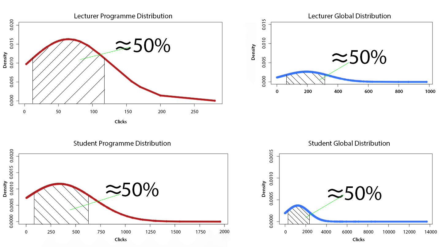
- Density plots [sample data for illustration purposes only]
Density plots can visualise student and lecturer clickometry [here, in Moodle] over a semester in a given DL programme or of all DL programmes; they provide an easy way of estimating chosen areas under the curve. For example, in the sample make-up image below, it can be estimated that approximately 50% of lecturers at a specific programme level clicked between approximately 20 and 120 times in total--this is significantly less than the sample globally for all lecturers (NB such a hypothetical spread would trigger a warning indicator for this programme). Correspondingly, the second sample visualisation presents clickometry for students at programme and global levels: this student programme spread would also trigger a warning indicator, as it is much lower than the global.
- Faculty and student DL course comparisons [sample data for illustration purposes only]
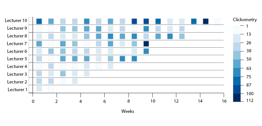
The next sample visualisation provides three layers of data in 2D: (1) the Y-axis = the names of DL course lecturers (in a given programme) in ascending order of total clickometry; (2) the X-axis = the number of weeks of the DL course; (3) the clickometry is in blue colour-intensity i.e. from lighter shades indicating lower clickometry to darker shades representing higher clickometry.
Such a visualisation could be used for e.g. quality control, pedagogical review or lecturer-KPI purposes; (low clickometry should trigger warning indicators)
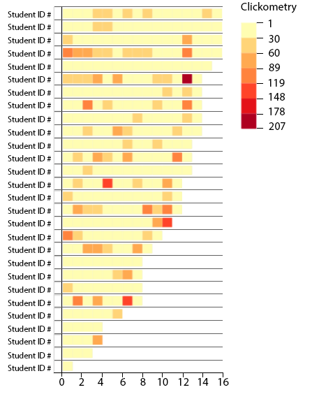
Similarly, the visualisation below sorts students on the Y axis according to total clickometry in a given DL course over time in weeks (represented on the X-axis) with colour red-intensity representing clickometry. This could be useful for e.g. identifying ‘at-risk’ students, targeting additional quantitative-qualitative data collection (real time too) or pushing notifications to students and lecturers [sample data for illustration purposes only].
- A Comparison of global/programme student and lecturer means and medians per semester [sample data for illustration purposes only]
It is highly likely that outlier student and lecturer clickometry will distort the usefulness of the mean, hence it is to be expected that the median will be more informative to use in visualisations. The sample-data visualisations below present the extent to which the means (in all DL courses) might be higher than the medians at global levels for student and lecturer clickometry and days active per week in Moodle. Low median days active per week and/or low clickometry may also be indicating underlying Learning Design weaknesses.
Lecturer Global DL-programme Median (orange) and Mean (red) LMS clickometry over time and days active in LMS per week over time.
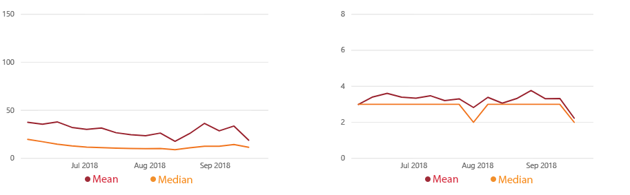
Student Global DL-programme Median (orange) and Mean (red) LMS clickometry over time and days active in LMS per week over time.
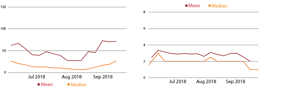
Please note, it is to be expected that student overall means/medians will be higher than lecturers’ if DL courses have biases towards student to content interaction.
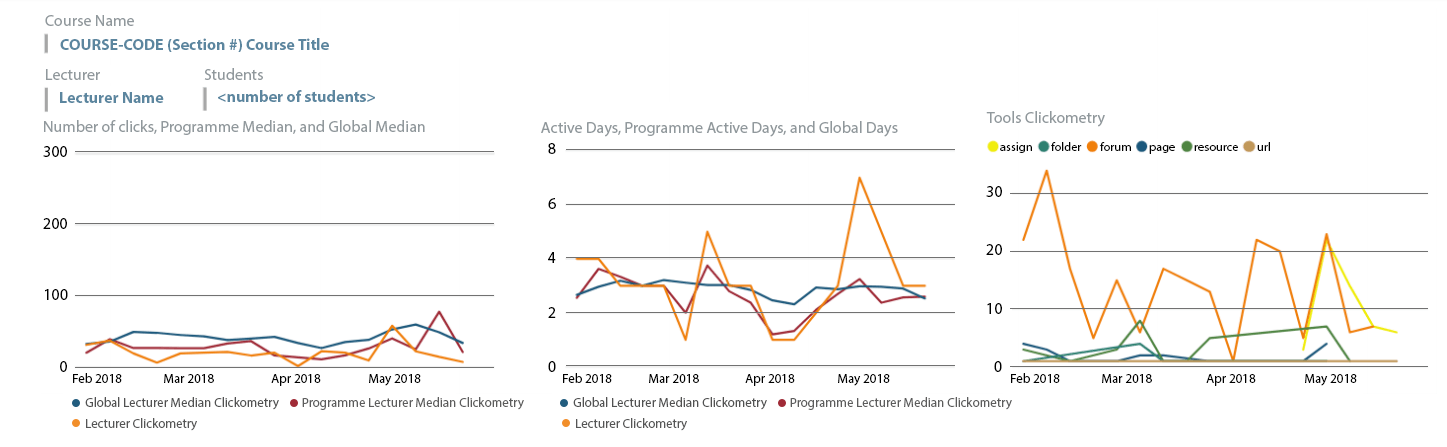
- DL-programme clickometry comparisons per semester of lecturers [sample data for illustration purposes only]
These three compact DL-lecturer comparison visualisations provide a quick way to compare all lecturers together one by one in more detail per DL programme [i.e. than the summary visualisation presented above]. The first visualisation on the left indicates lecturer clickometry over time during a semester (orange) with a comparison DL-programme median clickometry line (red) and a comparison DL-global median clickometry line (blue). The central visualisation presents the lecturer clickometry as number of days active per week over the semester with equivalent red and blue programme and global median comparison lines. The third visualisation indicates what tools in Moodle the lecturer was clicking on over the semester.
From these three outputs a lot of information can be derived for quality control purposes, better design of courses and comparison of aspects of DL programmes.
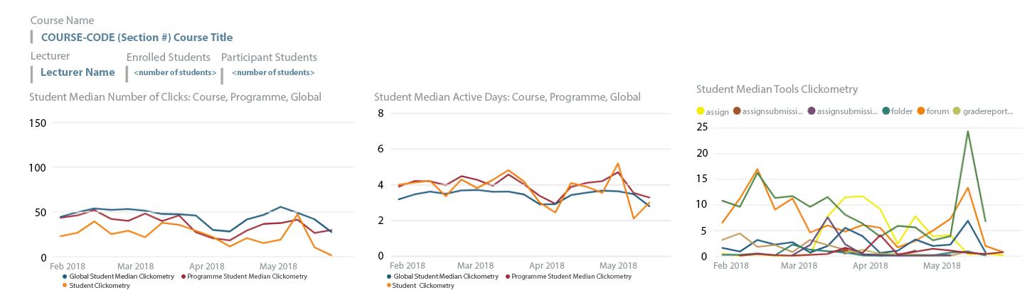
- Equivalent DL-programme clickometry comparisons per semester of course lecturers’ students [sample data for illustration purposes only]
The above lecturer output can then be contrasted with the course lecturer student visualisations with similar orange [total student course median clickometry], red [student DL programme median] and blue [DL-global median] comparison lines over time.
Therefore, many valuable observations about engagement in the DL environment can be made with such low-tech clickometric analyses.
- DL Tool clickometry visualisations--useful for Learning Designers/Instructional Designers [sample data for illustration purposes only]
The following visualisations, taken from a larger collection, provide examples of clickometry that might inform Learning Design, thus helping improvements to be made and measured during iterations of a DL course. It is assumed such data will be triangulated with e.g. student feedback data to strengthen Learning Design decisions.
Also, an Excel output is undertaken per course to identify any Moodle tool that is used by less than 30% of the student participants; this output can then likewise be used by Learning Designers to suggest improvements.
Correspondingly, the clickometry characteristics of students that fail courses can be analysed too.
Other engagement data will aim to include e.g. Articulate Studio 360 xAPI (Tin Can) output using a Moodle compatible LRS (e.g. https://learninglocker.net/features/) to WebEx Training video conferencing lecturer and student engagement data.
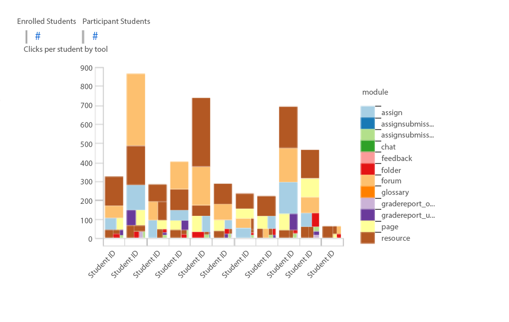
- Individual DL student clickometry engagement per Moodle tool per course [sample data for illustration purposes only]
The X axis = student, the Y axis = total clickometry, the colours = different Moodle course tools
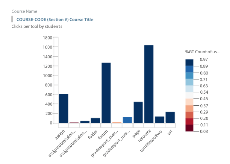
- DL course student total engagement per tool [sample data for illustration purposes only]
The X axis = the different Moodle tools in the course, the Y axis = total clickometry, the colours indicate the percentage of students in the group that clicked on the tool.
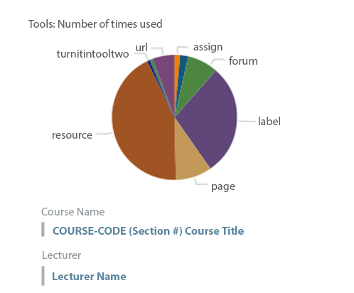
- DL lecturer comparisons in the form of pie charts indicating the Moodle tool breakdown per course [sample data for illustration purposes only]
Strictly not clickometry, but interesting.
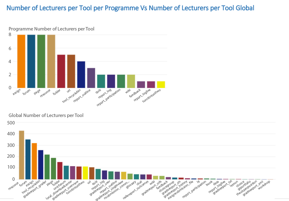
- A comparison of Moodle tool usage per DL programme and total global Moodle tool usage [sample data for illustration purposes only]
Strictly not clickometry, but interesting; also refer to my paper that mentions the preponderance of student to content interaction types that were in Moodle at Minnesota University.
This is a quick way for Learning Designers/Instructional Designers to assess which activities are being or are not being used in a given programme or globally.
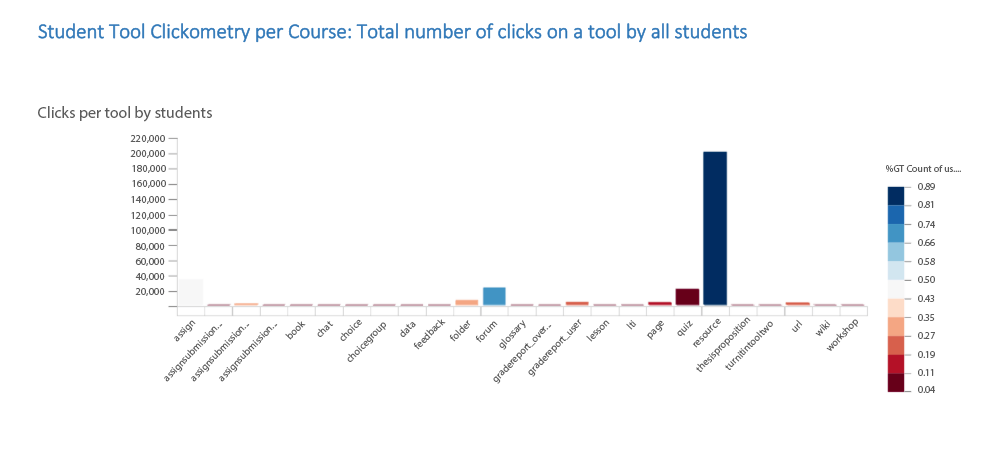
- Total student global clickometry per Moodle tool used in all DL programmes [sample data for illustration purposes only]
The X axis = Moodle tool, the Y axis = total clickometry, the colour intensity = the percentage of the total number of students that clicked on the given Moodle tool.
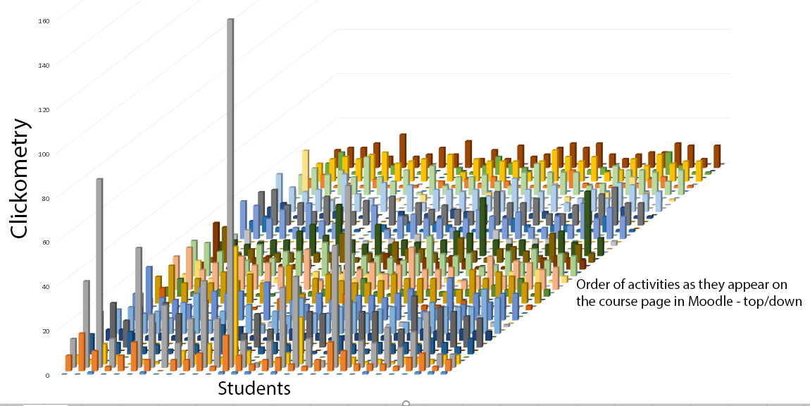
- [mainly for fun] Animated 3d learning-design clickometry output per course per student [sample data for illustration purposes only]
The X axis = individual course students, the Y axis = total individual student clickometry, the Z axis [from front to back] = type of Moodle tool in the order it appears top-down on the Moodle course page.
- Forum engagement analysis [sample data for illustration purposes only]
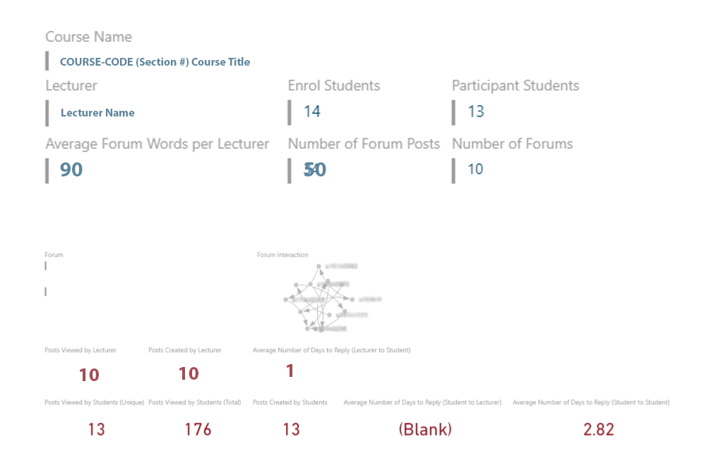
As the Forum tool is the most widely used interactive Moodle tool [see paper on https://elearningindustry.com/smart-learning-management-systems-dream] in DL, it needs specific analysis. The clickometry-related visualisation below is undertaken on every Forum in every DL course.
Overall DL Forum course stats are presented first i.e. the name of course, the name of lecturer, the total number of students enrolled in the course, the total number of students that participated in the course, the average number of words posted by lecturer per forum, the total number of lecturer forum posts, the total number of forums per course.
Then specific data regarding each forum individually is presented i.e. a sociogram (viewable in 3d), the total number of views and posts of this specific forum by lecturer, the total number views and posts (including unique) of this specific forum by students, the average number of days to reply (lecturer to student), and the average number of days to reply student to lecturer and student to student.
This kind of analysis can be undertaken on other learning technologies that require interaction, for example, group Wikis.
Furthermore, the above sample visualisations of Forum clickometry can be enhanced with various NLP analyses thus providing more qualitative perspectives on Forum engagement.
4. Some Conclusions And Some Future Plans For Learning Analytics
The key to improving Learning Analytics is developing a ‘data-connected’ institution with real-time machine-learning and/or Deep Learning capabilities. Data sources can be very varied though privacy and ethics will need to be evaluated carefully.
However, there’s a long way to go before we get geeky things such as:
- smart real-time virtual LMS assistants to notify, guide and learn from students and lecturers with the aim of improving success (maybe through personalisation or adaptation);
- a VR or 3D option to visualise ‘what’s happening’ and ‘where to go’ in large Forums e.g. in MOOC forums;
- advanced success-focused interventions based on ML/Deep Learning student life-cycle data analyses;
- smart data-collection technologies that push a wide range of more relevant and personalised questions to students individually and conveniently with a view to improving the overall effectiveness of the institution and the overall success of the student.
[1] Welsh, S., & McKinney, S. (2015). Clearing the Fog: A Learning Analytics Code of Practice. In Globally connected, digitally enabled (pp. 588-592). Australia: Australasian Society for Computers in Learning in Tertiary Education.
[2] These visualisations are part of a larger set that was designed by the author of this paper.