
How To Ensure Accessibility In Training
Everybody would argue that employee training should be accessible to all. But there’s something misleading about this statement. The phrase itself—“accessible training”—implies that there’s a place for training that isn’t accessible. And, while that place did exist, it should by now be well off the map.
Training has to be training for all. If it isn’t, it creates inequalities, missed opportunities, and an imbalance within your organization. Designing inclusive training isn’t just “the right thing to do,” it’s “the most mutually beneficial” thing to do. But it doesn’t happen on its own. It takes thought and planning to get it right.
And it starts with identifying what exactly it is you’re trying to do by designing accessible training courses.
Training Challenges Faced By People With Disabilities
Everyone’s different. And producing a definitive checklist of challenges people might experience with eLearning design can be a challenge in itself. Yes, there are web accessibility standards that identify most user needs. And these standards should form the foundation for your eLearning design. But how do they relate to eLearning, specifically?
To help link up the two, we’ve highlighted some of the most common accessibility challenges and placed them in the context of online training:
- Live training sessions: These can be difficult to follow for people with a hearing impairment.
- Prerecorded training sessions: Not being able to ask for clarification or additional support might prove problematic for people with a sensory or learning disability.
- Drag-and-drop exercises: People with a mobility impairment may struggle with the physical dexterity required to carry out this exercise.
- PDF documents: What looks like text in PDFs is often an image of a text. This can be confusing for blind or partially sighted people using visual screen reading software.
- Timed assessments and tests: For people with ADHD, AHD, ADD, dyslexia, or other learning difficulties, fixed assignments and timed tests could prove challenging.
- A completely color-driven UI: A UI that uses color as its only navigation tool will be less easy to follow for people who are color-blind.
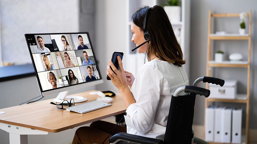
- Mobile learning: Small screen sizes, the potential for physical disturbances, peripheral noise, and phone-generated notifications could prove stressful for people with some sensory or learning disabilities.
These are a few common examples. But, if you want to build a truly inclusive training program and look beyond the generic web accessibility guidelines, why not go directly to your employees?
For example, when you onboard new employees and introduce them to your Learning Management System (LMS), this could be a good opportunity to ask for reasonable adjustments or specific training requirements. And, to find out about existing employees’ needs, why not carry out a short internal survey?
10 Ways To Boost Accessibility In eLearning
So, what do you need to do to deliver accessible training? Listed below are 10 specific ways to make your eLearning design accessible and inclusive. This list isn’t definitive, but it’s a good place to start.
And, remember, you don’t need to tackle these on your own. Having an LMS with built-in accessibility features can be a real game-changer. Being able to add subtitles to videos or integrate with web conferencing platforms so you can store and share recordings of live sessions, all from inside your LMS, makes things easier for you and your learners.
Now, it’s time to get down to the details.
1. Get The Contrast Right
Color accessibility (setting a high enough contrast between background and text colors) ensures that people with visual impairments or color vision deficiencies have the same experience as non-visually-impaired learners.
The best practice is to use colors with a high (at least 4.5:1) contrast ratio in your product palette/accessible learning navigation design. And remember to apply this contrast to your keyboard’s focus state indicator—this is the visual color outline that shows a user where they are on a web page.
2. Look Over The Rainbow
With the right ratio, colors work well in terms of navigation and User Interface. But they can’t do all the work. Make sure that important information (system notifications, errors, warnings, and outcomes, for example) stands out for people with visual impairments by including symbols and text.
And, rather than using block colors in graphs and charts, add textures or patterns to signal the differences in data.
3. Mix Things Up
Present the same content in different ways. Everyone’s learning preferences are unique. So, use a combination of formats (text, video, sound, graphics, or images) and empower all of your learners to choose the format that works best for them.
4. Take Time Out
Allow extra time on tests or the completion of training modules for people who might need it. Or, consider removing time limits altogether if the content or nature of your training supports this.
With the right support on hand when needed, self-paced learning can be a gentler and more accessible approach for all.
5. Be Clear And Consistent
How you present and group your content matters for everyone, but particularly people with some learning difficulties and visual impairments. With this in mind, remember to:
- Follow the same structure across different pages.
- Keep content length on different pages short and consistent (split long sections into different parts).
- Show learners, using a variety of delivery methods, how to navigate the course.
- Format hierarchical headings, checklists, and bullet points with screen readers in mind. For example, just highlighting a word, emboldening it, and making it bigger to create a header won’t be picked up by screen readers. Use style features built into your LMS or document to structure your content instead.
6. Get Descriptive
Screen readers group link titles together and read them out to the user. When including hyperlinks, uniquely describe what you’re showing or linking to. For example, opt for “information learning resources” rather than “click here.”
The same goes for images. Use alt text to concisely, but uniquely, describe each image.
7. Amplify Audiovisual Content
Maximize the accessibility of videos and audio content for people with visual or hearing impairments by using captions or transcripts and audio descriptions. If you’re hosting a live training session, consider using sign language interpreters to translate.
With a Learning Management System, adding captions to videos is a simple case of uploading a file. And for live sessions, you have the option of sharing the recorded presentation along with the transcript and additional resources.
8. Support Asynchronous Communication
For some people, articulating and communicating thoughts instantaneously or in a real-time environment can be a challenge. Writing speed, for example, could be an issue for people with some learning disabilities or certain mobility impairments. People using assistive technology can also experience a delay in being able to communicate.
The concept of social interaction itself may be a challenge for some people. For others, the challenge could be keeping track of different threads of conversation taking place at the same time. When designing your training courses, make sure to include opportunities for asynchronous communication between learners and instructors. For example, text-based communication (like emails and messages) and discussion boards empower users to pose questions and reply in their own time.
The same goes for group assignments. If you ask learners to work together in smaller groups, make sure this doesn’t happen in a hectic in-person or online meeting. Instead, they can interact through a designated online channel (e.g., on Slack) or through a forum where they share ideas.
9. Mimic The Mouse
Assistive technologies can imitate the functions of a keyboard, but not those of a mouse. To make sure that your eLearning design is accessible, you need to elevate the function of the keyboard so that the arrow keys can be used to replicate the navigation feature and other functions of a mouse.
10. Use Plain Language
Jargon, acronyms, technical terms, and idioms all add to the general inaccessibility of eLearning content. Use short, clear sentences and language that’s as clear and straightforward as possible.
A Work In Progress
You can’t truly be an inclusive place to work if your training isn’t accessible to everyone. But adding subtitles to your training videos or choosing the right font color doesn’t guarantee long-term accessible training.
Accessible design isn’t something you can look at once, tick the box, and then forget. It’s an ongoing commitment that requires regular review and a mindset of understanding and respect throughout your organization to make it a success.
So, keep communication lines open, identify and embrace differences, and adjust your training and overall operations as and when you need to. Then watch your people flourish. There is strength in diversity. And a workplace where training works for everyone is a workplace that’s set up for success.