Why is Responsive Design Important in Online Education?
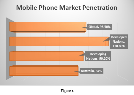
Mobile phones and tablets represent the ‘go to’ devices for the vast majority of people: 6.9 billion global mobile subscriptions will be achieved by the end of 2014 which equates to a 93.5% market penetration for mobile devices. Breaking these figures down further shows that market penetration of the mobile phone has exceeded 120% in the developed world, meaning that there is more than one mobile subscription per person. In the developing world the figures are not far behind with market penetration having exceeded 90%. Mobile devices are an economic and flexible alternative to computers, sophisticated enough to accomplish the majority of basic computing needs and increasingly becoming the common method people use to stay in contact, check their emails, and surf the web.
Online educational developers need to be aware of the growing importance of these devices. Often the desire to access educational content doesn’t correspond with the learner having access to a computer, but they will likely always have mobile devices at hand. Responsive design allows instructional content to be equally accessible on mobile, tablet and computer platforms; contrast this with educational resources developed specifically for use on a computer that often do not translate well to the smaller phone or tablet screen.
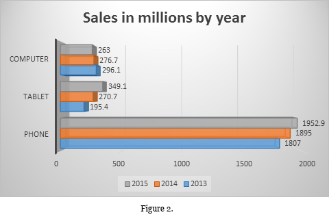
Recent sales figures illustrate a decrease in computer sales whilst mobile phone sales not only remain incredibly strong but also continue to marginally increase even though market saturation is approaching. Tablet sales also are strongly increasing, with predictions that by 2015 more tablets will be sold globally than desktops and laptops combined in the same year.
Not surprisingly, mobile data usage statistics illustrate the increase in the use of mobile devices to access the internet. In 2008 the average mobile device downloaded 149 megabytes per month; this increased to just over 1 Gigabyte per mobile per month in 2012, and predictions suggest this figure will rise by a factor of three by 2015. These figures correspond to a decreasing cost per megabyte download by mobile devices from 46 cents a megabyte in 2008 to a predicted 1 cent a megabyte by 2015. The increase in data downloaded and decrease in costs demonstrate that using mobile devices to access the web is increasingly becoming the norm. With cost then no longer the disincentive it once was the mobile device is an ideal platform for accessing educational content.
Delivery of instructional content via the internet is clearly increasing. There are a number of advantages for developers and institutions that accompany the adoption of a responsive design philosophy for this content. Emphasis is increasingly being placed on personalized learning, aptly shown by the phrase ‘bring your own device’ (BYOD). The IT Company Intel coined the phrase after noticing that staff preferred to connect their own devices to the corporate network set up with their own preferences. Increasingly this desire is being seen in education from faculty and learners alike. Museums, themselves informal learning institutions, have been moving towards a BYOD model for some time. At a recent museums conference in Tasmania, Australia, several speakers highlighted the move to BYOD explaining that exit surveys had demonstrated the desire of patrons to use their device to access additional information about exhibits. Those that had made the shift also found that costs decreased as the shift also moved the burden of cost associated with device provision and maintenance away from the institution.
Another significant advantage associated with the shift to a responsive design philosophy which encourages BYOD is that both staff and learners are able to focus on the content rather than the platform it is presented on. The natural user interface (NUI) common on so many of these devices also equates to a level of comfort for the user, further reducing the focus on the device and reducing distraction from the content.
By accessing learning material on mobile devices, leaners are also able to interact with faculty and peers using social interactions in the environment the learner is already engaged in. One future direction of education currently being explored by some early adopters is gamification. Again, the mobile device platform is ideal for this application as the majority of learners already use the device in this manner in everyday life. In the Australian context, Australia has the third highest mobile phone penetration of any market with almost 8.5 phones for every 10 Australians, further emphasized by the fact that 71% of all mobile phone owners in Australia also own a tablet. It is clear that educators will need to focus on the use of responsive design in order to engage learners.