Using Graphics In eLearning
Each time I start designing an online course for my learners I get an unstoppable desire that the output should be as much aesthetics as it could be. The very first image I picture it in my head is, that there would be a lot of visual elements – illustrations, animations, photos, charts, well, you name it. Of course, nothing is wrong with this planning, unless it comes into the reality without understanding the basic rules of use of graphics in eLearning.
If you don’t want to read the whole article and just want to get quick, interactive and visual overview of those principles, explore the following Learning map. If you find it useful, use it as a quick reference while you’re designing the next online course.

Everyone, who has ever tried to design an online course and then wanted to dig deeper into the instruction design principles, might heard for the book “e-Learning and the Science of Instruction” by Ruth Colvin Clark and Richard E. Mayer. When I was collecting relevant resources for this post, I’ve noticed that almost each source had a reference to this book or to its authors. Since the book is so well written and useful, this fact doesn’t even surprise me.
Use graphics with text rather than just text alone
Anyway, as Clark and Mayer proved with ten different studies, people learn more deeply from words and pictures than from words alone. To be more specific, students who were involved in studies and learned from both words and graphics, produced between 55 t to 121 percent (a median across all studies was 89 percent) more correct solutions to transfer problems than people who learned from words alone. The authors called these findings the multimedia effect.
Stay away from decorative visuals
Thus, if there is a scientifically proved evidence for use of graphics in learning materials, let’s do some decorating, insert stock photos which don’t even need to be relevant to the text and our job is done. This thinking is a classical mousetrap, in which every instructional designer is caught at least at the very first eLearning projects. It’s quite easy to convince your learners that your brand new online course looks great, because it has beautiful images, even one icon at top-right corner is blinking. Why? Because it was so nice to put it on that place.
A harsh truth is that decorative graphics can hurt the learning process. If the learner can’t find a correlation between the text and the graphic or as Kuhlmann said - a graphic doesn’t help the learner to develop a visual model of the information, then based on cognitive theory this situations add cognitive load to learning.
Place words and graphics together
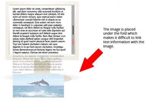
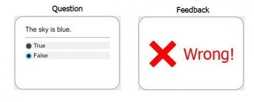
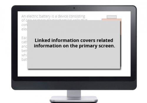
Another empirical evidence from “e-Learning and the Science of Instruction” book which relates to the use of graphics in eLearning shows that placing the text near illustration it describes, facilitates the learning process. As Clark and Mayer wrote, when words and pictures are separated from one another on the screen, people must use their scarce cognitive resource just to match them up. Then, they have fewer cognitive resources to use to mentally organize and integrate the material. The importance of placing words and graphics together is wrapped up in the so-called contiguity principle.
The most common violations of the contiguity principle are:
- Separation of text and graphics on scrolling screens
- Separation of feedback from question
- Covering main screen with linked screen
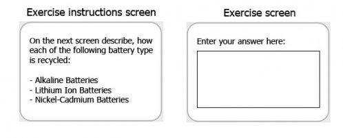
- Exercise directions are separated from the exercise
Use low-fidelity graphics
One interesting aspect of use of graphics in online learning materials for me was revealed in Connie Malamed’s article “Realistic graphics and Learning: What’s most effective”. The main question Connie stated was whether the use of realistic graphics improves learning comparing to low-fidelity graphics?
Connie explained the difference between high and low-fidelity graphics in this way: A high-fidelity graphic is a graphic with lot of detail, depth, shadow, texture, and nuance of color that nearly replicates what you see in the physical environment. On the other hand, low-fidelity graphics use fewer visual elements and qualities that resemble a recognizable object. Examples of low-fidelity graphics are: line drawings, silhouettes, and icons.
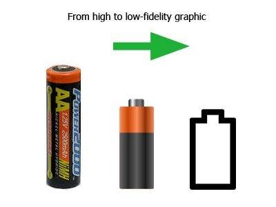
From the cognitive theory perspective and according to Connie’s findings, low-fidelity graphics require fewer cognitive resources to transform the graphic into a simple form of crucial information and therefore take less time to encode the information into long-term memory.
Even though there are cognitive advantages of low-fidelity graphics, it is still recommended to use high-fidelity graphics when required by a particular learning objective. For instance, if you have to show the distinctions between different clouds, then the best way would be to use clouds’ photos with a lot of detail. However, as Connie said, you will need to balance the goal of reducing realism enough to improve cognitive processing.
To conclude, I think the right feeling or skill of how to use graphics in eLearning comes with practice. Maybe we’ll again put decorative elements in the next projects, because we all like aesthetics products. This is in our nature. But we have to restrict ourselves, our imagination in favor of better learning experiences. If we follow the guidelines above and just make sure the visuals we use are relevant to the learning, we can’t fail in our mission as instructional designers.
References:
- Clark, Mayer. e-Learning and the Science of Instruction. San Francisco: Pfeiffer, 2003. Print
- Tom Kuhlmann - Warning: Using the Wrong Images Can Confuse Your Learners
- Connie Malamed - Realistic Graphics and Learning: What’s most effective?
- Jake Huhn - A Guide to Superior eLearning Graphics
- Ruth Clark, Chopeta Lyons - More Than Just Eye Candy: Graphics for e-Learning: Part 1


