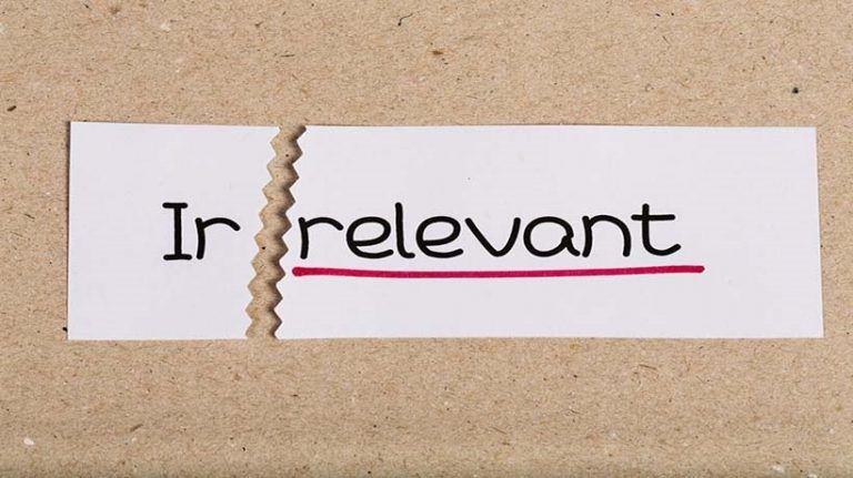

Irrelevant Graphics In eLearning: It’s Eye-Catching... But Is It Relevant?
We know instinctively –and research has proven– that the use of media, including graphics and illustrations, can indeed help people learn. However, as professionals who create eLearning and other types of training we often end up going overboard, adding eye-catching elements in the hopes of making our content more appealing or engaging. As the research findings of Clark, Mayer, and others have shown, for the most part this tendency does not enhance learning. In this article, I’ll focus on why the use of irrelevant graphics in eLearning inhibits learning, why it is important to use media directly related to the idea or ideas we want to convey to our learners, and provide some examples that you may find helpful.
Adding A Graphic That Is Not Germane To The Material
Are your graphics relevant? This seems like an obvious point, but this is where so many of us go wrong. Perhaps we are under a tight deadline and we can’t think of a graphic that is truly relevant to a concept we are trying to convey, so we are tempted to add something. The screen looks lonely with only text, and it just feels better to include an image. We reason with ourselves that the lame graphic we’re adding is better than nothing and it could help to make our training more interesting. At worst it's harmless, right?
Unforuntately, no. Adding a graphic that is not germane to the material will detract from your learners’ ability to learn, because part of their focus will be turned to something that is irrelevant. If you are pressed for time and can’t come up with a relevant graphic to use, it would be better to use nothing.
Here's an example of an irrelevant use of graphics. This screen introduces a module that provides an overview of four different accreditations available to sales professionals at a high-tech company.

The images used here might be tangentially related to the subject matter if getting accreditations are likely to increase salespeople’s incomes. However, they are not truly relevant to what is being taught. Some learners might find these graphics cute while others may find them annoying. Regardless, they serve as distractions. At first blush you might look at this and say “Ridiculous – I would never create something like this”. Yet have you not committed similar sins under pressure, rationalizing that you were at least causing no harm to your learners’ experience?
The following example is an improvement that required a minimum of effort. It is artless, but more effective. The distracting and irrelevant elements have been removed, and the message does not get lost. Time permitting, it might be improved by adding a graphic that presents a unifying message of the content, and/or a graphic for each accreditation that accurately represents the accreditation's domain.

Purely decorative graphics can be hard to resist, but research shows that we should limit or avoid their use most of the time. The next example is inspired by an excerpt of a high-tech company’s online training course for its sales partners.
We’ve all seen slides like the next one, and though we may not want to admit it, many of us have created slides like this. Time is short. Not every frame or screen can be amazing, so what’s the big deal if you have a few bullet points and throw in some random visual appeal? Maybe something that’s abstract and hopefully kind of jazzy? Just something – it’s got to be better than lonely bullet points, right?

Well, no.
Screen after screen of bullet points is not a good experience for learners, but in this case, they would be better off with a slide with just the four bullet points. This graphic is harmful because it means absolutely nothing in relation to the content, and in this case, perhaps even worse is that this particular graphic encourages learners’ eyes to move off the screen, disengaging them further.
What to do, then? As usual, you are up against a deadline. Just removing the graphic will result in a better experience for your learner, but if you have a little spare time, you might try something along the lines of the following example.

This screen is an improvement because with each of the stated objectives we’ve got an image that is relevant. That the images share the same style and that they are simple and sparse in detail also supports learners' ability to stay attentive to the relevant content.
It’s proven that people learn better from words that are enhanced with the right graphics, but we must resist the urge to pile on the eye candy. Decorative, irrelevant graphics don’t provide instructional value and should be used sparingly if at all in instructional materials.
Sources:
- Clark, Ruth and Mayer, Richard (2014) eLearning and the Science of Instructional Design, John Wiley and Sons, Inc.
- Mayer, Richard et al. (2014) The Cambridge Handbook of Multimedia Learning, Cambridge University Press
- Clark, Ruth and Lyons, Chopeta (2011) Graphics for Learning, Pfeiffer