
Choosing An Adaptive Design Authoring Tool
If you’re experienced in web design, then you’re likely to know a thing or two about adaptive and responsive layouts. But if not, then you might be interested in exactly what they are and how authoring tools are using them. Both responsive and adaptive design are responsible for controlling how web-based eLearning content displays on a screen and across various devices. While many people mistakenly think that they’re the same thing, they do have some different qualities. Most authoring tools will consist of either adaptive or responsive design, or a combination of both if they are dedicated to providing an accessible multi-device learning experience for their audience. We’ve previously discussed responsive design features, but this article will focus on what it means for an authoring tool to be adaptive.
Get a free eBook on how to create and distribute a Responsive eLearning Course
What Is Adaptive Design?
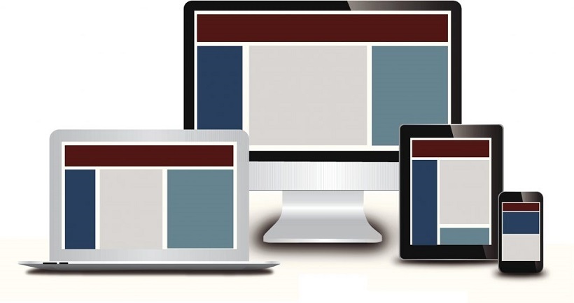
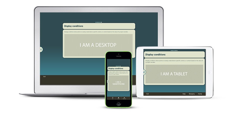
The term adaptive design originates from a book called ‘Adaptive Web Design’ by web design author Aaron Gustafson. The book explains how websites can be built to work for anyone, anywhere. An adaptive eLearning authoring tool uses a range of different static layouts to present content on a screen, depending on the device being used, as well as the screen space available. Adaptive templates are usually pre-designed and are instantly ready to detect the device and screen width – in this way they are able to present the viewer with the correct layout based on device detection. For example, an authoring tool that uses adaptive design will allow the user to create different device and varying sized layouts, like a separate template for tablets, smartphones, and desktops. Alternatively, content could be designed based on screen sizes. Popular screen widths include:
- 320
- 480
- 768
- 960
- 1280
- 1600
When a course is complete and ready to be viewed in a browser, it will then be able to recognize exactly whether the user is browsing on a smartphone, desktop, or tablet, and select the most appropriate design. Creating several different layouts might seem like a lot of hard work for learning designers, but a smart authoring tool will be able to take care of this for you so that your only task is to provide the content and information about which layouts are required.
How Is Adaptive Design Different From Responsive Design?
It’s easy to confuse adaptive and responsive design as the differences between them are subtle to the end-user (although that’s not the case for the learning designer!). They both have the same purpose: To present content in the best possible format according to device specifications. They do, however, function in different ways. While adaptive design selects the best layout from a range of ready-made templates, responsive design is more flexible and is able to adjust to the perfect layout regardless of screen size or device. Responsive design adjusts one layout for optimal viewing and doesn’t require the prior creation of different device layouts.
Instead, responsive design relies on CSS media queries and HTML5 to be able to detect how it needs to adjust to fit a screen. It is able to ‘respond’ to information that it’s presented with automatically, and optimizes the size of an eLearning course using only one layout. Adaptive design is automatically selected by the device type and screen size but when it comes to content creation, it’s not a one-size-fits-all approach. While responsive design is more fluid, an adaptive design adjusts by adapting an eLearning course to the width of the browser at specific points – it will wait until the browser has reached a certain width, after which it will select the most appropriate layout for the screen.
Get a free ebook on how to create and distribute a Responsive eLearning Course
What Are The Advantages Of An Adaptive Design Authoring Tool?
1. Delivery
It might be the more suitable option for delivering to an audience in less developed parts of the world, since it does not rely on CSS media queries like responsive design, and therefore has the ability to work on older models of mobile phones that are used in certain locations. This means that the eLearning you create in an adaptive authoring tool has the maximum reach for a workforce that is globally dispersed, which is quickly becoming the standard for modern businesses.
2. Loading
Adaptive design authoring tool content also tends to be quicker at loading than web pages made with responsive design, because essentially only the necessary content is loaded. If the web page detects a device that has the ability to display high-quality images, then it will display the high-quality images. However, if it senses an older device with poorer resolution qualities then it will adapt the images accordingly to only use low-resolution images so the device can cope.
3. Customization
With learners using many different devices to view courses, learning designers can use adaptive design authoring tools to enhance user experience. Adaptive designs allow you to customize content according to device, so you can create a particular design to work for mobile and tablet users, while choosing another for desktop learners. Obviously each device contrasts in how they are interacted with in terms of touchscreen versus mouse, vertical versus horizontal screen viewing and so on. A good quality authoring tool should help you work with these elements to create the best possible learning experience for your end users.
A Final Word On Adaptive Design eLearning Authoring Tools
By now you should have a better idea of how adaptive design eLearning authoring tools work, how they differ from responsive authoring tools, and why they might be a suitable option to create eLearning courses for wide audiences. Benefits range from fast loading times, control over unique device content, and accessibility for global learners. There are clearly some unique ways that adaptive authoring tools can help businesses with eLearning creation. So how do you choose which one will work best for you? The answer is simple: You’ll need an authoring tool that has both an adaptive and a responsive design already built in. This means you’ll get the best of both worlds when it comes to web design and never have to worry about whether a course will display correctly on your learners’ devices. A truly adaptive and responsive eLearning authoring tool will take care of the hard work for you, so you can get on with creating beautiful, multi-device content in no time.