Boost Employee Satisfaction And Knowledge Retention With Microlearning
As learning professionals, executives, human resource representatives, as well as operations managers and sales directors, we strive to equip our employees and coworkers with the most relevant information and skills so they can perform in their job role as smoothly and effectively as possible. At least, that's the ideal scenario with microlearning.


Microlearning That Engages: A Guide To Successfully Drive Employee Satisfaction
The reality is often more… bare bones. It can boil down to:
- Assign training.
- Assign a completion date.
- Tick the box "training done!"
We might ask if they enjoyed the training or ask them to fill out an evaluation form, but in our heart of hearts we know we made them do it and they probably didn't like it much. Tracking the impact of the experience on the bottom line of the organization is, under these conditions, close to impossible… and establishing the link between learning and performance is equally difficult. And lots of times we shrug our shoulders and move on to the next "learning experience."
At Obsidian Learning, we completely reject this model. The learning experiences we strive to create for our clients include a couple of simple, non-negotiable criteria:
1. Is It Enjoyable For The Learner?
The negative impact of sitting through a page-turner for 60 minutes or so cannot be overstated. It’s like trying to meditate after an intense fight with your significant other. Some can pull it off, but most just fake it. If the learning is fun, the learner has a reason to stick around and is more likely to retain what they've learned. So what makes an enjoyable learning experience?
- Length
Will I have to spend my entire lunch break on this? - Structure
Can I get to the information I need with ease? - Interactivity
Will I be clicking "Next" for the foreseeable future? Snooze. - Clarity
Do I need to review the content several times to get the point? - Utility
Am I clear on when, where, and how to use the information?
2. Is It Effective For The Organization?
The organizational side of this equation is often simpler, as most larger companies have clearly established corporate identities and some semblance of the corporate culture. They generally have a clear vision of what they need and systems in place to achieve their goals. What are the attributes of effective training for any organization?
- Improvement/change
Was the desired outcome of training achieved? Did the learner retain the knowledge? Can they apply the knowledge in their daily tasks? - Cost/budget
Did creating/acquiring the learning asset break the bank? Were the costs in proportion with the value the training may bring? - Versatility
Is the learning asset useful beyond training?
Because organizational needs are somewhat easier to understand and address, I’ll focus here on what can make or break a learning experience for the learner. And—surprise!—how microlearning fits with each of these elements.
Length
Like it or not, your attention span is decreasing and so is that of your employees. Organizations tend either to ignore or simply not be aware of this and continue to crank out 45-60 minutes of digital page-turners. Again—this type of learning might have its place, but if our job as learning professionals is to assure knowledge transfer and positively impact the organization's bottom line, we must take into account studies that point to shrinking attention spans when designing our trainings, and that definitely means taking a look at course length.
Research is inconclusive as to the ideal length of microlearning. We have seen figures anywhere from around 60 seconds all the way to approximately 15 minutes. In our humble opinion, a general rule of thumb is the shorter the better. Custom design and development and close collaboration with subject matter experts can be crucial success factors in this regard. Your role is to help the SMEs distill the content to the very barest essentials (What do my learners really need to know to do their jobs?), and then ensure that the critical information is packaged in a way that is impactful, accessible, and concise.
CASE STUDY:
The Lean Organization concept is not a new one. These days you can get a degree in Lean and/or Six Sigma management at some of the most prestigious universities. The subject is vast… and that was part of the problem for one of our clients. They spent millions of dollars to educate their workforce on the principles and advantages of this approach, but as with most change management efforts, it only works if everybody is on board and understands the motivation behind the change. The client was focused on getting employees to report waste and suggest improvements, but the 2-hour workshops and online trainings just weren’t cutting it. Our advice? Create an advertisement! Rather, a microlearning nugget that explained the concepts clearly and simply. Something short, sweet, and fun to watch.
We developed a 3-minute long animation with very clear objectives:
- Explain the concepts;
- Tie the concepts to the daily tasks of as many employees as possible; and
- Make it actionable—make sure employees know exactly what to do. A final element—What’s in it for me (and the organization)?—was an overarching theme.
The impact was immediate. The 3-minute length was a key success factor (though we’re not going to discount the creative animation, the analogies, the strategically crafted narration, and the concrete examples). Its versatility was also immediately evident; the organization used it for educational purposes, but it also integrated into workshops and mentoring programs. And it was also versatile in terms of delivery: it could be e-mailed, embedded, texted. It was extremely gratifying to see how much of an impact our little microlearning piece made… and our clients ended up feeling that they got a lot of bang for their buck: they paid for training but got a sleek, multi-purpose tool that unquestionably added value organization-wide.
Structure
"Welcome to this online training on…"—oh, those dreaded words. Is a formal introduction to a 45-minute time suck really necessary? Full disclosure: I have experienced those exact feelings ones or twice myself. And I'm a learning professional! The linear progression, the lack of tracking or progress indicators. And don't get me started on trying to go back to find a little bit of information that might actually be relevant… sometimes the course is locked and it's not even possible. In this particular instance I might be bashing long-form learning a tiny bit, but (stay with me, here) with a purpose. Even the longest, most boring training can be made into a useful resource center/hub by simply structuring the information in a manner that is both intuitive and useful. Does what I am describing sound like an online training menu? Yes indeed—sometimes it can be as simple as that.
Tips & Tricks
- Naming sections
Even your longest legal course can be made more digestible, less annoying, and vastly more useful if the menu sections are logically labeled. For example, you may want to omit "Section 1," "Section 2," etc., and replace it with the boiled-down, 2-to-3 word long title which describes the nature of the section. Example: "1. Why this subject?", "2. Definition of…", "3. Exceptions to…", "4. Application of…", "5. Resources…". Succinct menus can be a way to clearly set expectations not only for each section but also for the narrative of the course. - Linear vs. freeflow
Another simple way to improve your learners' experience is to open the flow of the learning asset and allow the user autonomy over how they take the course. I understand—the content is designed in a deliberate, logical way and in many cases builds from one section to the next. Strangely enough, that doesn't seem to factor in a free-flowing online course as the perceived freedom to move around seem to tend to relieve resistance to the training as designed… and (in our experience) learners tend to proceed linearly. At Obsidian Learning we recommend that clients promote the asset first as a learning module first and secondarily as performance support. Concretely, this means that the first time a learner takes the course, it may be locked down (progression is strictly linear) but the learner is informed that it will "open up" once the training is completed, at which time content can be accessed at will.
Interactivity
Interactivity is almost always desirable and, in most cases, arguably improves the learning experience. Microlearning, however, is not necessarily the ideal means of integrating interactivity. If you’ve produced a 2-minute long learning video, it may feel disruptive to have to pause and interact with the interface. That's why we believe visual appeal; strategically designed, distilled content; quality of script drawings and diagrams are the best means of ensuring visual or tactile engagement. Combining these elements improves the learning experience, retention of the information, and overall employee satisfaction.
Clarity
What do we mean by clarity? As a learning professional, it is an overarching attitude toward designing and executing a learning asset. There are 2 areas where clarity is essential:
- Clarity of the message (content-focused)
Are the key messages and associated content easily understood? Is the user aware of the benefits of taking this training? - Clarity of the experience (UI focused)
Does the learner know how to get the most out of the learning asset? Can they easily navigate within it? A smooth User Experience doesn't mean including a 6-minute instructional piece explaining all the finer points of course navigation. Rather, it means creating an intuitive design such that there is absolutely no need for such instruction.
CASE STUDY:
Many of our clients deal with subjects or environments which could potentially cause harm to their employees. Understanding, knowledge retention, and applicability are much more important when lives are at stake. Our clients are aware of the high stakes, often turn to custom trainings that are adapted to the seriousness of the issues at hand. In this case, our task was to create a practical, utilitarian, field safety guide that could be returned to as a resource center/toolkit after delivery as a comprehensive learning module.
The solution was a simple, intuitively structured, highly visual course. Each interaction was designed to be a seamless and organic progression of the training, but could also be extracted and viewed independently while retaining its coherence and applicability. What was the basis or our design? For each section, topic, and for the course as a whole, we designed with an eye toward these four questions :
- Is it clear (message wise)?
- Does it make sense?
- Does it work in the context of the training?
- Does it work on its own?
Utility
Do you think your workforce would be more likely to be satisfied with training if they knew it would be their go-to resource post-training, at the time of need? As adults (and as humans) we hate doing tasks we know are necessary (we must take the course) but useless (we already expect not to remember much). If the learning asset is designed as a series of microlearnings and it is explained at the outset how it will be used after the training, you're likely to see a more positive outcome. Time after time, we've successfully reduced the resistance and cynicism associated with "taking another training course" by transforming the learning experience into something altogether different. Letting your learners know that a learning asset will serve as direct performance support is a winning satisfaction and engagement strategy.
CASE STUDY:
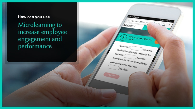
A good example of this approach is this app, which included intuitively organized videos, manuals, attachments, descriptions, etc. It was essential for the information to be easily accessed from a smartphone, as direct support of the employee's tasks was the key criterium. An intuitive structure consistently applied across all topics was the main element of this deliverable's success.
Most organizations at least talk the talk when it comes to employee satisfaction and knowledge retention. Both are obviously desirable, and microlearnings can be a highly effective tool to achieve those twin goals. We tend to focus on the "micro" aspect of such offerings, but brevity for brevity's sake is not a leading indicator when it comes to a powerful learning experience. Creating synergies between ideal length, clear structure, and focused intent will elevate your learning and lead to greater employee satisfaction and knowledge retention, and thus to improved performance. Microlearning is here to stay. Discover how you can do it properly to benefit both your learners and your organization by downloading the eBook Microlearning That Engages: A Guide To Successfully Drive Employee Satisfaction.


