
Responsive eLearning Design Is A Necessity: 4 Reasons Why You Are Expected To Adopt It
Responsive eLearning, or responsive anything, at the outset, was initially considered to be something that was purely convenient. However, as time progressed, a responsive design has become the expectation, rather than the exception, and this has found its way into the eLearning space.
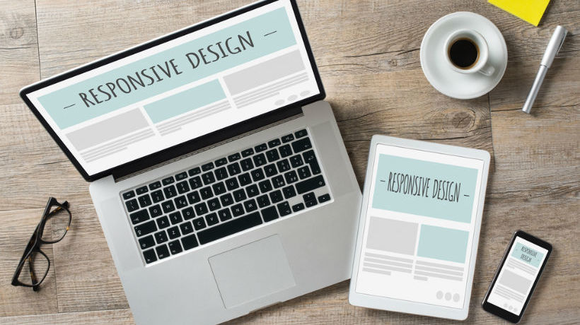
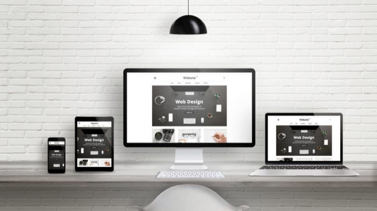
1. Learners Are Using Multiple Devices To Access The Same Content
One of the biggest reasons that responsive eLearning should be considered an absolute necessity to your strategy is the frequency with which users switch between devices, and the length of time learners say they use a mobile device or tablet to complete their eLearning courses. According to 2016 Towards Maturity Report [1], 70% of users surveyed said that they completed eLearning via their mobile phone, while 52% said that they used a tablet. Additionally, in a 2012 Google study on multi-screen device usage, 98% of those surveyed said that they move between different screens (i.e. devices) each day. Clearly, users enjoy having the flexibility to review content on any device of their choosing, as evidenced by the previous statistics. With that in mind, it would be a huge misstep to create courses that only function properly on a desktop or laptop.
2. Responsive Is Here To Stay
A responsive design is no longer something that’s just seen as a happy convenience. When users interact with a website on their mobile device or tablet that does not meet their needs, it can lead to frustration. In fact, one of the greatest challenges that L&D professionals face is creating an environment where learners are more apt to complete their courses and modules in a timely manner and not feel as though their personal or professional time is being encroached upon by something that they aren’t excited about. Sources like Coursera put completion rates at as low as 40% [2]! This makes responsive eLearning even more crucial because it means that when it’s well-done, learners can complete their courses at times when they feel it’s the most convenient, such as while they’re on public transportation or have some downtime at home or between meetings.
3. Web-Based Means No Apps Or Downloads
Another advantage of responsive eLearning is that it’s web-based, meaning you access it through a browser. This means that it’s even easier for your learners to complete their courses wherever they are, at their convenience, since there’s no apps or programs to be downloaded. Sequential screening—when you start an activity on one device and then move along to another—is the new status quo. We unconsciously make the transition from device to device in our personal lives; increasingly, we have these same expectations for interacting with our work environments. While there may be the risk of slight issues with appearance across web browsers, since a responsive design simply resizes and rearranges itself to suit the screen size, using a framework like Adapt, and thorough testing across multiple browsers and operating systems will ensure this isn’t an issue.
4. Simple Publishing
Finally, responsive eLearning has some major advantages for the L&D team - one being that, because it’s web-based it may actually be simpler to update and publish. With some traditional LMS models, creating content that can be viewed across multiple devices means that your L&D team may need to create a modified version of the content for each device. This could mean there are multiple versions of a course floating around, each needing to be tweaked if the content is updated. With responsive courses, you simply create or edit the content once, hit "publish", and it’s instantly available to your learners on whichever device they prefer to use.
The new multi-device world order is here, and it means you need to build and design content that will work on almost any device. This means you need to rethink that fancy slide-based eLearning show that was designed for a desktop and became unusable when viewed on a small tablet. It’s now a dinosaur, relegated to the forgotten corners of your LMS.
Are you interested in learning more about designing responsive eLearning? What are L&D professionals striving for? Download the following webinar: Being Responsive: Tips and tricks for developing eLearning in Adapt [Recording].
References: