

Mobile Marketing For Online Courses: How’s Your Course Marketing Machine For Mobile?
I’m all keyed up about mobile, having just attended a webinar on mobile optimization by marketing agency OST. So I thought I’d offer some good practices for optimizing your course marketing machine for mobile, and boosting your mobile marketing for online courses.
You do have a course marketing machine, right? If you’re an edupreneur (someone who sells courses online for passion and profit), it’s probably fair to say that success comes from a 20/80 split between creating course content and marketing it. If you need an intro to marketing your online courses or want to improve your marketing and boost your course sales, check out these guides. Then come back here and read on. Don’t worry, I’ll wait.
Okay, let’s get back to mobile. Here come some facts.
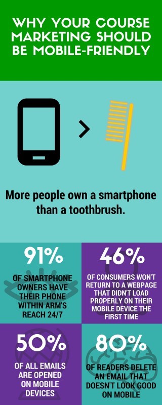

Here in 2016 most of us should know that mobile internet usage has overtaken desktop internet usage. It happened some time in 2014 or 2015, depending on which reports you read. But it has happened, and that means that a majority of people accessing your online marketing materials are likely to be doing so on a mobile device. The question is, are you mobile-ready?
Firstly, take a look at your website on a mobile device. How does it look? Does it adapt itself to the screen and make itself easy to read? Type your website URL into Google’s Mobile-Friendly Test page. If it gives the site a thumbs-up, buy your web designer something nice and stop worrying. If it doesn’t, work is needed.
Did you survive “Mobilegeddon”? In April 2015 webmasters trembled when Google announced it was changing its algorithm to favor mobile-optimized sites in mobile search. Terrified marketers everywhere dubbed it “Mobilegeddon”. Like the Y2K bug, it didn’t turn out to be quite the apocalypse that was feared, but it can and does affect site rankings on mobile search. I believe Google are reasonable people who want their users to have a good online experience, so why should they offer mobile search results that look terrible on mobile?
So before anything else, you must have a responsive website. When viewed on mobile, it should organize itself into a single column and display all images nicely within that column – no left-right scrolling or humongous images the user can only see a tenth of. Would you stay on a site like that? Only if it contained a kidnapper’s instructions on how to save the life of your family pet. Otherwise, you'll go elsewhere for your information.
Some choose to have a separate mobile site. That isn’t really necessary these days – your “main” site can function perfectly well on mobile as long as it’s responsive and optimized. And you’ll keep all your clickthroughs and analytics on a single site rather than having to manage two.
Here are some good website practices for mobile:
- For text, it’s best to use nothing smaller than 14 pt, as this translates to a comfortable mobile reading experience. Keep the amount of text to a minimum.
- Ironically, on smaller screens where space is at a premium, white space sells. Make sure the calls-to-action on your site display clearly on mobile, are not embedded in a sea of text, and are easy to respond to immediately.
- Most responsive designs will move navigation menus to a drop-down in a top corner of the screen to keep them out of the way, so use the content that is fully displayed on each page for maximum impact, simplicity, and clarity of message.
- Keep pages light for fast load speed – if a mobile page takes more than three or four seconds to load, you’re starting to lose people.
- Make it shareable. Include a social share bar that makes it easy for users to tweet, pin, share etc.
Most of this also applies to email campaigns. Use HTML templates that deliver the above experiences and you should get a better response from users who open your emails on mobile.
Consider the different states in which mobile users consume content. They can be said to be in one of 3 broad states:
- Heads down.
The user is actively searching for or reading about something and is in a focused state. - Heads up.
The user is not particularly focused and is flicking around on the mobile device, either in between tasks or not sure what to do next. - Curl up.
The user has time to “curl up on the sofa” with their device and get stuck into reading longer content.
Users in a heads-down state need information fast and you need to appeal to their time-starved brains.
Users in a heads-up state can be distracted by simple, tempting marketing messages.
Users in a curl-up state are more willing to read your in-depth material. They are likely to be a bit further down the sales funnel.
Try to cater for all 3 user states. Satisfy the heads-down users quickly and give them a big, clear call to action to pursue. Catch heads-up users with timely marketing messages. And make sure there is content for curl-up users that is easily accessible but doesn’t clutter the initial experience. Put it in a menu somewhere rather than on a main page.
So, there are a few basics of mobile marketing for online courses. What have I missed? Apps? Social? I know – there’s so much to cover. Please do comment below with your views on mobile marketing for eLearning courses – especially if you’re an edupreneur who’s in the thick of it.