
Webinar: Lesson 7 – UI/UX Best Practices For Your Online Courses
If you’re new to this series, it’s better to start from the first lesson.
In this lesson, you’ll learn about interfaces, user experience, why it’s important, and how to bring it all home for your learners with iSpring.
The Ultimate Guide – How To Create Great eLearning Content From A To Z
Basic Concepts For UI And UX
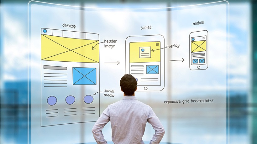
UI, or User Interface design, is a complex and theory-driven science. To succeed with UI, you need to know your learners and their behavior: who uses it, how do they use it, and what are they going to see and do on screen. UI involves graphic design, but it’s not correct to consider it as just graphic design. It’s our goal, as eCourse developers, to think about how these graphical things need to be integrated within the learning process.
UX, or User Experience design, is also a robust and complex field of study. In contrast to UI, UX is more focused on functions: how does something do something on a screen? What do users feel? What is their experience?
In the picture, we can see a well-thought-out pathway made of concrete. However, it would probably be much better if that shortcut, where the person is walking, were the actual design. When we are focusing on user experience while developing content, it increases content credibility and authority.
![]()
![]() 9 General UI/UX Considerations
9 General UI/UX Considerations
- Plan
You need to have enough time not only to plan and design the UI/UX, but also to get information and feedback from your actual learners and stakeholders. - Ask “how?”
Like “How do learners get to the next page?”, “How do they open this tab?” or “How do they close this pop-up?” - Don’t assume
Don’t think you know what is best for a learner without asking the learner. - Consistency
Make sure that you create a cohesive design and your content is consistent so that the learners experience it in the same way each time along the course. - Navigation
Consider whether navigation is important, and how it can help to achieve the learning final goal. - Pay attention to daily life
Monitoring your own daily digital experiences and what’s around you is a great way to approach UX design. - Be responsive
Make sure you’ve thought about devices that are on the go – tablets or phones. Will content look and work well on them? - Use existing practices
Look for references to existing websites and apps, see how they’re put together, and borrow ideas that work for you. - The journey never ends
Stay up to date with the latest tech and UX trends.
The Nuts & Bolts Of UI/UX In iSpring
Font & Typography
- Fewer is better. Try to use no more than 3 basic font types and styles.
- Standard, not exotic. Prefer tried-and-true fonts such as Arial, Helvetica, and Verdana, as they’re guaranteed to be displayed well on all devices.
- Size: 12, 14, 16. 14 is good for main text, 16 for titles, and 12 for smaller texts if necessary. Avoid using smaller font sizes.
- Infographics. Present important data with charts, graphs, and pictograms.
- Text body. Use no more than 20-40% of on-screen space for texts. Turn on gridlines inside PowerPoint to get information on the percentage of space used.
- Contrast. Highlight the most important elements of the slides.
Templates
The iSpring Content Library is a great starting point. There are plenty of professional-looking templates, including some that contain 40% text and less. It also includes icons and objects that you can apply in your project.
Interactivity
If you want to engage learners even more, add some interactions to your content. In the previous lesson, we were talking about making immersive content with tests and dialogue simulators. Here are some more ways to get learners’ attention:
- Triggers
- Animations
- Hyperlinks
- Branching
Customizing The Player
Customizing the actual player for the user is a sort of finishing touch we’ll put on, making sure that the experience for the learner is at its best.
When you’re ready with your presentation, click Publish on the iSpring Suite tab. There are three player options in the drop-down menu:
- Universal — this player can be adjusted for any content type.
- Video Lecture — suitable for presenting SME videos.
- None — when you want your students to see only the content.
Select one of the options and click Customize. In this window you have two options: either use ready-made templates (corporate, business presentation, online video lecture, full) or set the layout manually. Think about whether you need to show a structure, notes, information about the speaker, etc. You can also customize colors for background, buttons, and text.
Experimenting with the player layouts allows you to present your content in a succinct and usable manner. Think about what works best for your learners and make sure that if you choose a certain layout or customize something, there’s a reason.
In the next lesson, we’ll talk about how to ensure efficacy, viability, and accessibility in your content. Stay tuned!
Like this lesson or have any feedback? Please share with us in the comments below!