


UX/UI Is Not Decoration, It's Foundation
In the world of custom eLearning, good content alone isn't enough. Learners expect intuitive, engaging, and accessible platforms that support—not hinder—their learning experience. That's where UX/UI comes in. For Instructional Designers, UX/UI designers in EdTech, and eLearning developers, mastering the User Experience in eLearning isn't optional.
In this article, we'll explore common pitfalls in eLearning design, break down best practices for crafting seamless UX/UI, and highlight along the way real-world examples that show how these principles work in action.
The Pitfalls Of Poor UI In eLearning
Let's start with the obvious: a lack of visual orchestration kills motivation.
Even with the best-written content and most tailored learning journey, learners' motivation can drop when they encounter a blandly designed course. Multiple variables factor in to impact this blandness, so let's delve into the common ones.
1. An Unbalanced Text-To-Graphics-To-Colors Ratio
Learners have a limited attention span and memory at any given moment. Hence, larger bodies of text and fewer visual breaks (whether artistic or informative) can quickly turn the task of comprehension into a struggle to fight boredom.
Utilizing too many fonts, not enough whitespace, too many colors, or too few colors can impact the balance on screen. The best practice here is to make sure that you are achieving balance in the visual that complements your great content. Creating a style guide for your project that includes main elements such as primary and secondary colors as well as color usage proportions helps. You could also include the graphic style you are going for and show how it can work with text blocks within actual content.
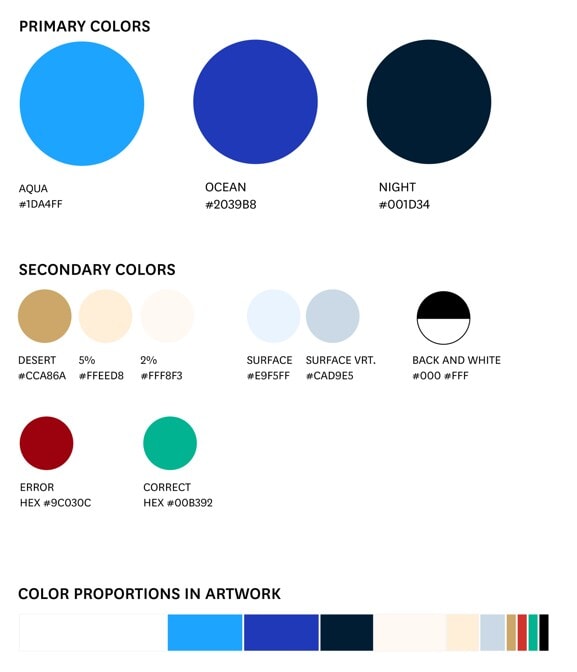
Once you've chosen your primary and secondary colors, define how much each will be used. Setting clear proportions helps create a consistent, visually balanced style across your content.
2. An Unclear And Inconsistent Design Language
Great UI design should disappear into the background. If learners are busy figuring out how to interact with the platform, they're not focused on what they're supposed to learn.
Making sure you are basing your User Interface on a system will ensure that no decision of color, sizing, placement, etc., is made haphazardly. A good tip is to study different available UI systems, such as Google's Material Design, and utilize the existing building blocks to your advantage. This ensures that whatever UI needs you have will be properly and consistently executed for any eLearning project, whether a course on an LMS where you can customize buttons and your theme or a gamified interactive package.
An example of this is setting up templates for every thinkable type of page or slide in your project and making sure the system you create accounts for the various possibilities of how your content can be structured.
This showcases how to organize various page elements into a cohesive layout using design software (in this case Figma), to demonstrate how all components align and interact in a unified User Experience.
3. A Perfectly Set Up Course Optimized For Desktop Use That Dismisses The Percentage Of Mobile Users
This pertains to highly customizable authoring tools among other platforms. It is no longer optional to design for smaller screens. The goal here is to start from the smallest screen possible and then adapt your designs to the larger ones. This ensures that font sizing, clunky and messy layouts, hover-only interactions, as well as tiny tap areas are all avoided. This would also inform your button sizing, as well as the amount of text that appears at a time. A very particular case of this is using software such as Articulate Storyline to create fully interactive courses. While this software offers a great deal of customizability and a large range of functions and coding, what you design is what you get no matter the screen size. So, it wouldn't be best practice to design your interactions based on desktop-only parameters because it will most likely translate badly when seen on mobile.
Screen capture of a course built in Articulate Storyline with a custom UI. Note: Tap targets like buttons should be at least 38x38 pixels to ensure easy interaction on mobile devices.
4. A Weak Visual Hierarchy
This goes back to the system you created for your project. A course that does not define the content structure visually can easily become boring if not confusing. Utilizing a proper Styles Scale will ensure there is enough clarity. And while at it, you need to ensure that you have at least two scales: a desktop and a mobile one. And the best practice here is to use two fonts, one for headings and another for body text and buttons. This rule has been tried and tested since the invention of printmaking and helps the learners identify the sections of your course more easily and anchor themselves in the learning journey. Another point of which you should be mindful is making sure you are accounting for the font sizes across different languages when applicable. Point or pixel sizes change from one font to another and from one language to another. So, while 16px is the rule for mobile font size, it is not necessarily true in all languages and font choices. Make time to test and compare.
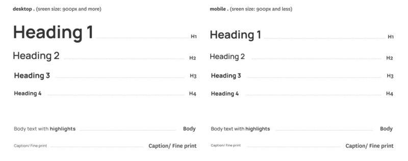
An example of the text style scales for mobile and desktop.
5. Not Enough Attention To The Details
After taking care of all the above points, thoughtful use of animations, transitions, and feedback animations can make the interface feel more alive and responsive. Utilizing animations sparingly to reinforce actions—like a checkmark when a module is completed or subtle movement when hovering over interactive elements—will create a better experience for the learner.
Now that we covered the UI pain points, let's dive into how paying attention to certain UX pitfalls can uplift the learning journey.
The Pitfalls Of Poor UX In eLearning
1. Non-User-Centered Design
Designing a learning journey without proper research and a good understanding of your learner might turn into wasted time, effort, and resources. To avoid that, start with the learner in mind. Understand their goals, challenges, tech habits, and accessibility needs. Creating learner personas helps you adjust the learning preferences and goals and allows you to work around the learners' pain points. On the other hand, mapping the user journey places you in their head and ensures that priority is set to what matters. This validates the decisions made and increases relevance, motivation, and retention.
2. Poorly Timed Disclosures Or Instructions During The Learning Journey
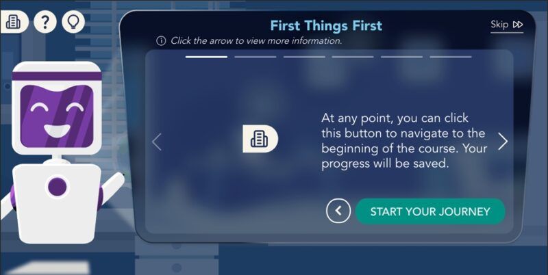
Imagine starting a new online course, and before you even start with the introduction, you get messages and instructions about items with which you haven't interacted yet. This applies strongly to gamified courses. And those should be treated using proper gaming UX. Think about progressively onboarding your learner and only dissipating the relevant instructions or tips as the journey unfolds. This can be easily achieved if the journey map has been well executed. At that stage you can ensure how much and when you are disclosing. Another stage where this can be identified is during user testing where you can gather feedback from users regarding the course onboarding.

An example of a course that reveals content progressively, guiding learners step by step to maintain focus and avoid cognitive overload.
3. Long Reads, No Breaks, And Passive Information Dumps
Going through content with no apparent end in sight could deviate the learner from completing their course. Microlearning supports modern learners who prefer quick, digestible chunks of content. It also aligns well with spaced repetition for better knowledge retention. To achieve that, designing modules that are 3–7 minutes long, each focused on a single learning objective, is the way to go. It also helps when there is a clear set rhythm to the learning journey. Engagement skyrockets when learners "do" instead of just "watch." Interactivity reinforces concepts and keeps learners curious. An example is offering short scenario-based content followed by short questions that help recapitulate the information and retain it faster. Other tactics include:
- Gamification (points, badges, leaderboards)
- Animated transitions to guide attention
- Micro-interactions (hover effects, visual feedback)
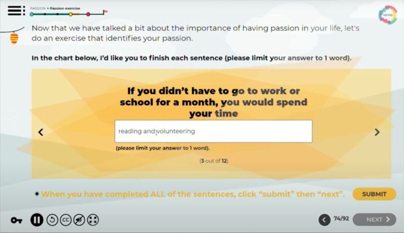
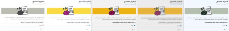
Screen capture of an interactive activity designed to help learners explore their interests and uncover what truly drives them.
4. Accessibility And Inclusivity
Accessibility isn't just compliance; it's an opportunity. Designing for users with disabilities pushes creativity and makes content better for everyone.
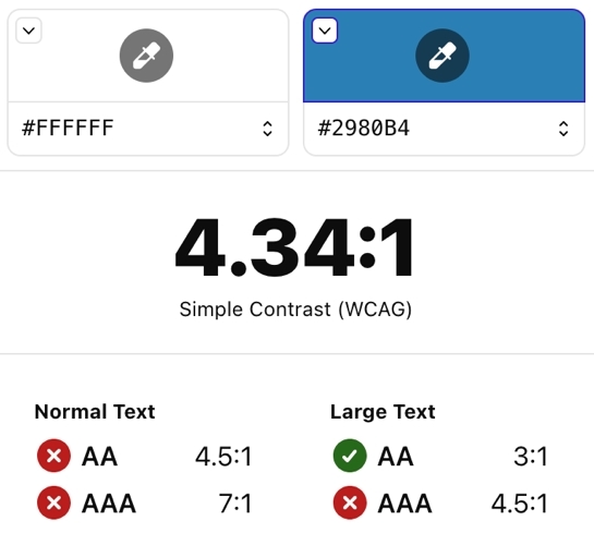
WCAG principles to follow: Provide alt text for all visuals, use transcripts and captions for media, ensure keyboard navigation works smoothly, maintain color contrast and scalable text.
Creative tip: Accessibility doesn't mean boring. Use haptic feedback, audio cues, or visual progress bars to enrich learning for all types.
Using accessibility testing tools helps ensure your design choices meet compliance standards, and more importantly, that they create an inclusive, user-friendly experience for all learners.
Wrap-Up: UX/UI Is A Strategic Advantage
In eLearning, UX/UI is not decoration; it's foundation. A great course design balances form and function. It makes learning easy, engaging, and inclusive. And when done right, it drives real outcomes: better retention, higher completion, and empowered learners.
If you're building or improving your custom eLearning, focus on:
- Designing for the learner, not the system
- Keeping it clear, simple, and interactive
- Ensuring accessibility as a strength, not a limitation
- Prioritizing mobile usability from the start
At Kashida, we build with these principles in mind, because design isn't just about how it looks, but how well it works for every learner.