Steps To Improve User Experience
You put a lot of hard work into your public-facing educational website. You (or maybe your team) chose a content management system, designed the User Interface, and crafted the content. You spent countless hours making updates and keeping everything running smoothly.
And yet.
Maybe you aren’t getting the search traffic you expected. Maybe users leave for no reason you can discern. Maybe you’re hearing this kind of feedback:
- People can’t find the right page
- They can’t find the resources they’re looking for
- Users can’t load the website on their phone
Sound familiar?
Why Isn’t My Website Performing Better?
All websites exist in a complex ecosystem of changing technologies, search engine algorithms and user expectations. Maintaining them is both an art and a science.
You may already be familiar with the term "User Experience." It describes the quality of the interactions a user has when visiting a site. This can include:
- Ease in navigating the site
- The time it takes for pages to load
- How intuitive the layout is
- If the site meets user needs and expectations
A good User Experience can give your site an educational edge. It also makes it easier for users to learn from your content, because they’re not expending so much mental effort on things like navigation. In other words, nothing gets in the way of learner engagement, motivation and retention.
A good User Experience can even improve your search rankings. Search engines like Google use complex algorithms to determine a site’s quality, relevance, and authority. User engagement is one important factor in these algorithms. If users have a positive experience on your site, they’re more likely to engage with and share your content. This, in turn, signals to search engines that your site is relevant to user needs.
Get To Know Your Users
The first step to improving your website’s experience is to understand your users. This goes beyond basic needs and demographics. People are complex, with unique thoughts, emotions, and contexts that shape their behavior.
Ask yourself:
- What learning goals do users want to achieve by visiting your website?
- What information are they looking for?
- What words do they use to describe your product or service?
- Are they using a desktop computer or a mobile phone?
- Are they more likely to be feeling rushed or relaxed?
User research, such as surveys or interviews, can help you answer these questions. You can also analyze user behavior on your website. Tools such as Google Analytics can reveal how long users spend on each page, what devices they use and where they drop off. This data can help you understand common user flows and identify potential sources of frustration.
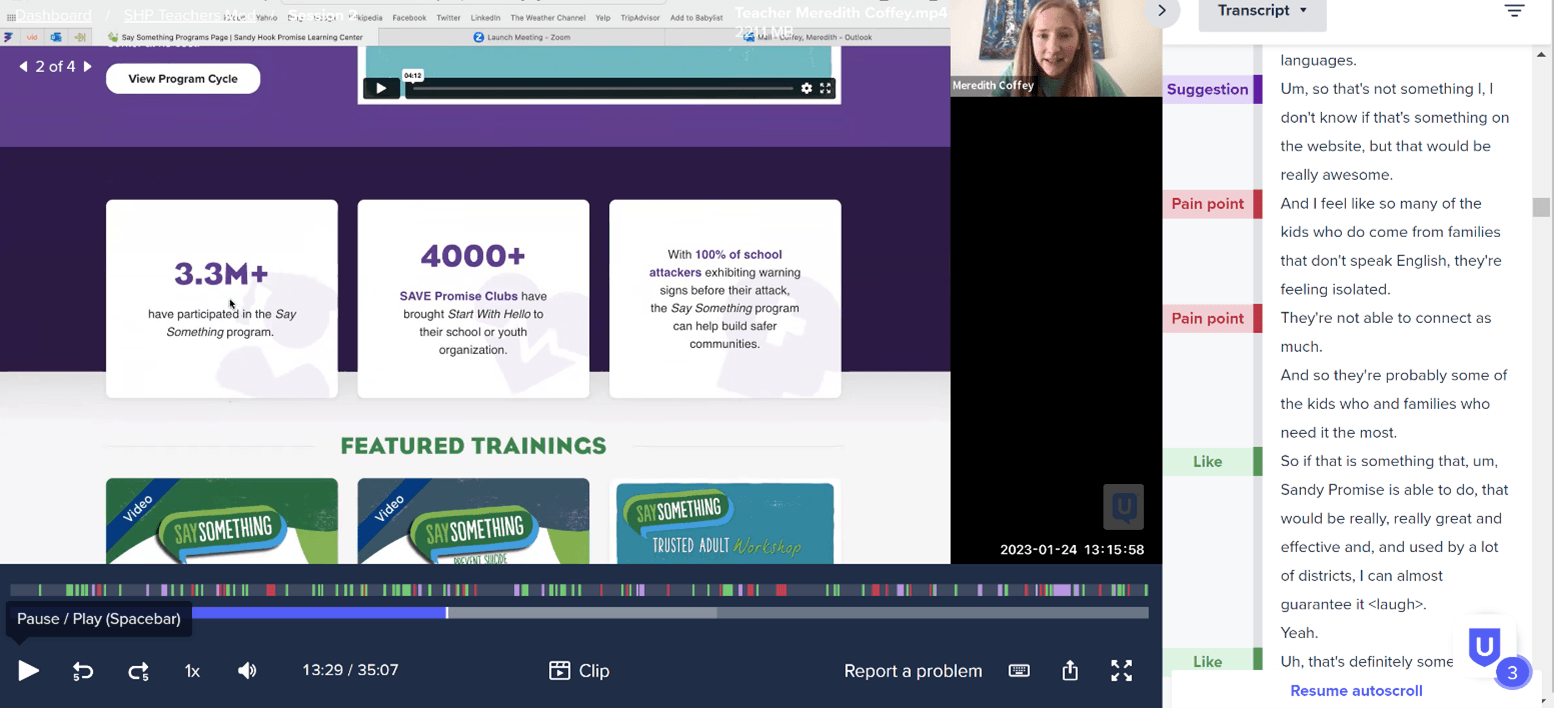
Want even deeper insights into user behavior? Consider usability testing. During testing, participants are given tasks to complete on the website. They record their interactions and feedback as they go, typically with the help of a moderator or a web browser plugin.

A moderated user test session performed in the UserTesting.com platform.
In the past, testing was performed in high-tech usability labs—often at great expense. Today, testing often happens remotely on the users’ own devices, where they are most likely to use the website in their daily lives. This minimizes investment and helps to ensure accurate findings.
Improve The User Experience Of Your Educational Site
Your research and testing might reveal a need to update your site’s User Interface. Or maybe it’s just time for a more modern design. High-fidelity, full-color designs can be impressive, but they’re also expensive and time-consuming to revise. Consider a more agile approach—one that’s rooted in design thinking.
The origins of design thinking can be traced back to the 1960s, when it was introduced as a way to solve problems in the design industry. Today, it’s also used to create meaningful digital experiences. The design thinking process starts by empathizing with users and understanding their needs. From there, UX designers work with developers and content teams to ideate solutions.

Source: Wikimedia Commons
This often takes the form of greyscale wireframes: simplified visual representations of site structure and content. Through wireframes, teams can visualize key components of the User Interface such as navigation elements, content layouts, and web forms. From there, they can test and refine before investing in more detailed mockups.
Website Accessibility Benefits All Users
This process might help you meet most user needs. But not all users have the same abilities. Some may be visually impaired and struggle to read certain text. Others may be using assistive technology that relies on your technical setup to function well.
Users might be watching your video in a noisy café and need captions to understand the content. They might be rocking a baby while they try to navigate your mobile interface with their thumb.
Web accessibility benefits all users—not just those with disabilities. It’s also a legal right protected under the American Disabilities Act (ADA). Businesses and organizations that fail to make their websites accessible to people with disabilities risk legal action.
Mitigate this risk while also demonstrating your commitment to inclusivity. To start, make sure your website is compatible with Web Content Accessibility Guidelines (WCAG). There are three levels of conformance, with WCAG 2.0 AA often considered the minimum. Use alt tags for images and captions for videos. Test your website’s color scheme and font choices for readability. A web accessibility audit done by a reputable web partner can help you uncover existing issues and prevent new ones from emerging.
In Summary
No matter how much you’ve put into your public-facing website, your work is never done. Improving the User Experience of your educational website—or maintaining a good User Experience—is an ongoing process. It requires understanding your users and making iterative improvements. It takes user research, optimization, and a commitment to accessibility. But by committing to this process, you can ensure your website is both effective and enjoyable to users—both now and in the future.


