The Progression of Responsive eLearning Design
There were times when businesses used to have two versions for their websites: full-fledged PC version and a mobile version. But since the evolution of Kindle, Tablets, iPhone, Android and other smart phones etc., it is not cost effective for companies to maintain a different version for different sets of devices.
Ethan Marcotte coined the term responsive web design (RWD) in a May 2010 article in A List Apart. Responsive design was also listed as #2 in Top Web Design Trends for 2012 in .net magazine. Mashable referred 2013 as the Year of Responsive Web Design.
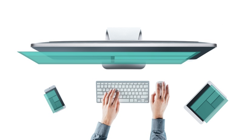
The much anticipated decline in sale of PCs/Laptops has indicated that the consumer is moving from computing from a fixed location to something they can get their hands on anytime and anywhere; a Tablet or a SmartPhone! Increasingly, SmartPhone sizes have gone up and a lot of websites have a variant for SmartPhones or the same website in a Responsive format that will work on SmartPhones as well.
With depreciating tolerance in browsing on a non-tablet/smartphone friendly website, it’s important for businesses to hold their online visitors with designs which are responsive. Websites are expected to respond to every kind of device in a very personalize manner. Being pro-active and sensitive about their web presence many companies are already providing responsive designs to cater the vast segment of audience who are accessing their websites with multiple devices with different screen sizes.
This paradigm shift of user expectation and behavior has challenged businesses to think while designing their online spaces. While eLearning will not be an exception in getting affected by this expectation; the million dollar question is “Are we ready yet?”
But before you attempt to think about the above question - please take a moment to think “do you really need a responsive eLearning design solution?” eLearning industry is driven by the principles of delivering courses to learn effectively. It has to be learner centric. With every course we create; it has to impactful, keep the learner’s attention and achieve the learning objective.
Responsive eLearning design is not a fashion statement
May be we would like to be responsive to some extent in the kind of work we deliver to the clients but we have to be responsible first.
- Do you really want your employees/customers to use their smartphones/tablets to undergo courses?
- If yes, what kind of course should this be? A 2-3 hour long or short 5-10 minute modules?
- If yes, do you want to provide learners with a summary of a larger course on mobile devices as a refresher?
- Is your LMS available in a mobile friendly format? Or is it really meant only for access on PCs? If the answer is no, then there is little point to go down this road just yet.
- Would having larger courses packaged in smaller modules help increase adoption and completion rates for your eLearning?
- Among the authoring tools or options you have for authoring, which tools allow for creation of responsive eLearning?
We create custom courses for clients using tools like Articulate Storyline, Articulate Studio, Lectora, Captivate etc. and have had multiple requests from clients for options that they could run the same course on SmartPhones as well.
Unfortunately, this is not an option just yet with any of these tools. To address this need, we have built a custom HTML5-based framework to address the gap in the capability of these authoring tools.
The framework allows you to run the same course on PCs, Tablets and SmartPhones. You can have an audio-based course or a non-audio-based courses as well.
If you are having a hard time visualizing your course using a framework like this, you could look on a SmartPhone; we have added some screenshots below to help you.
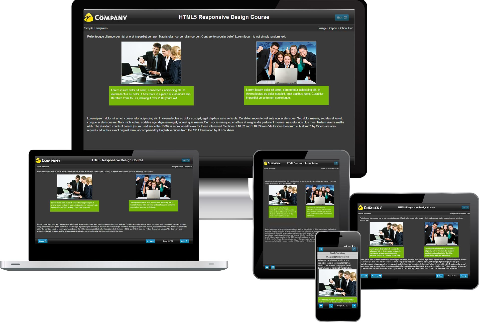
Note – This is not an authoring tool but a custom framework we have built for creating courses for clients that are responsive and one course will run on PC, Tablets and SmartPhones.
PS: The new version of Captivate claims to support responsive design. We have not yet given it a whirl. Other tools like Gomo have also emerged. When we know more about the capabilities of these tools, we will do a follow up post on this blog.