
How To Improve Your Visual Design Skills For Non-Designers
You know very few things about visual design and yet you are determined to be the best you can be in this area. Is this possible? Of course it is. We all know that great sense of visual art is inherent, but with a little bit of practice you can certainly learn the art of visual communication and improve your aesthetic skills, even if you are not a designer. Like many things, good visual design can be created by skills that anyone can develop. In this article, I will share 10 tips to improve your visual design skills when you are a non-designer and make sure that after a while you will be able to create beautiful visual design for your eLearning courses.
- Seek inspiration everywhere.
This is something that literally all designers do all the time, even the well-known and highly-experienced ones. There are very few people in this world who don’t need to look for inspiration around them in order to get better with time. The amazing thing about inspiration in visual design is that it can strike you at the most unexpected hours; not only when you study visual design books, but also while you’re watching a movie, you’re flipping a magazine, or you’re stuck in traffic and looking at street ads. Creativity is a state of mind, and being open minded, asking questions, thinking out of the box, being observant, and always assuming there are better ways to do things will enhance your ability to boost your imagination and be innovative in order to upgrade your work. - Follow the "less is more" approach.
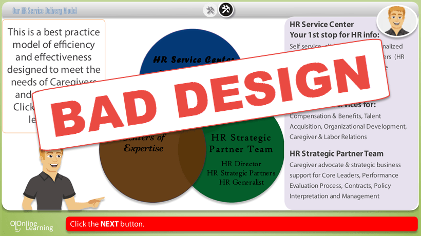
The thing about non-designers is that, due to their lack of graphic design skills and knowledge, they usually get anxious and try to apply everything they know to every single attempt to design anything. Don’t forget to follow the "less is more" mantra. Clear, balanced design enhances focus on vital information, making it crucial, particularly when using UX design tools to create course or website interfaces Effective design is clear cut and balanced, to help viewers focus on important information. Of course, you will make mistakes; don’t let failure discourage you. In time you will realize that learning the art of visual communication takes a lot of time and practice, but trying not to combine many contrasting elements and pile multiple textures on top of each other is a very, very, good start. - Know how texture works.
Speaking of textures, texture in visual design is defined by the surface characteristics of a material which can be experienced through the illusion of touch. It can be used to accent an area that you want to focus on and make it more dominant than another; or, on the contrary, to avoid attention for an element. Texture can be a very powerful tool. Adding too much texture creates highly busy spaces and tires the eye. Consider studying layouts that you like and see how to use certain textures to create depth. - Utilize typography.
It may sound strange, but typography is great part of visual design. Knowing your fonts is key; choosing the right fonts for your next eLearning project can make a world of difference, as fonts speak louder than words. Fonts and typefaces carry a lot of meaning and they can completely change not only your intended message depending on how you use them, but also the visual impact of your eLearning course. If you don’t feel confident, stick to the basics: Experiment with different types, but don’t change fonts without a good reason. Also, don’t hesitate to ask for help from the professionals to strengthen your visual presence. - Pay attention to color.
Studying a little bit of color psychology would not be a bad idea, as color plays a vital role in creating emotional connections between your audience and your eLearning content. There is only one way to learn how to use color effectively: Have your eyes open and practice. Experiment with different color palettes, the Adobe Kuler’s color wheel is a great tool for seeing what works and what doesn’t. Also check how color and contrast in visual design works in order to help you highlight or fade out elements. - Use whitespace wisely.
Whitespace is practically the empty space between, images, graphics, text, margins, and other elements. It is also called “negative space” in contrast to “positive space” which is filled with information. Using whitespace effectively improves readability, transforms every page into something elegant and sophisticated, and delivers an overall enjoyable experience to the viewer. Although it is called “white” space, it doesn’t mean it should be white; but the truth is that white is by far the friendliest color you can use for creating clean, beautiful visual design. Whitespace is a great way to draw attention to something without using extravagant colors or images, but a very busy whitespace, let's say very large spaces left empty, can be tiring for the eye. A great trick to determine whether you use whitespace effectively is to take a picture of your visual design (use the Prt Sc key on your keyboard) and flip it horizontally. This will allow you to see how your design looks through a mirror, which will make it remarkably easy to evaluate your whitespace balance compared to other screen elements. - Go for balance and harmony.
Even the ugliest visual design can get better simply by pulling all pieces together to achieve harmony. Harmony in visual design means that all visual units relate to and complement each other. How can you achieve this? Simply by using the same type of images, and not combining, for example, photos and clip art, fonts, and layout in all of your pages. Consider focusing on creating a rhythm, as rhythm influences the visual flow and helps eye movement. Also, find creative ways to arrange repeating patterns, to achieve visual unity so that your visuals come together and be in agreement. - Learn how to use size, scale, and proportion.
Big and small, light and dark, strong and weak: Contrast is a fundamental principle of visual design, but too much contrast between sizes and colors can contribute to wrong visual quality. Consider enhancing your understanding of size (the physical dimension of an object), scale (the relative size of different objects), and proportion (the harmony of scale) by using the good old pen and paper method. This will help you understand the relationship between different design elements and use it to draw attention to the areas you want. - Understand how and when to use icons.
Learning how to choose or create icons can make a real difference in your visual design. The right icons will grab your audience’s attention and convince them to begin reading. On the other hand, icons should only support your eLearning content, so you should never let them steal the spotlight. Use them wisely to break up long texts, add information, and sustain your learners’ attention. Remember that visual design is all about communication, so make sure that the icons you are using convey and communicate messages effectively. - Be meticulous.
Being meticulous is a crucial aspect of being a professional, no matter in what area, and visual design is no exception to the rule. After all, attention to detail conveys a love for the end product. Great visual designers pay attention to everything and take care of every single detail, no matter how small it is. What does this mean in practice? It means that the more attention you pay in placing elements, organizing things, using color and contrast, and so on, the more immersed will be your audience into the world you are creating for them with a great sense of visual art. In other words, study carefully visual design works you like, and practice as much as you can.
Now that you know how to improve your visual design skills with these simple tricks, you may be interested in learning some visual design tricks. Read the article Top 5 Tips for Visual Design in eLearning and find out how to take the visual design of your eLearning course to the next level.