Visual Design For Better eLearning
In my book Interface Design for learning, I look in depth at how graphics, multimedia and other elements of the interface design can literally boost learning gains. Here are five foundational strategies drawn from the book.
- Think Quiet design
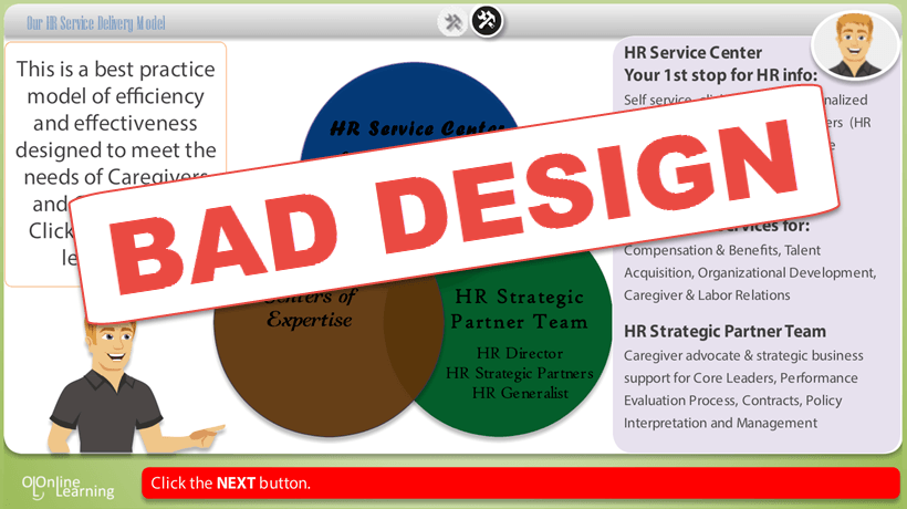
One of the most important roles visual design can play in eLearning is to get out of the way. Educational interface researcher Sharon Oviatt calls it quiet design. The basic rule is that everything on your screen should be there for a reason and anything that isn’t should be removed. The simple reason is that the more of a learner’s brain that’s needed for processing the visuals, the less there is available for learning. Remember that even color is information and overuse of color has been shown to decrease learning performance. Instead, use color and eye-catching effects in very minimally applied and deliberate ways to direct attention to just the important things at the right times. Tip: research shows we recognize outlines of objects as quickly as we recognize photos of objects and we remember the outlines better! We don’t need detail to rapidly understand what something is, so feel free to use line drawings to help pare down details and keep focus on the essentials. - Use interactive imagery to manage detail
I know what you’re thinking, going minimalist is great but what do I do when my learning content is full of essential detail? Multimedia has a great secret weapon for detail and that’s interactive graphics. Take health as an example. Learners in this area need to learn a lot of detail (eg. microscopic details in immune cells) without losing a sense of the larger context (immune system and whole person). This is where clickable hotspots on imagery can be a huge boon. Clicking on a lymph node in an image of the human body in order to access more detailed information about that area gives learners control to drill down at their own pace without losing the larger context. It also means you can present the detail in a way that doesn’t overwhelm. Hotspot images can be created in Prezi or PowerPoint so you don’t need fancy tools. - Use video for physical procedures
Since our cavemen days we’ve been learning by observing others. This is probably why so many of us head straight to YouTube for a how-to video when we want to learn how to make or fix something. Research supports the idea that we learn better from watching physical procedures so use video or animation to teach these. Remember to give your learners controls to pause and move through the video so they can view and review at their own pace. A caveat is that this doesn’t apply to abstract concepts that you can’t watch being performed physically. For abstract ideas (eg. how rain is formed in the atmosphere) static images still perform better for supporting learning. - Foster a positive mood for better learning
Believe it or not, research shows that putting people in a positive mood will make them more creative, more flexible in their thinking, more thorough, and better learners. To show this, researchers have used tactics as simple as showing a funny video or giving subjects a bag of candy before a meeting. If that’s all it takes, imagine what good visual design can do to prime learners for creative open-minded thinking. For examples of little interface-based mood-lifters, look to websites that use humor in their interaction design (think Flickr’s “Hold on there, tiger” download text and MailChimp’s monkey high five as examples). - Use visuals to direct attention not distract it
“Pop-out features” are those features of the visual world that our eyes are hard-wired to notice unconsciously and in under a second. These are things like primary colors, edges, and movement. As such, these make up a visual designer’s arsenal of powerful tools for directing attention. Use one or two to make just one or two critical things in your information pop out. Overuse them, however, and send your learner into a hopeless state of confusion and overload. Take the popular Where’s Waldo hidden picture books. They use thick black lines and primary colors to draw your attention to...everything on the page. This overload makes it a huge challenge to discern Waldo amidst the visual clutter. Brilliant for hidden pictures but we don’t want our learners to have to work that hard to get to the point. So leverage pop-out features but apply with strict restraint.
Visual and interface design wields great hidden power when it comes to learning environments and experiences. Know what works and your design will improve learning outcomes and make for much happier learners.


